

UX Case Study: MIRROR
Client: Designlab Project
Client: Designlab Project
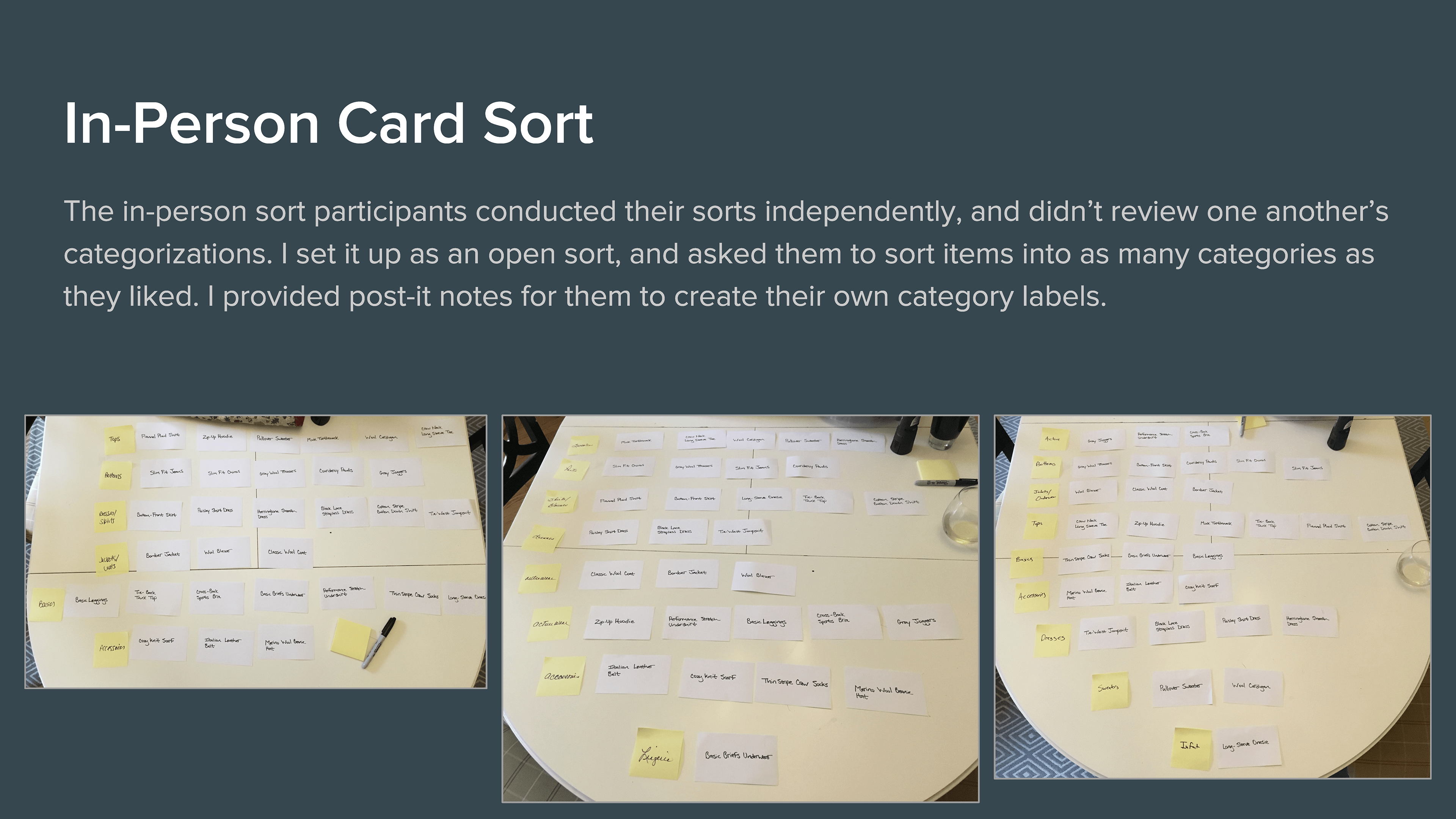
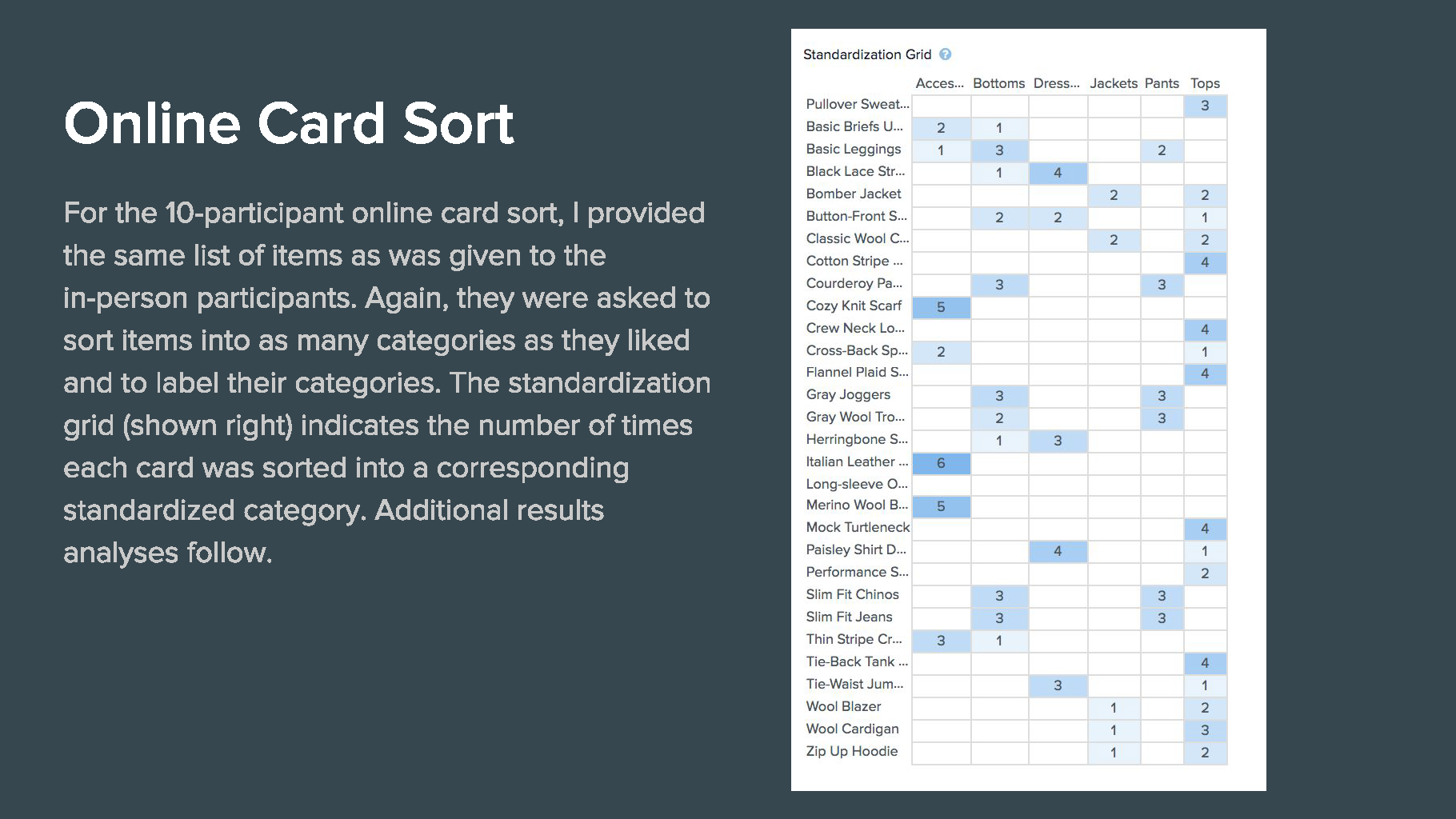
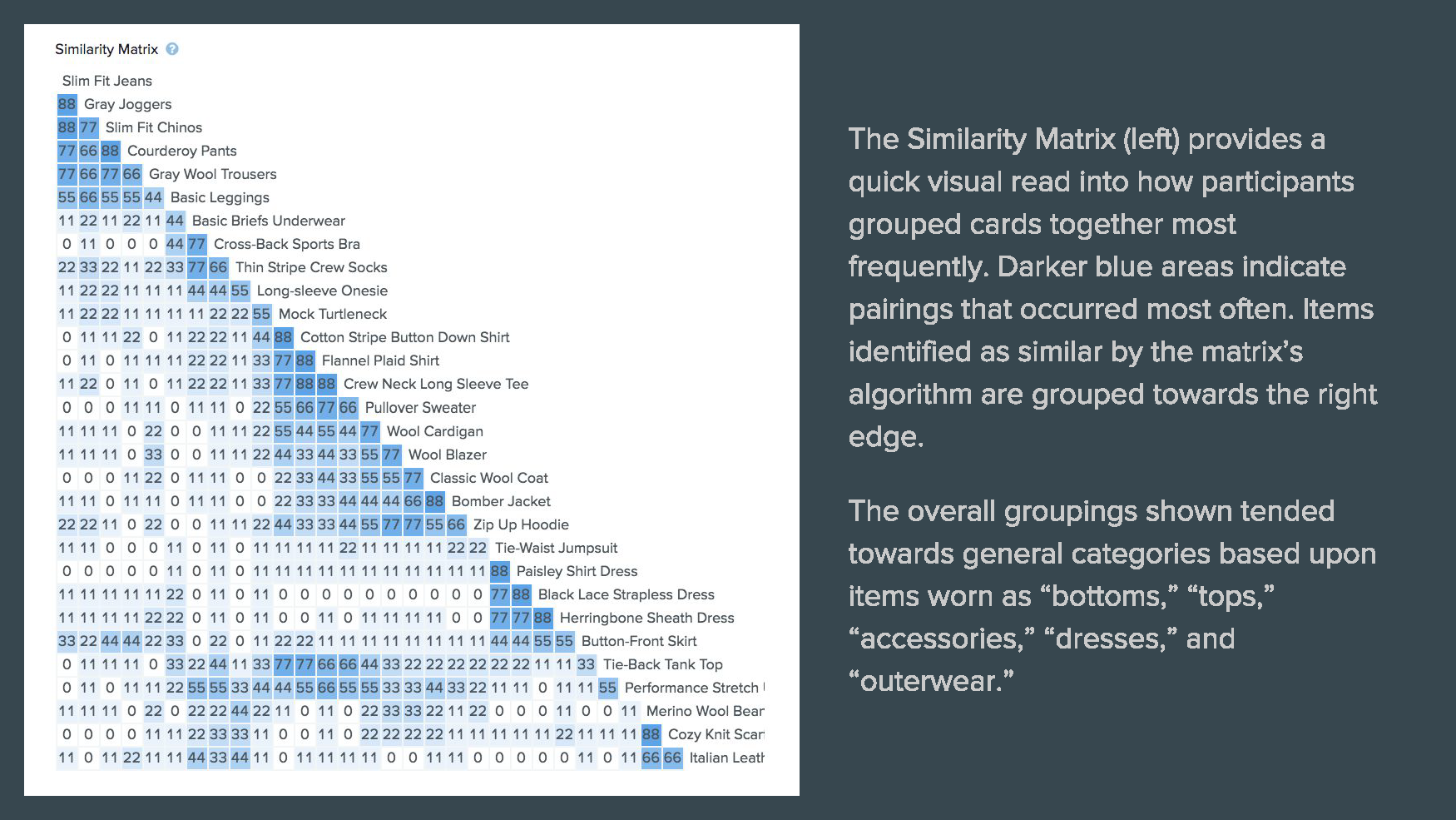
CARD SORTING
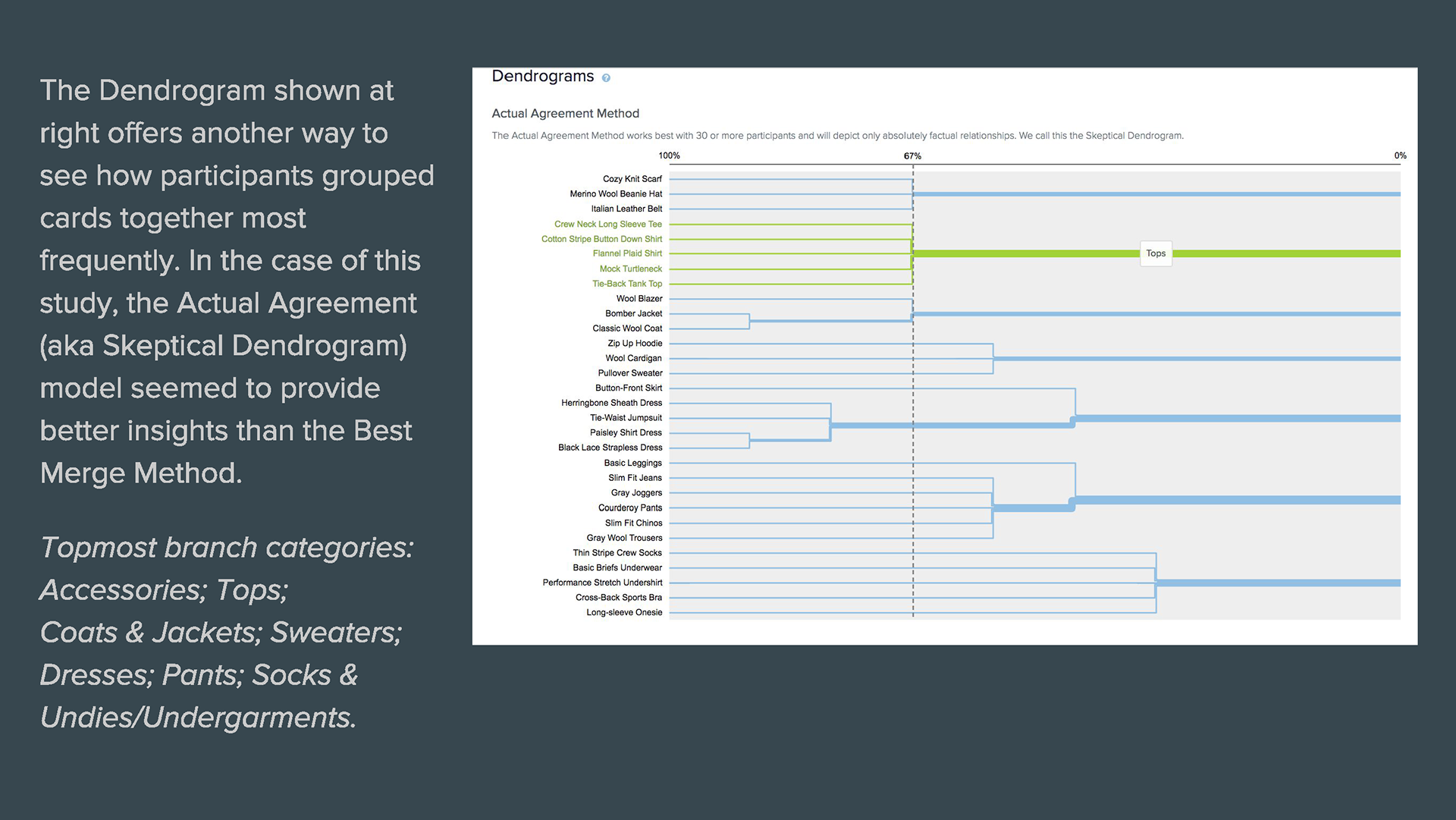
To begin the process of thinking through the structure and flow of the Mirror site, I conducted a combination of in-person and online card sorts. The online survey enabled me to survey a larger number of participants, and the in-person sorts gave me the opportunity to observe those I met with to see how they approached the exercise and gain more empathetic insights. In total, I surveyed 3 participants in person and 10 participants online (via Optimal Sort). Participants were men and women between ages of 25 and 70, with a variety of living situations and locations.
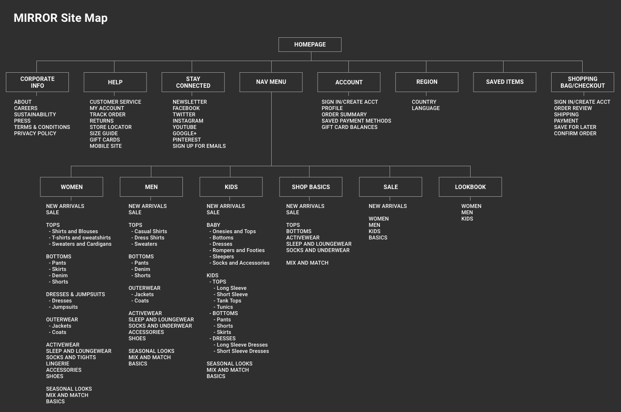
SITE MAP
Based on the results of my card sorting, I created a preliminary site map.
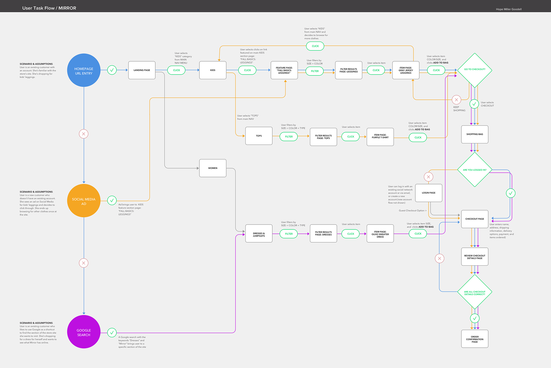
USER FLOW
I then mapped out user task flows to find out if the site architecture would support and encourage a positive user experience. My focus was on ensuring that smooth paths of navigation be in place for accomplishing tasks identified and prioritized as business and user goals.
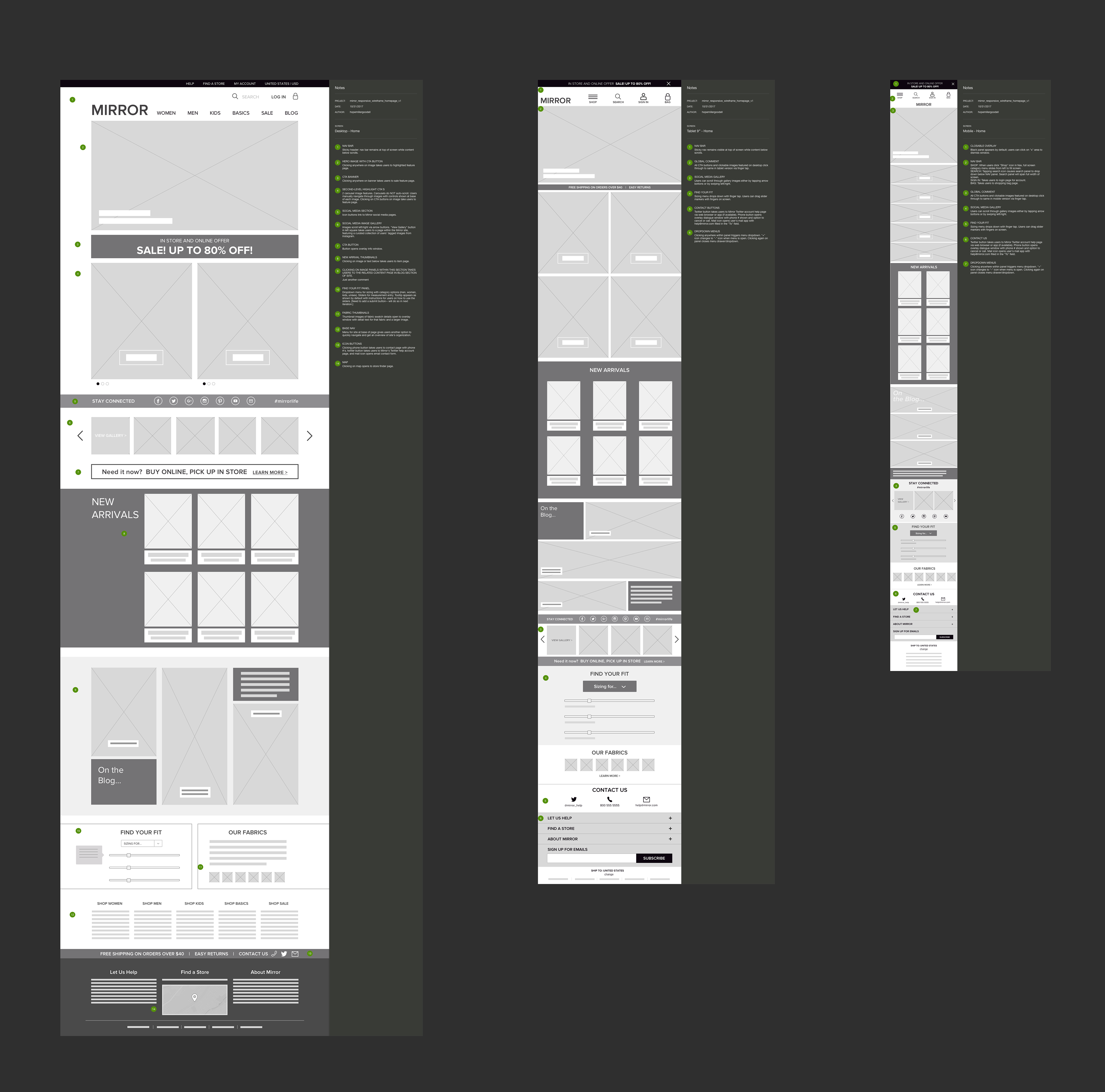
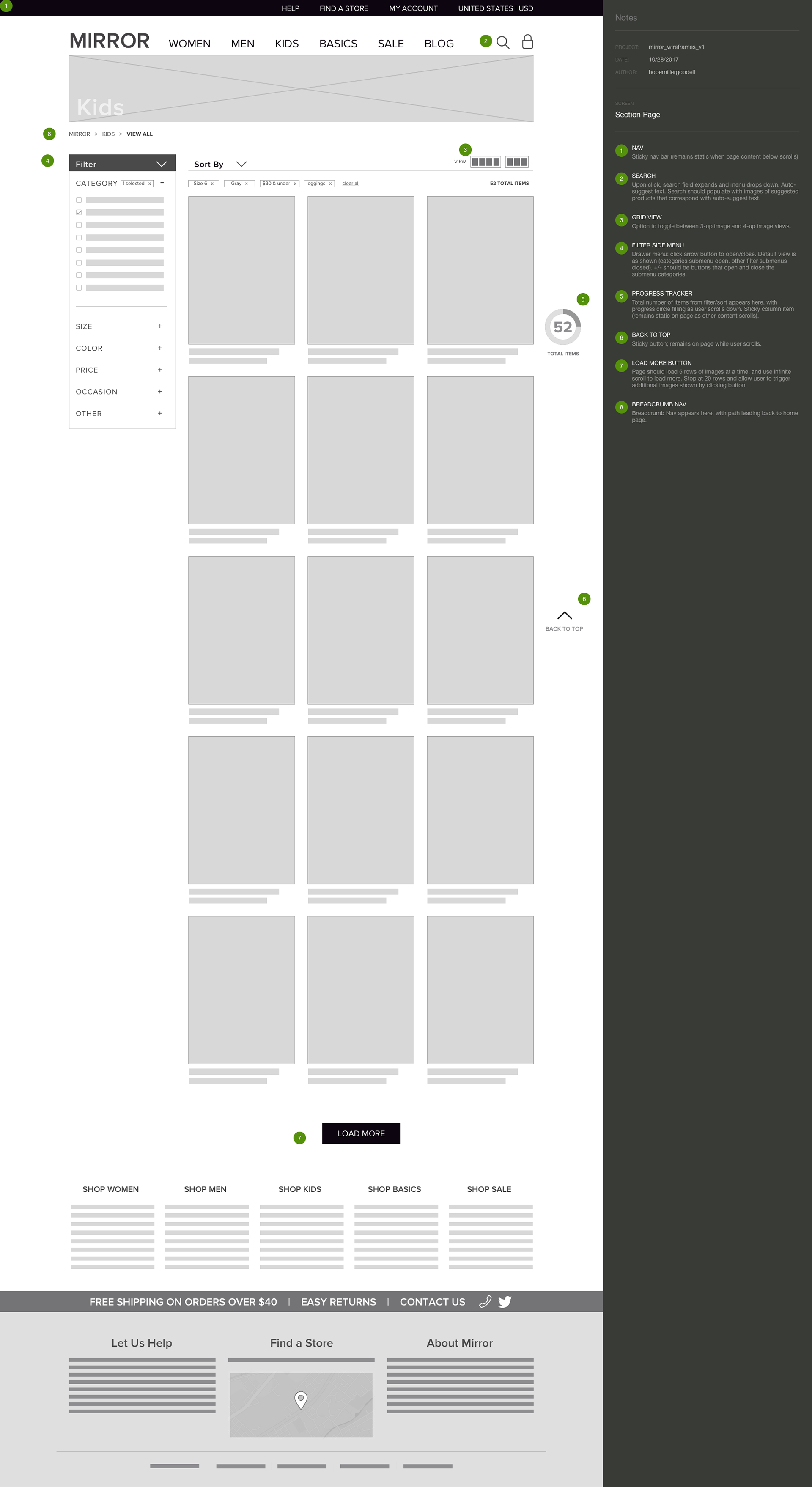
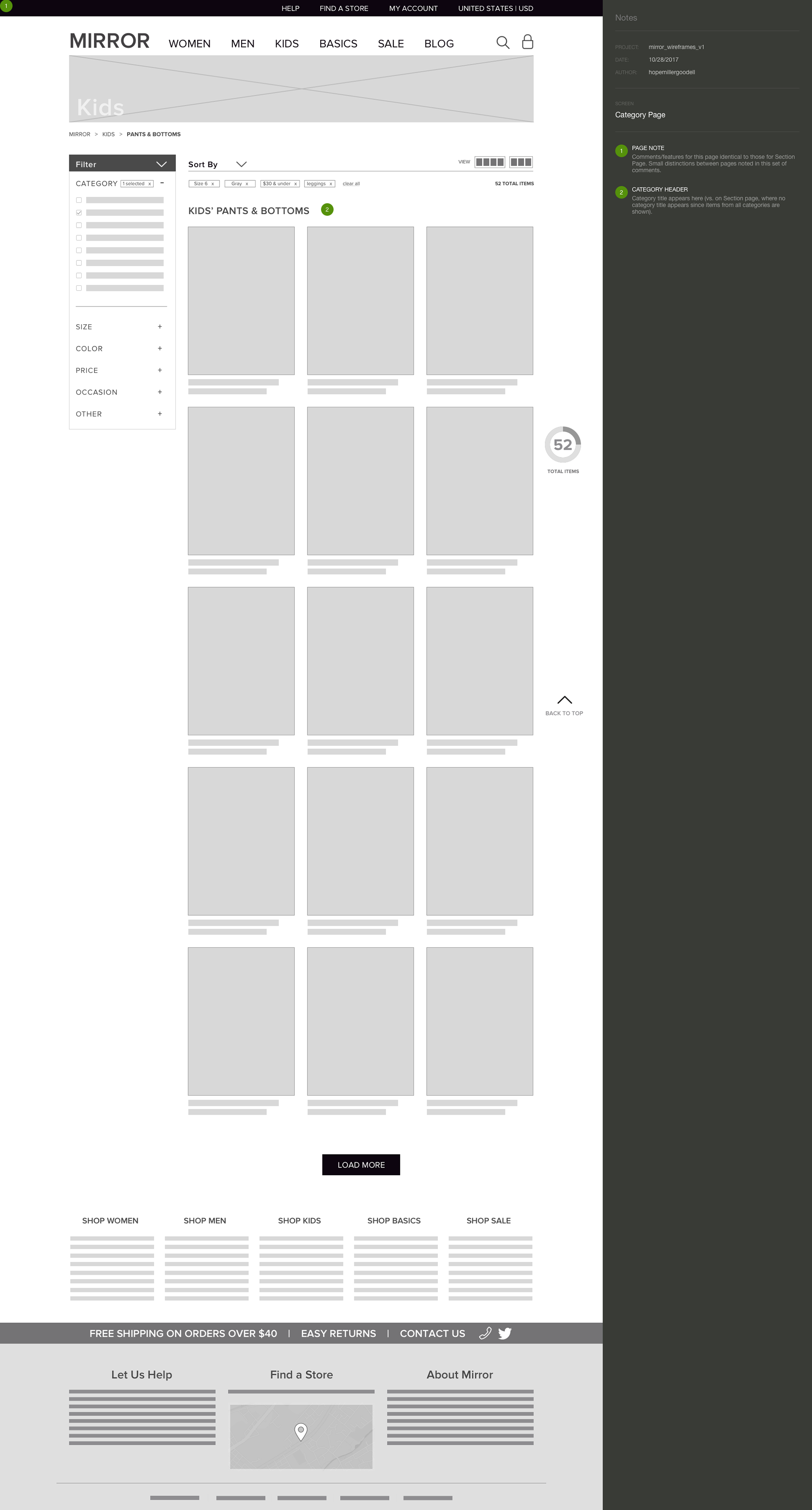
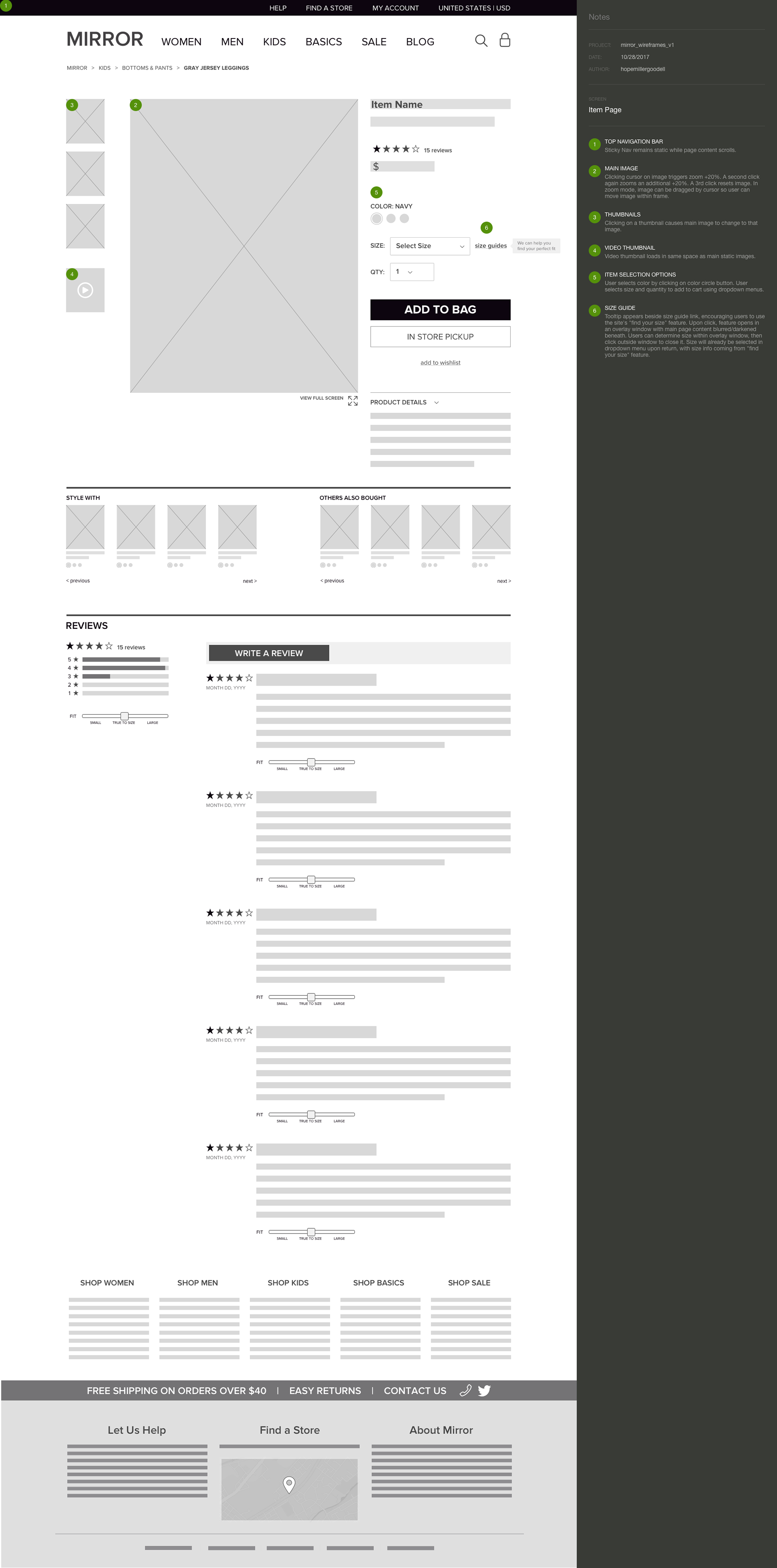
WIREFRAMES
Following some initial sketching, I created some preliminary digital wireframes with annotations to begin establishing what features the site will require, consider content hierarchy, and prepare for prototyping.
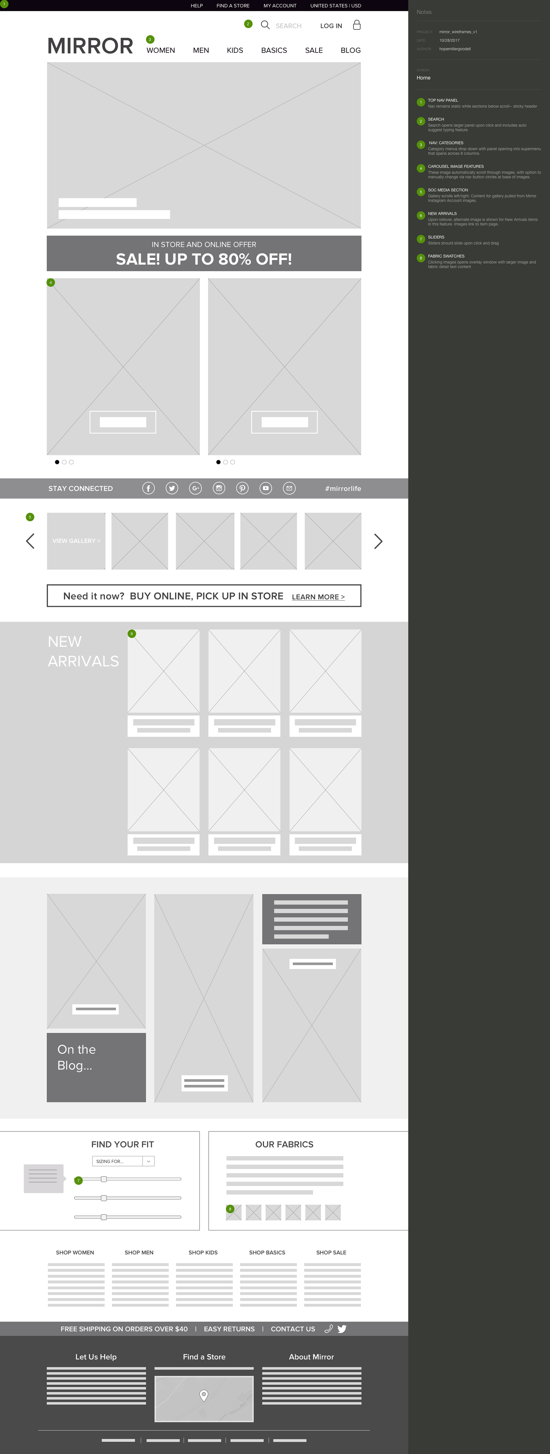
Above, initial desktop wireframes. Below, initial responsive wireframes for the Mirror home page for desktop, tablet, and mobile viewports.