

UX Case Study: MIRROR
Client: Designlab Project
Client: Designlab Project
BRANDING + IDENTITY
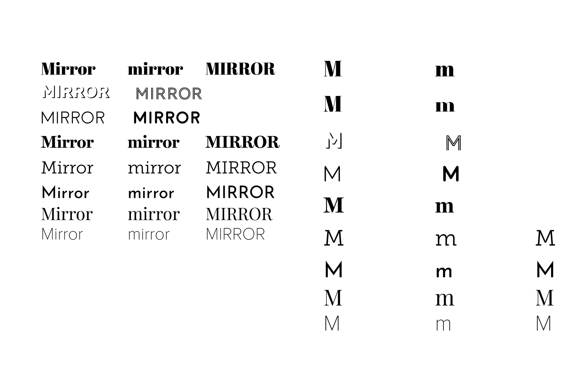
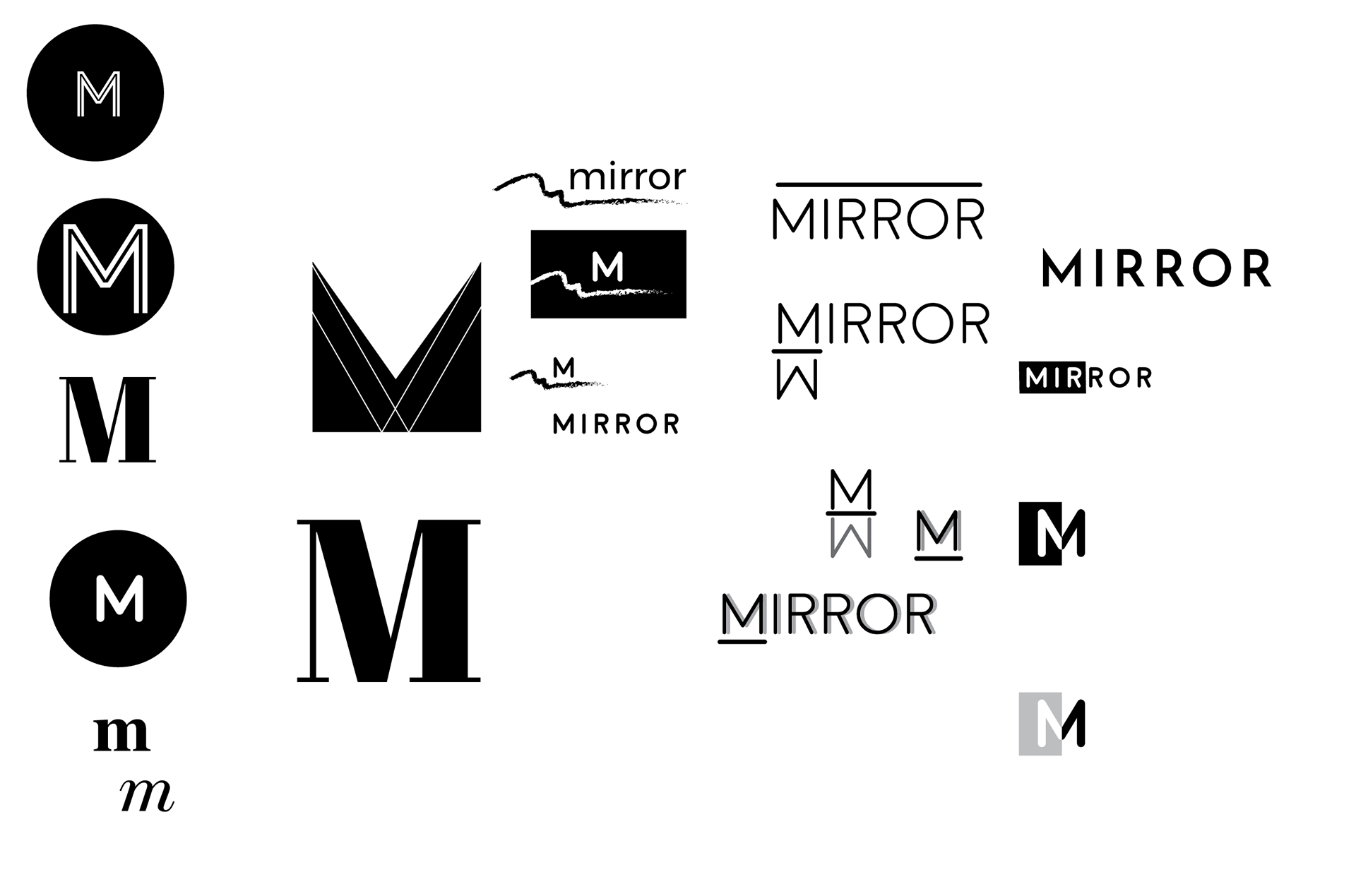
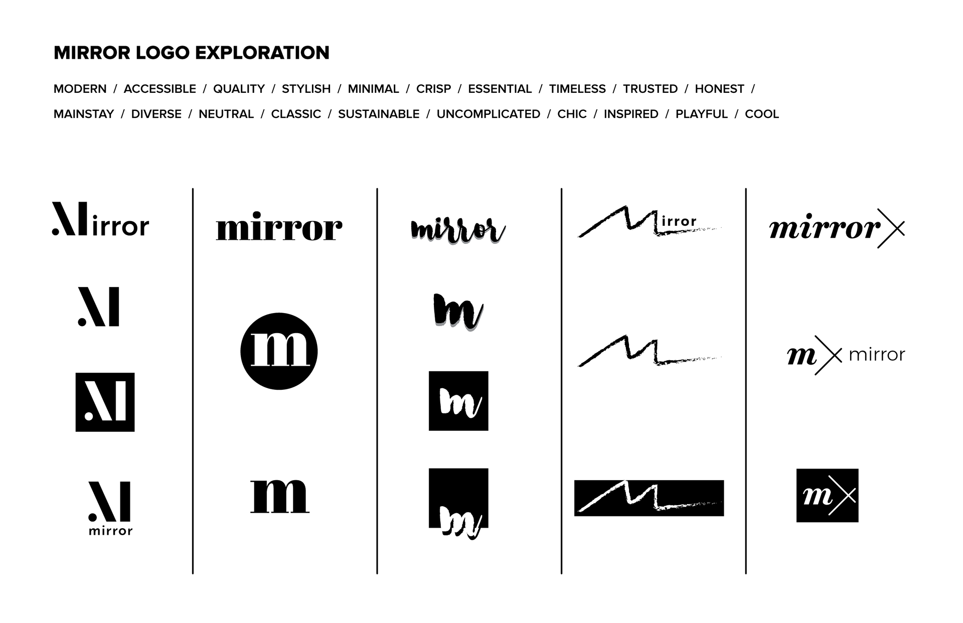
I created a wordmap of brand attributes, then moved to sketching as I considered possible directions for a wordmark/logo. I took some of those concepts into digital comps and narrowed down to a few possible directions.
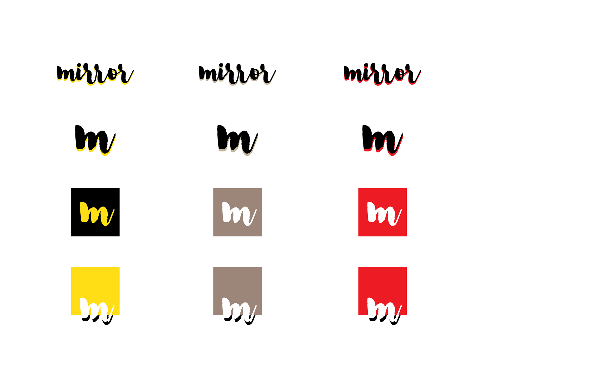
I then moved on to creating a style tile for the brand, showing how the logo would be employed and further defining the identity via typefaces, color palette, photo direction, and overall aesthetic.