


Cover Design for Cases and Concepts in Comparative Politics: An Integrated Approach
W. W. Norton (2016). Art direction: Debra Morton Hoyt.
A walkthrough of my design process for this project.
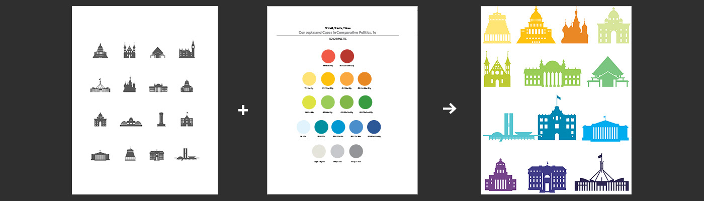
Above: My starting point (left image). These icons represent various governmental buildings from around the world. This icon set has been featured on covers of other books by the same authors, and have become a recognizable identity for the series. For this book (new to the collection), the editor requested a cover design that would use the icons in a new way, while still retaining a relationship to the series. It should be a bit of a breakaway in terms of identity, and the design should signal that this title was unique and new. I drew from the book's interior color palette (shown above) and applied the saturated, bright colors of the design to the icons (which had been set in gray on the other covers). I decided to explore the ideas of transparency and overlapping colors as a reference to the concept of integration, which was central to the book's approach.
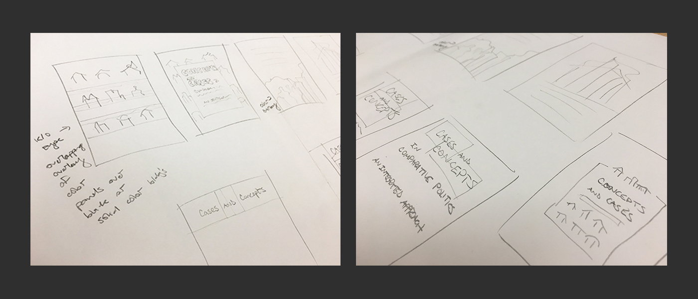
Above: Details of my initial rough thumbnails sketches for thinking through layout ideas, concepts, and type.
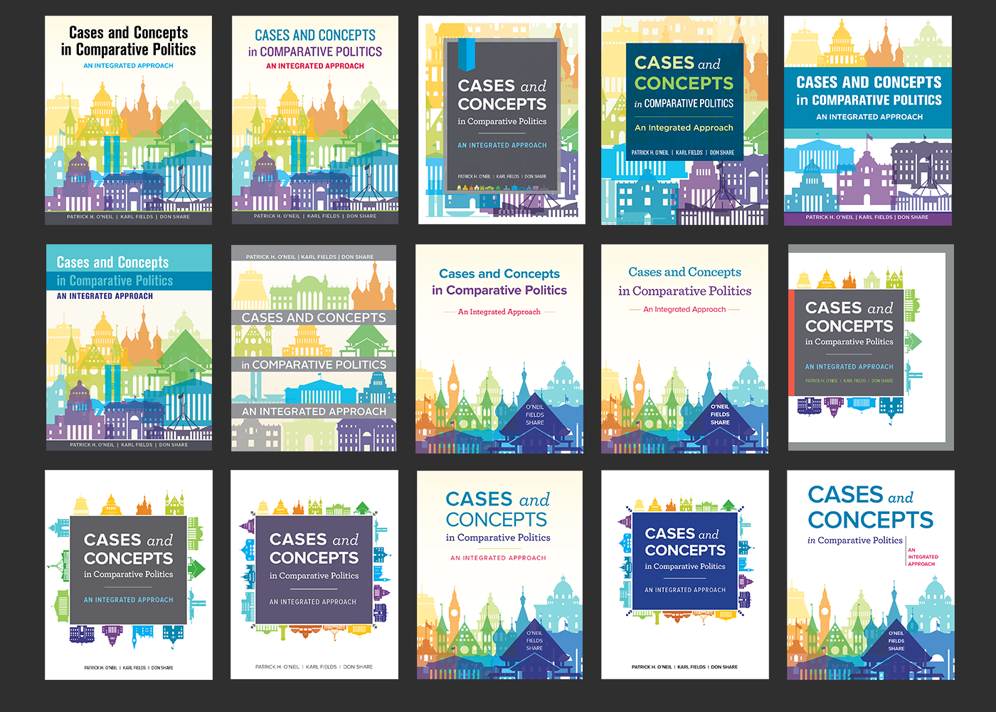
Above: selected sketch directions developed into comps. These are ordered top left to bottom right in order of progression from the rougher, unfinished concepts to the more refined directions.
Above: The final two directions presented to the editor (with variations on color and author/subtitle placement). The top direction keeps the icons individual and distinct, and therefore more legible and recognizable (and closer in identity to other covers in the series). The bottom direction employs transparency and overlapping to convey the concept of integration. It is more of a departure in style from the other series covers.
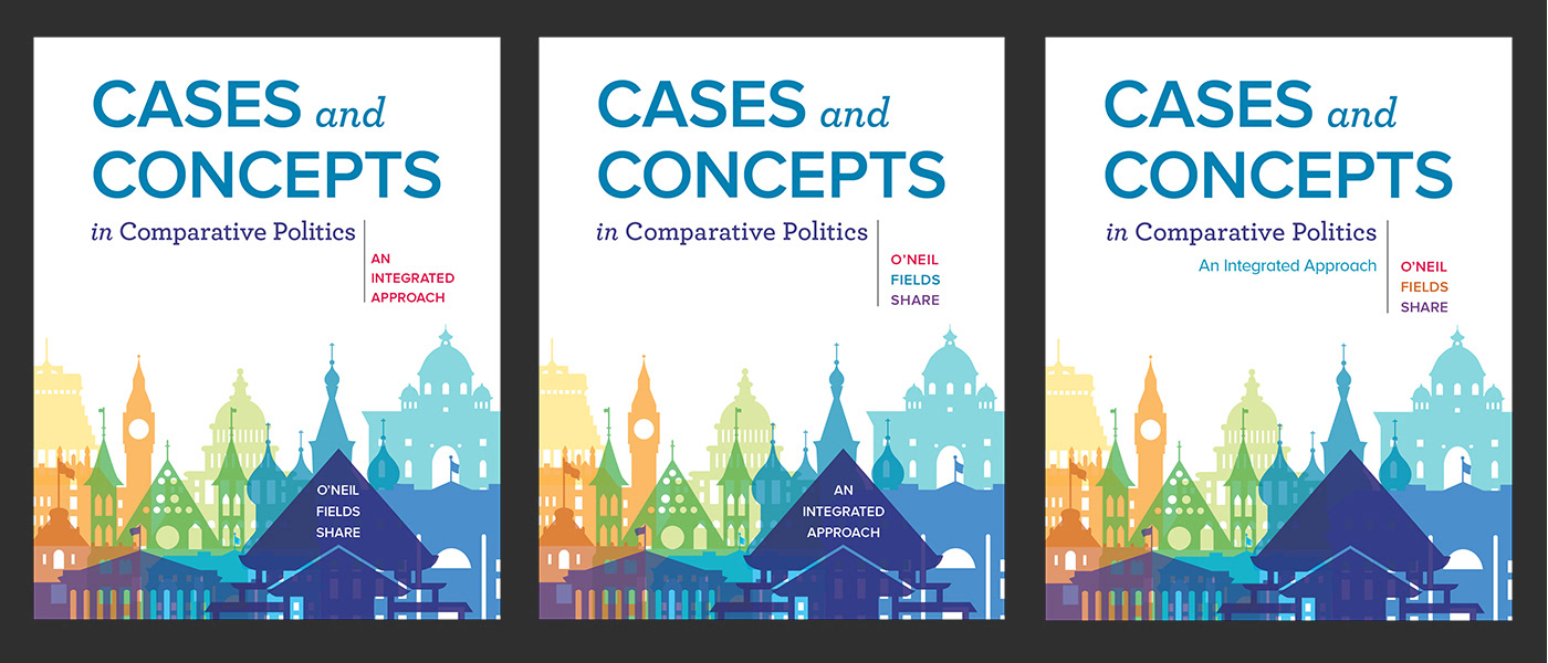
The editor chose the bottom row, but felt that "in Comparative Politics" felt too separate. He asked that the authors' names to be listed in their entirety and given more prominence, and for "An Integrated Approach" (the subtitle) to stay close to the main title.
The editor chose the bottom row, but felt that "in Comparative Politics" felt too separate. He asked that the authors' names to be listed in their entirety and given more prominence, and for "An Integrated Approach" (the subtitle) to stay close to the main title.

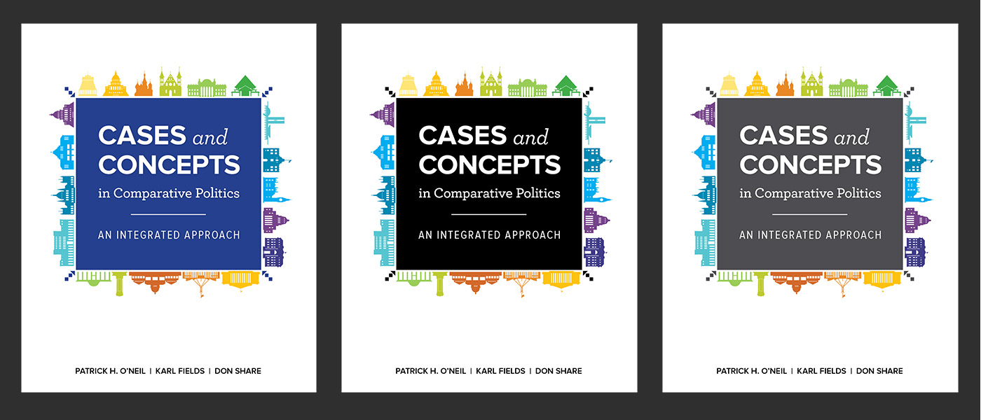
Above: I changed the type style and color of the title's 3rd line so that it more closely related to the first two lines. I presented a few type options and colors for the subtitle. I also moved the author names to the top of the page for more prominence while providing another option with author names at the bottom of the layout.

Above: Final approved cover.