

Amex Business App:
Driving Engagement
Driving Engagement
A new account home screen and quick, impactful updates boosted engagement, delivered a better experience for users, and built towards enterprise strategy and long-term vision.
RESEARCH + DISCOVERY | DEFINITION, IDEATION + STRATEGY | PROTOTYPE | TEST | DELIVER | LAUNCH
ROLE: proDUCT Design lead
PROJECT TEAM: UX DESIGN (2 DESIGNERS, 1 PROJECT MANAGER, 1 RESEARCHER), MOBILE PRODUCT TEAM, PRODUCT STRATEGY TEAM, ENGINEERING TEAM, LEGAL/COMPLIANCE
CLIENT: AMERICAN EXPRESS
TIMELINE: Approximately 4 MONTHS
TIMELINE: Approximately 4 MONTHS
THE CHALLENGE
The American Express Business App needed a revamp. Central to this initiative was the creation of a new Account Summary Home Screen. (Because, believe it or not, there wasn’t one until this initiative! The app’s default landing screen was a very simple transaction summary screen... a legacy of the app’s minimal beginnings).
THE OUTCOME
A quick-to-market app uplift which delivered an immediate improvement in user experience, providing cardholders with quick access to key tasks, membership services, and an overview of their accounts. In terms of measuring impact following release, we saw a total increase of +40% monthly visitors, +9% visit frequency, and +13% increase in time spent per visit.PROJECT CONSTRAINTS
A quick to market mandate, “MVP” mentality (prioritize the most essential features and capabilities, leaving others for future releases), a focus on U.S. Small Market Enterprise customers, and a need to align with the future membership experience strategy and roadmap (which shifted and changed significantly as Covid hit).BACKGROUND
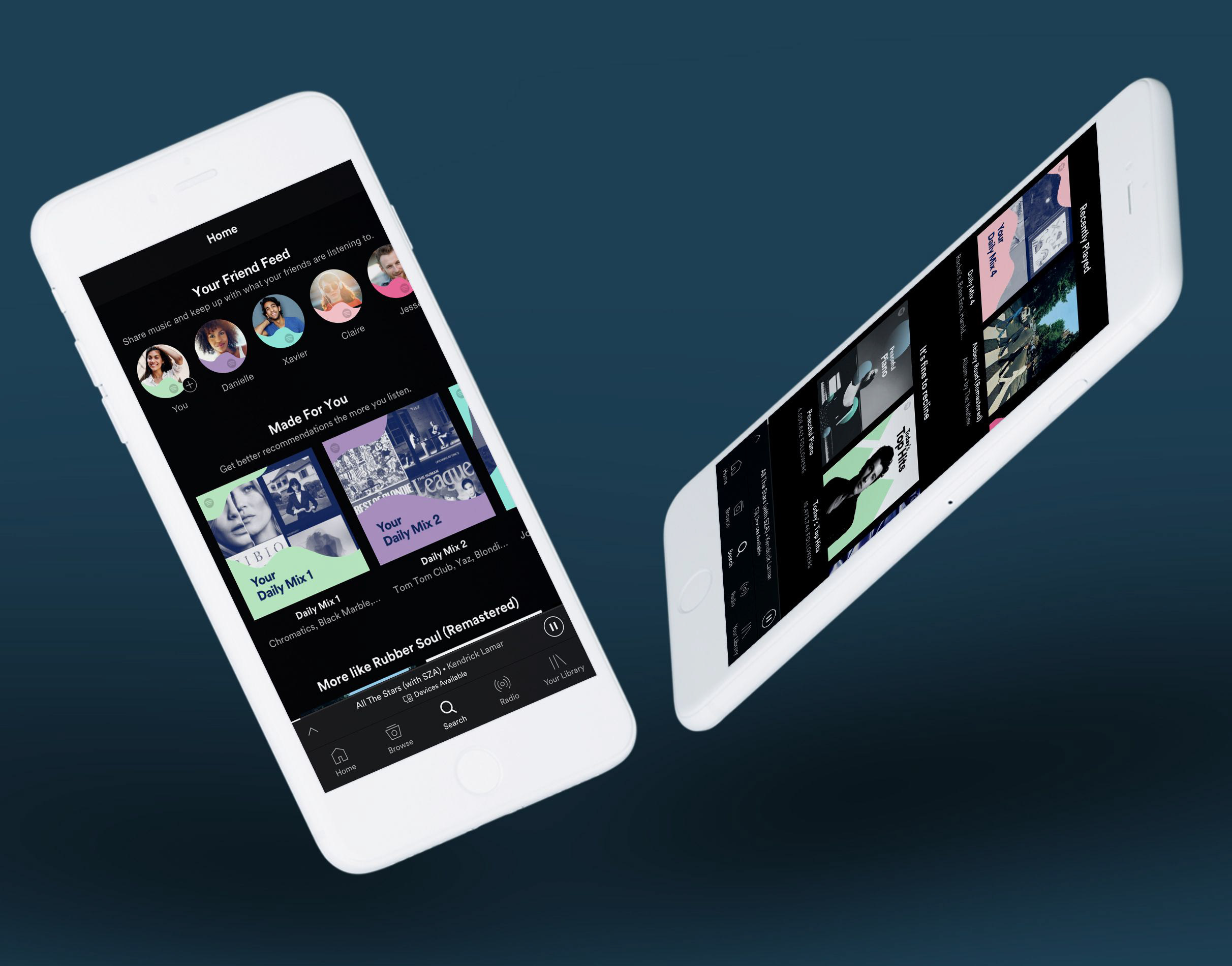
The Amex Business App was created in 2012 with the purpose of being a simple tool allowing users to match receipts to transactions. Since then, many additional capabilities and features had been added, and it grew to no longer be a single-purpose, simple app. It had essentially “Frankensteined.” And when users logged into the app, there was no proper home view, which was disorienting and frustrating for users. Points of access for many priority tasks were not easy to find.
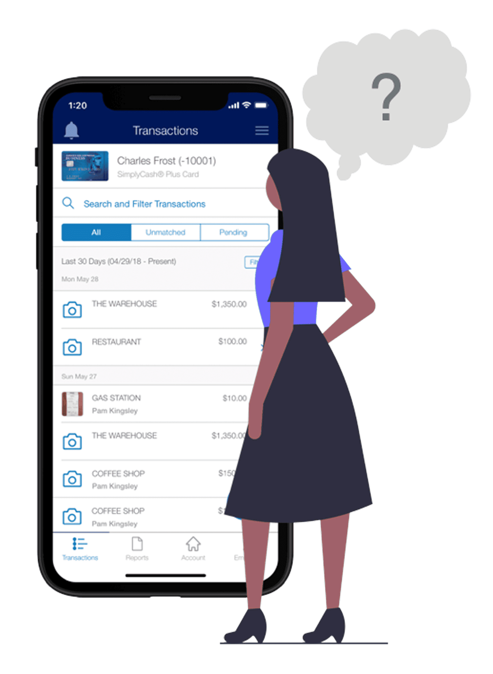
At the time we began the project, the app simply didn’t meet baseline expectations for a business app from a global financial services company like Amex. The app as a whole was undergoing a revamp, and I led the design of the Account Summary Dashboard while other teams focused on reworking the navigation, uplifting features on other tabs, and reskinning the UI.
And looking at this within the context of the enterprise at large, this is one of many experience gaps that currently exist for Amex customers. In such a large company, with so many types of customers and kinds of financial and membership service products… there’s a great deal of legacy experiences and tech debt. Many digital experiences across the company are not yet presented to users in a holistic, consistent way. So not only are products and apps like this outgrowing their original purpose, but the way we ask users to interact with the various digital interfaces that go along with those things is very inconsistent, disorienting and frustrating.

Is the company aware of this? Yes. Can it be resolved overnight? Unfortunately not. But the good news is that the company has aligned on a strategy to bring together these disparate experiences, centralizing user journeys and providing customers with a more holistic, consistent, easy and delightful experience.

Sharing that strategy in depth is well beyond the scope of this case study, but it is important to note that it was vital for us to look for opportunities to align with this strategy and vision– to build a “point of next” as we iteratively and incrementally work towards the “north star vision” of a unified membership experience. By starting small and delivering quickly, we set up an opportunity to test, learn and iterate as we work towards the longer-term objectives and goals of our north star POA vision.

Credit to Henrik Kniberg for this concept: https://blog.crisp.se/2016/01/25/henrikkniberg/making-sense-of-mvp
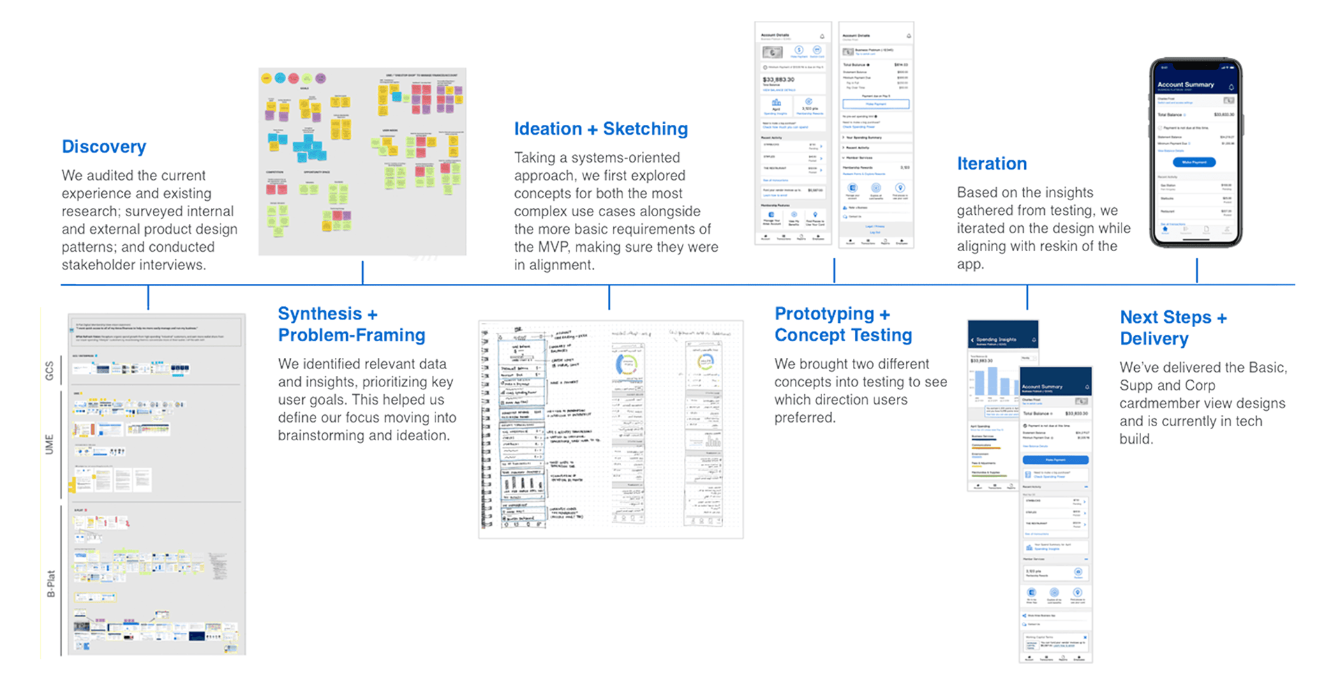
project overview at a glance
This is a long-form case study, but if you’d prefer a TL;DR short version, the following image gives you an at-a-glance overview of our project approach.
RESEARCH + DISCOVERY
Tools used: RESEARCH AUDIT, AFFINITY MAPPING, EMPATHY MAPPING, STAKEHOLDER INTERVIEWS, TASK MAPPING, DESIGN PATTERN REVIEWS
Where We Began: Research Audit
We began by reviewing existing research and strategy decks from the various stakeholder and business groups who were involved in the project. We sifted through, noting relevant data and insights.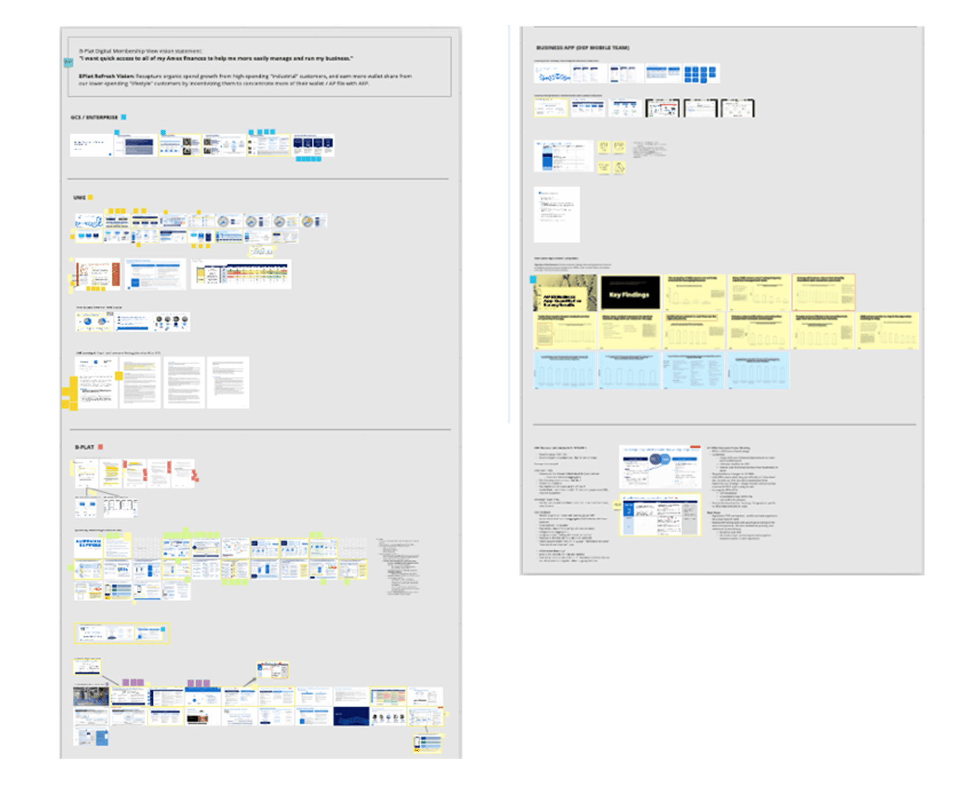
Research and strategy materials were gathered and reviewed from all relevant products and teams.
We found that overall, much information was available on product and enterprise strategy– but we lacked information on our users.
Finding Focus: Affinity Mapping
Through affinity mapping, we identified relevant themes within the research. This helped to define our focus, identifying SME (Small Market Enterprise) customer needs as well as priorities and goals for the business.
We grouped findings by:
•. Business and Product Goals
•. Competition and Opportunity Space
•. User Experience Goals
•. User Needs
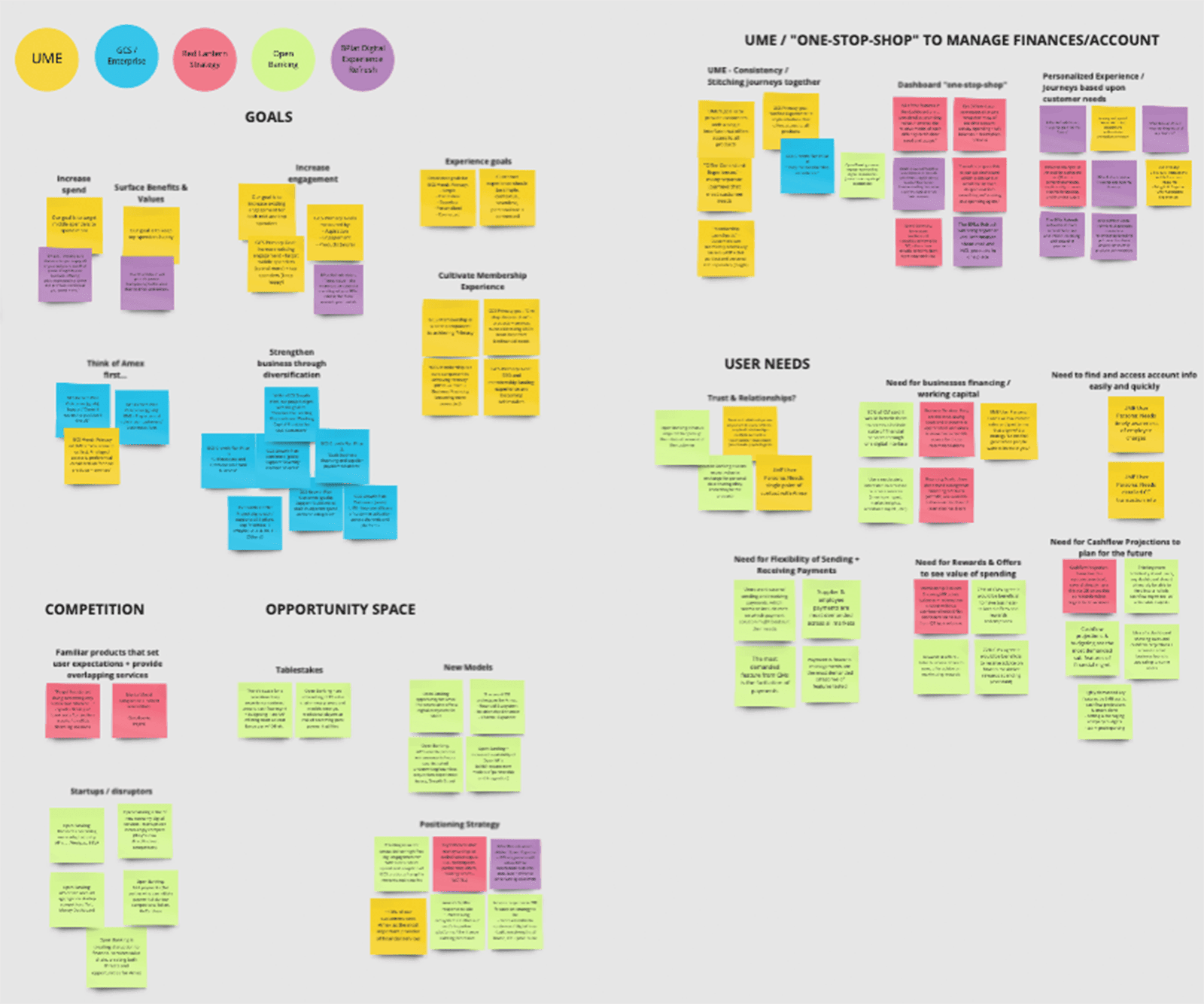
Affinity Mapping was used to identify themes within and across the audited research materials.
Understanding the User: Empathy Mapping
Due to the time constraints of the project, we weren’t able to interview or observe users, and we had limited data on user behavior (Amex is still inconsistent in their analytics and metrics practices, especially on the B2B side of the company). Working with what was available, we pulled together existing data from the research audit and synthesized it via an empathy mapping exercise.
We found that Business App users and SME customers:
1) Appreciate having an efficient way to view and manage their finances in one place; but not all of them are comfortable integrating all of their accounts as security is a concern
2) Like having easy access to tools and services that might save them time and money, helping them run their businesses more efficiently.
Stakeholder Interviews
In tandem with our research audits and mapping, we also conducted stakeholder interviews to gather and document the different perspectives of stakeholders.
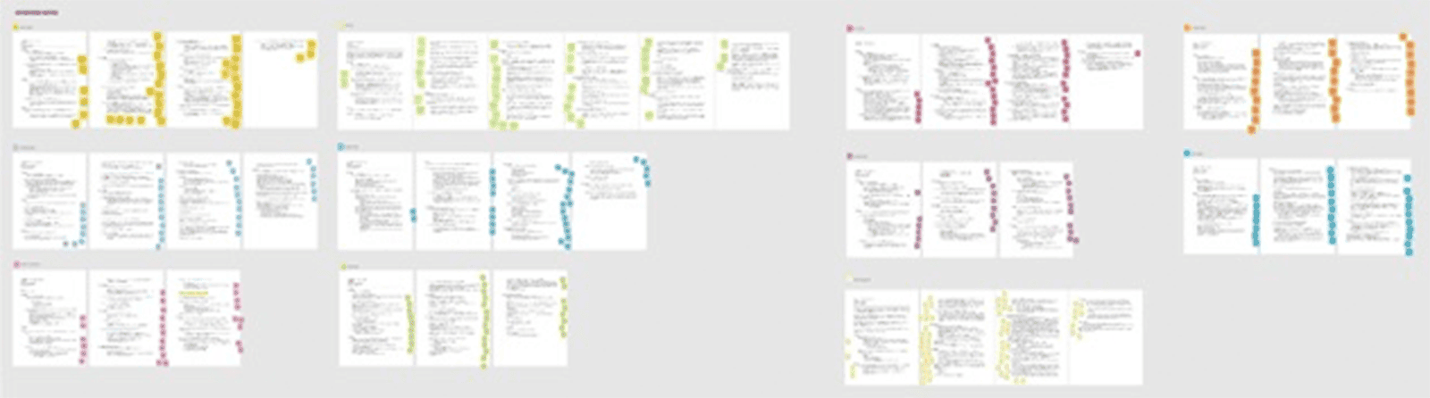
Interview Notes (Each interview subject represented by a different color post-it)

Affinity Mapping Stakeholder Interview observations and notes to identify themes
Benchmarking: Auditing the Current Experience
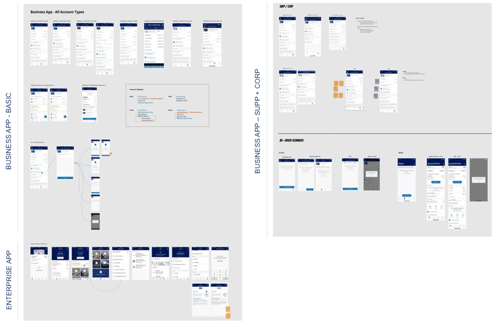
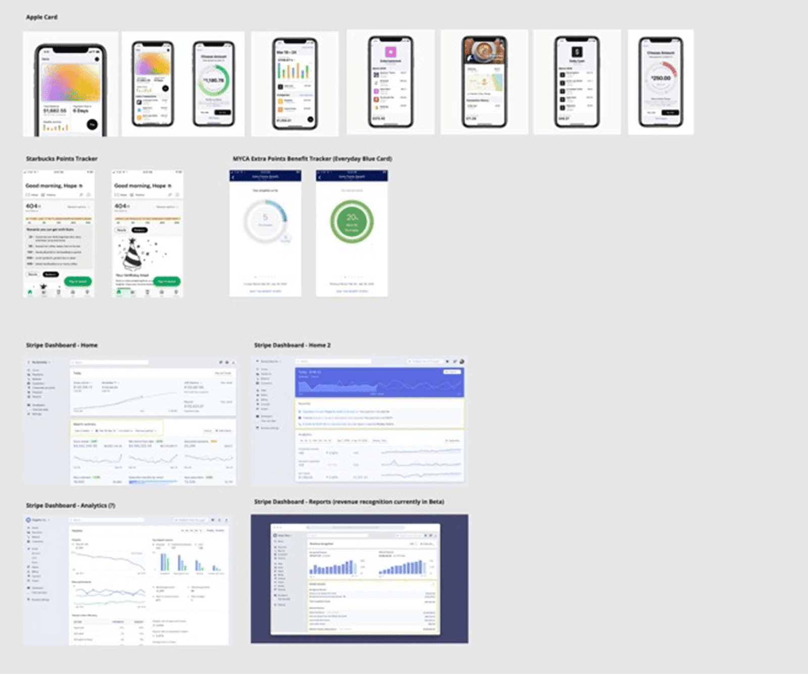
We then documented the current user experiences for SME Basic card users across three platforms: the Business App, Enterprise App, and Amex’s consumer-facing website. This allowed us to benchmark and compare experiences, identifying similarities and gaps as well as features unique to each account type and platform.
Aligning with Project Partners via Task Mapping
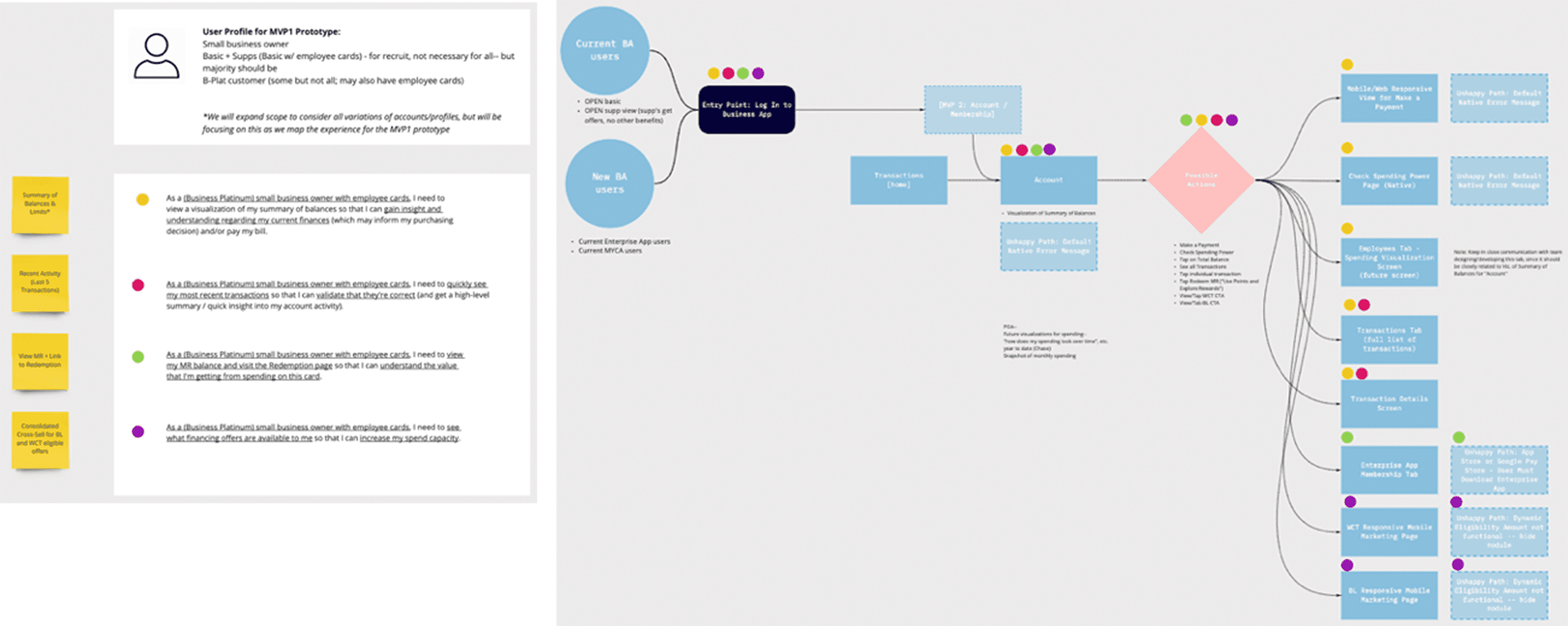
Working together with product partners from the UME and DEP Mobile teams, we defined a preliminary persona and identified key tasks that this user should be able to accomplish within the redefined mobile Business App Account tab. We then mapped those tasks through the flow of the existing app experience, identifying key screens where updates might occur.
Design Pattern Review
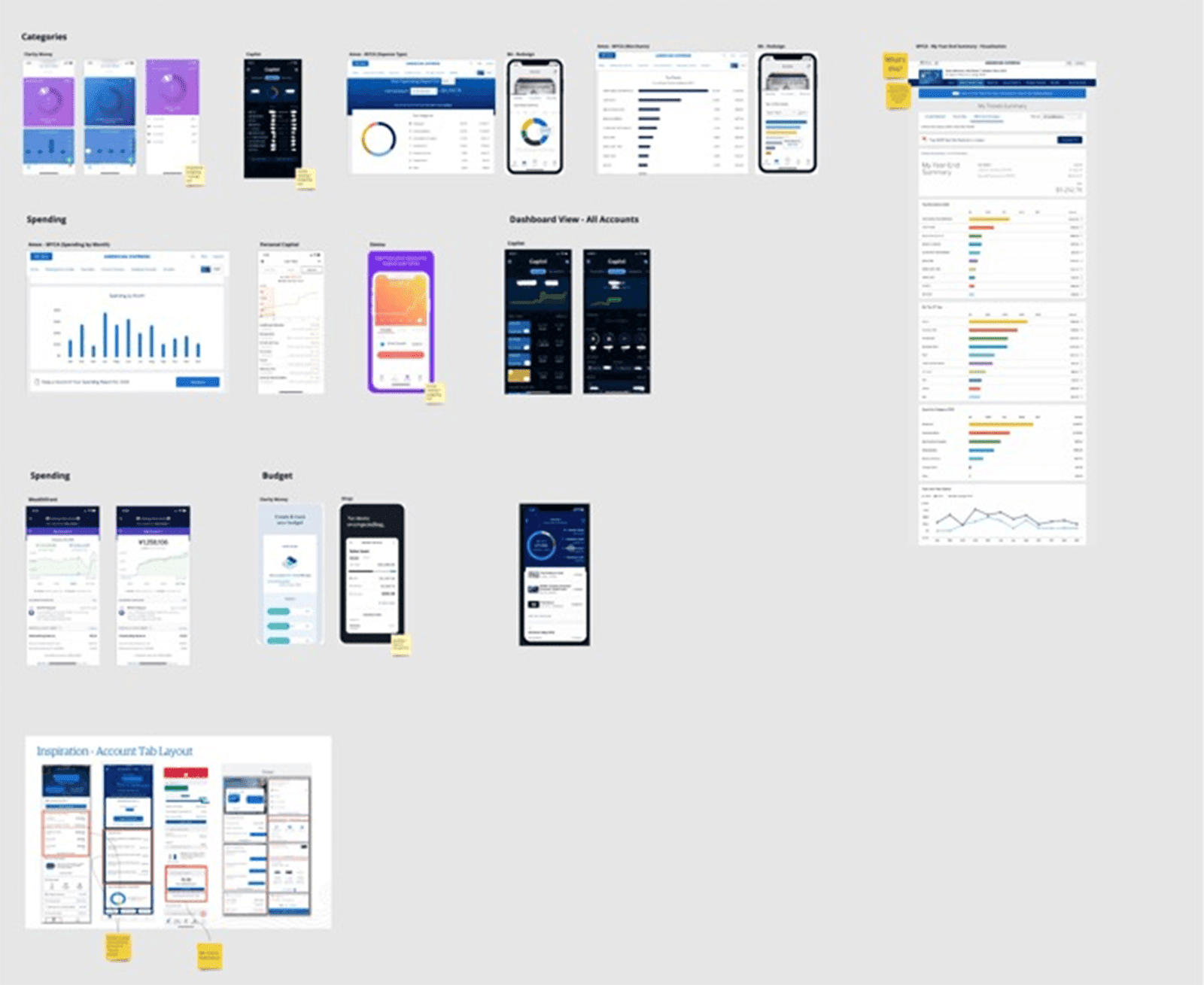
Finally, we looked at both direct and indirect competitors to inform our design process. We focused our audit on design patterns and features, seeking out compelling products and noting strengths and weaknesses for each.
DefiniTION, IDEATION + STRATEGY
Tools used: PROBLEM-FRAMING, BRAINSTORMING + PENCIL SKETCHING
Moving into problem-framing, we outlined the user goals we’d identified during discovery. We looked at how they overlapped with the business goals (which we’d identified through our strategy audit and stakeholder interviews).
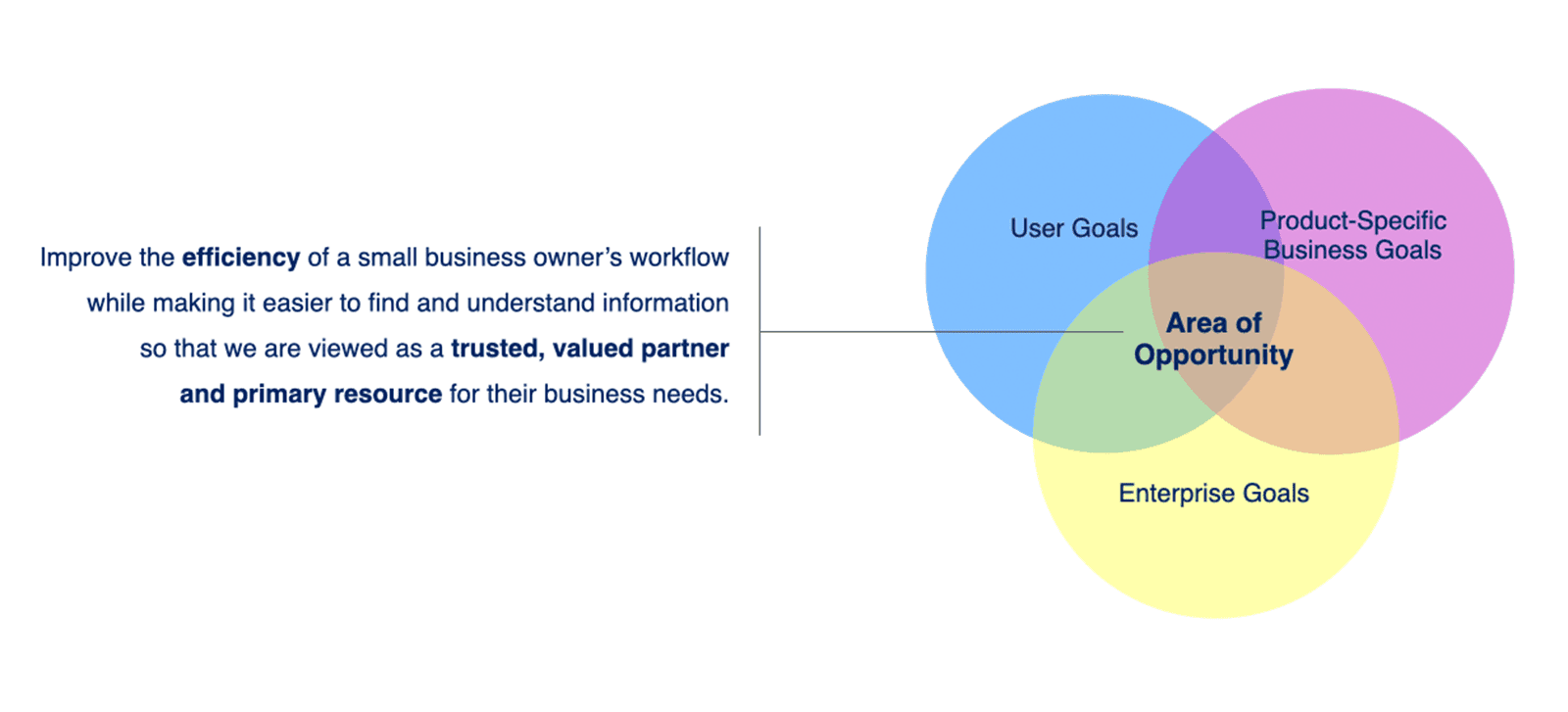
Locating the overlap of these shared goals helped us focus and frame the direction we took with our design work, informing our decisions when it came to feature prioritization, etc.
Hypotheses + Assumptions
Again, drawing from our synthesized discovery findings, we aligned on some hypotheses and assumptions about our users. This helped us frame the focus of our design and ideation work.
1) Small business owners want to quickly view their most recent transactions to validate if they're correct and get a high-level summary of their account activity.
2) Making a payment is a priority task for small business owners and is one of the actions they use the Business App for most frequently.
3) Surfacing Membership Rewards as part of the account summary will motivate Business App users to take advantage of of their membership benefits.
4) Small business owners will value seeing a visualization of their account spending in order to gain insight on their finances.
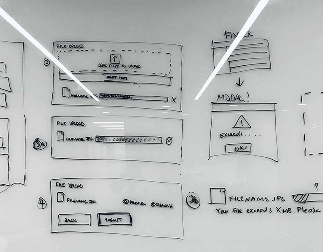
MVP + POA: Sketching + Exploration
Having done those exercises in problem-framing, we moved into problem-solving and sketching. While we knew our list of requirements for the MVP, we still needed to think about how this dashboard might need to evolve– what a future state might look like and the potential features and capabilities that a POA might include.
Taking a systems-oriented approach, we first explored concepts through sketching both for the MVP and POA. Doing so allowed us to consider the most complex use case alongside the more basic requirements of the MVP, making sure they were in alignment.
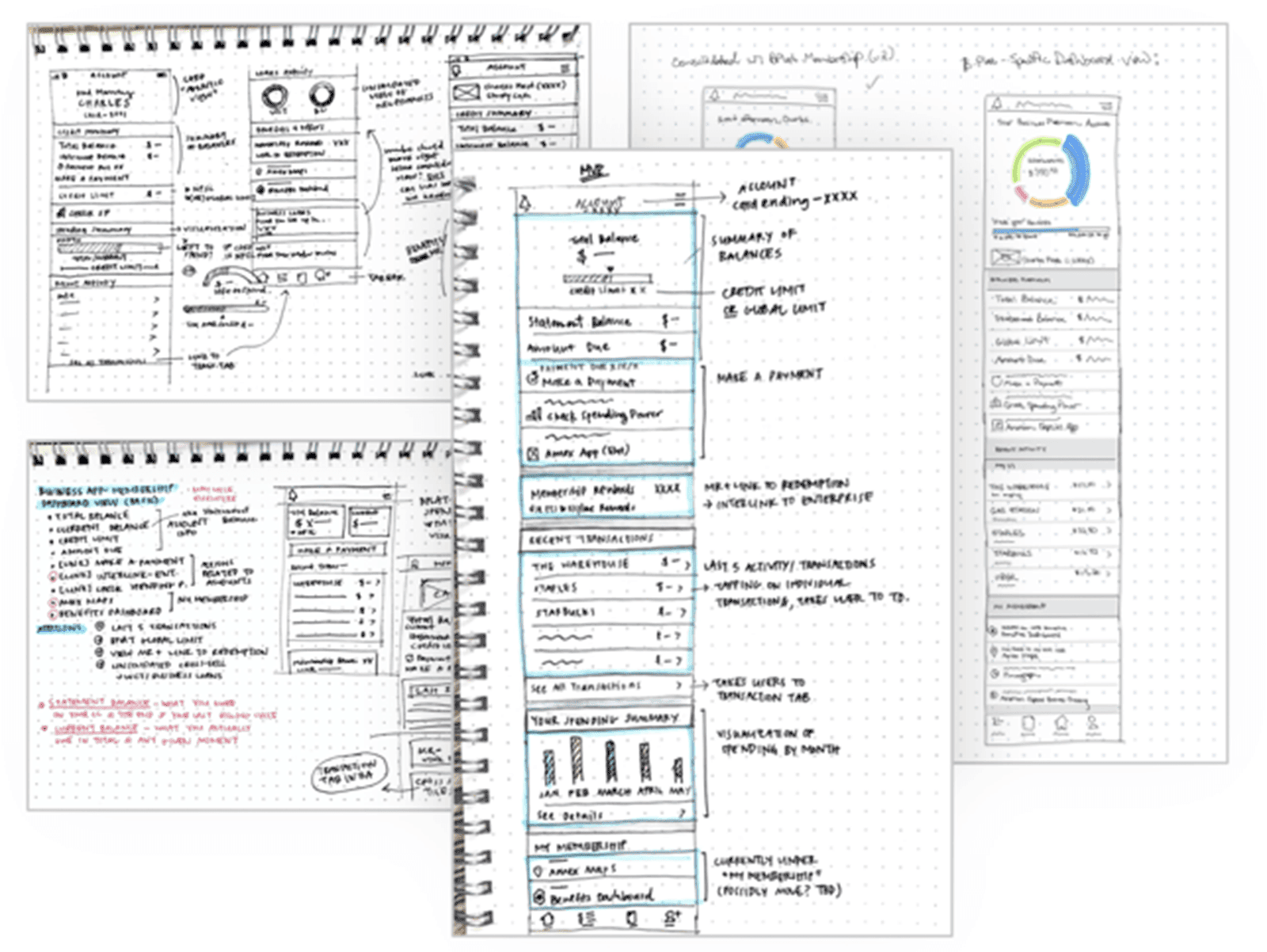
Next, we brought the focus back to the MVP and explored possible directions, now considering the feature requirements, tech constraints, and how the design would need to align with the Business App’s reskin.

It was important for us to approach it this way because a good MVP serves as scaffolding. It’s the beams of the house– it sets the key, basic elements in place, provides a solid foundation to build upon, and preserves space in the right places for future development and additions.
ProTOTYPING + CONCEPT TESTING
Tools used: User flow mapPING, wireframing in sketch, prototyping in invision,
From ideation and sketching, two possible directions for the MVP emerged, which we called “minimal” and “maximal.” We brought both concepts into testing with a mid-fidelity prototype.
Both concepts included:
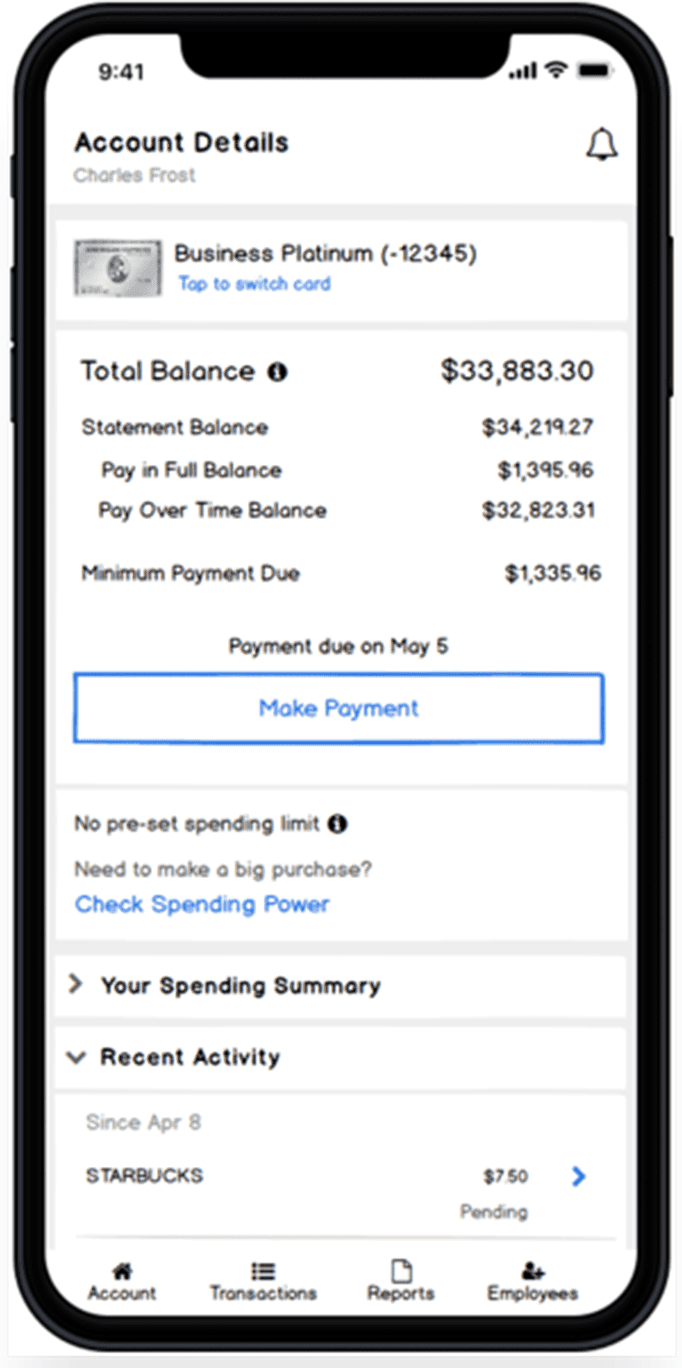
• a section with users’ Balance information
• a Spending Insights section (an early version of what could eventually become a more robust cashflow insights tool)
• a Recent Activity section showing users’ three most recent transactions
• a cross-sell component (again, an early version of what can eventually become a more sophisticated, contextually relevant cross sell proposing a solution for customers at just the right moment in their user journey)
• a membership rewards and details sectionYou can view the prototype used for the concept testing using the password UMEMVP.

In our two concepts, the way we presented these features differed.
• The “Minimal” Concept prioritizes essential information and key entry points for tasks, and users tap to see more details on secondary screens.
• In contrast, the “Maximal” Concept features all information on a single screen, so users don’t have to tap through to access anything and are given control to view and hide sections with collapsible panels.
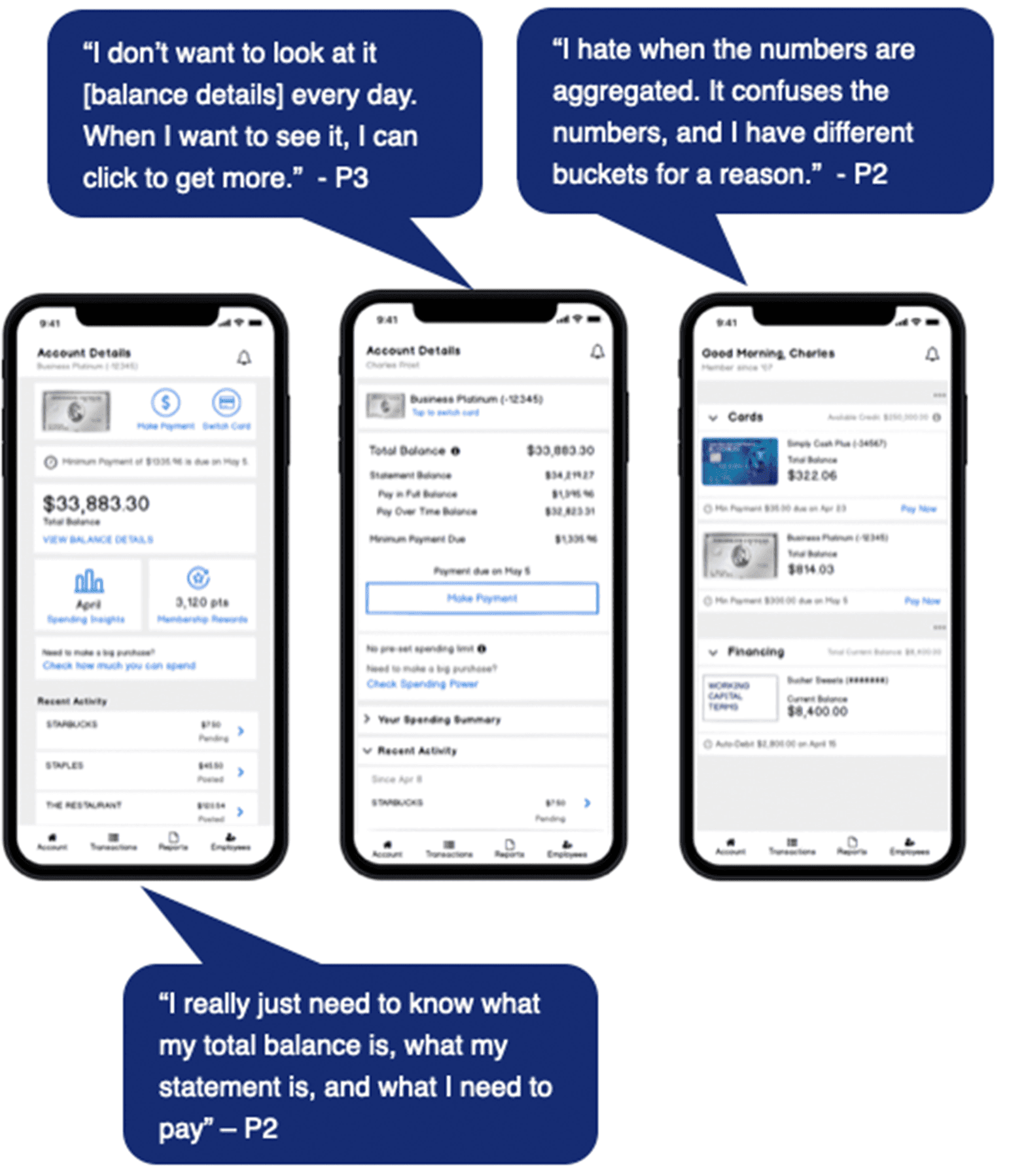
Findings + Recommendations
Min vs. Max concepts: Users prefer a more minimal design of the account dashboard, as it prioritizes information in a clear way while surfacing entry points to key tasks more easily.
Recent Activity feature: Many users want to view recent transactions to check for fraud, so the new Recent Activity section on the account dashboard view is perceived as a welcome addition.
Making Payments: Some users are comfortable making payments based on a high-level summary of Statement & Total Balance while others want to dive into the details so it’s important to show both views to customers but allow them to choose their view.
Progressive disclosure of detailed content: When detailed content is presented (such as balance details or spending insights), users prefer navigating to a different screen vs expanding within the current screen.
Spending Insights: More discovery and exploration is needed for this feature to make sure it is in line with customer expectations and provides value.
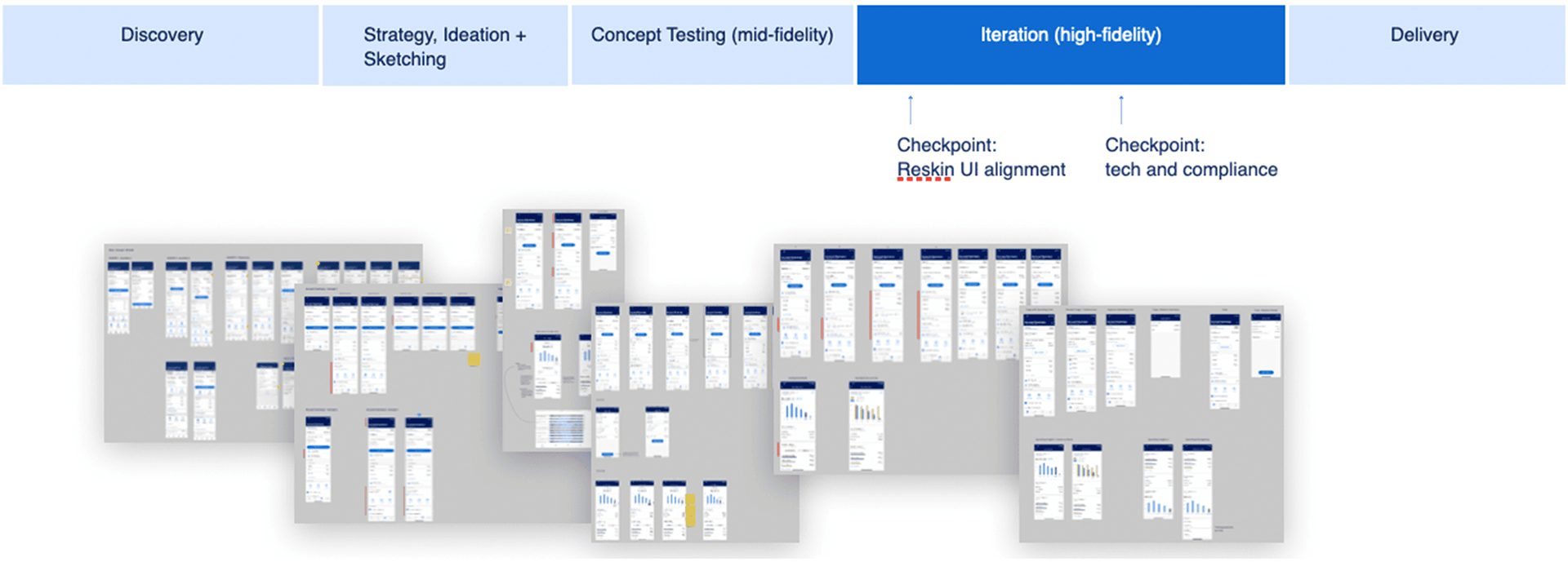
ITERATION + DELIVERY
Following testing, we iterated based on user feedback and moved from mid-fidelity to high fidelity renderings. At this point we were able to incorporate the new UI visual system for the Business App, working collaboratively to align with the mobile design team. We reviewed the design with the mobile design and product team, tech, and compliance, incorporating feedback through several rounds of iteration.

Delivery
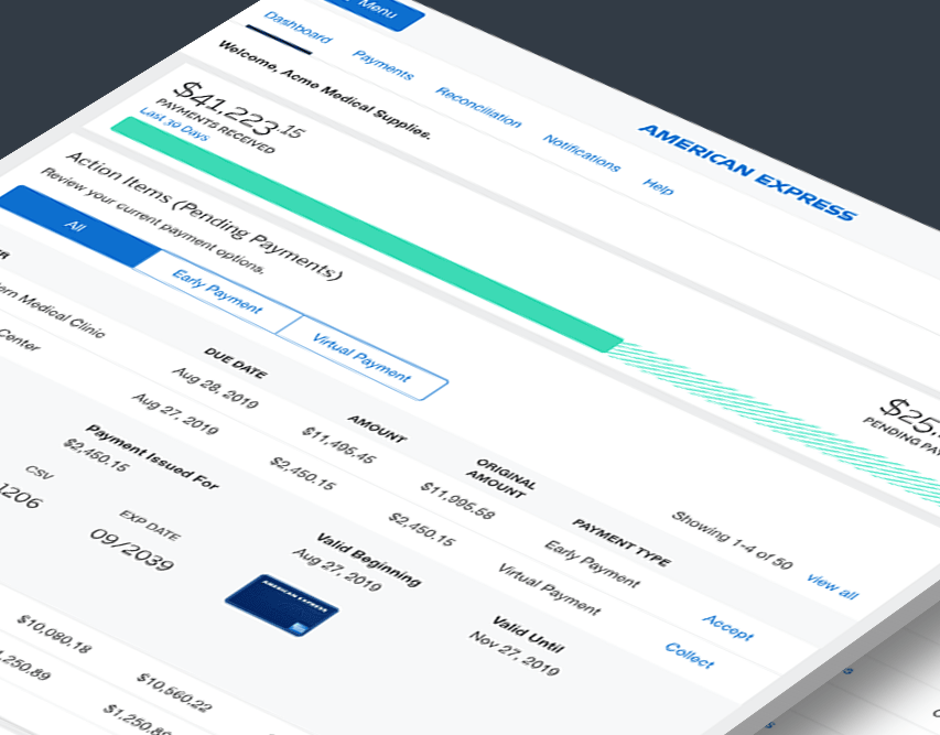
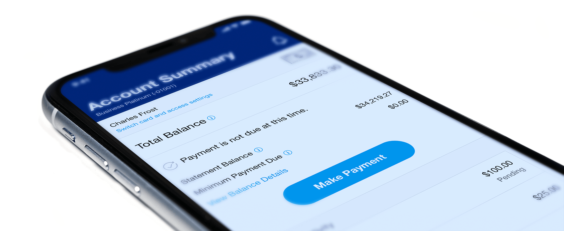
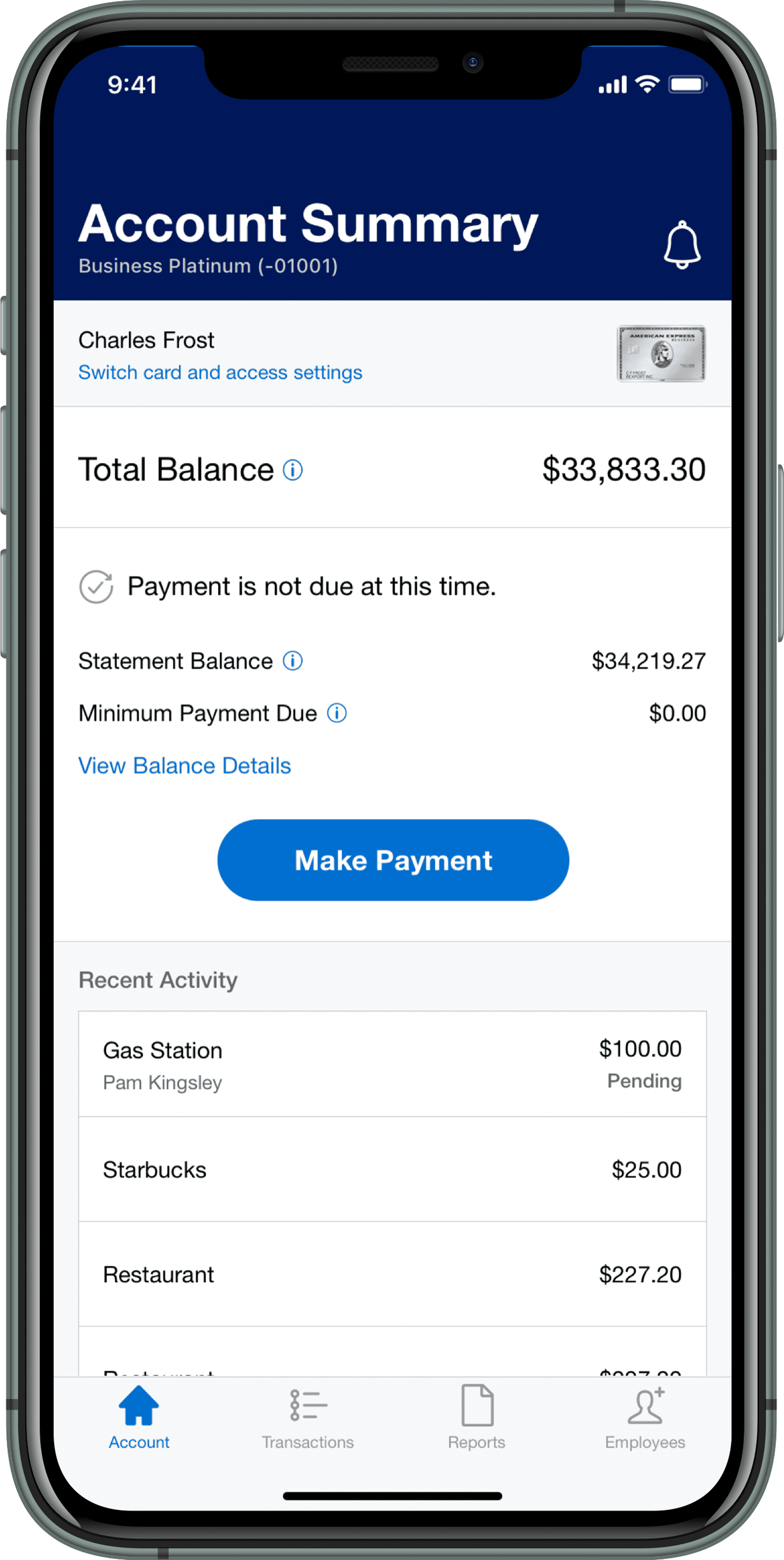
Finally, the Account Dashboard view was finalized and delivered. For the first time, users have a way to access to a centralized view of their essential account and membership information within the app, with:
• easy access to priority tasks by surfacing essential information
• clear presentation and hierarchy of information
• addition of elements that highlight value of membership
In addition, the uplifted experience helps incrementally bring the user experience towards the future-state vision with:
Consistency of Experience By mapping the experiences of various account types while considering current and future states, we took a systems-oriented approach to ensure the basic requirements of the MVP feed into the roadmap of the UME vision in a scalable, flexible way.
Holistic view of the customer We've started to show elements of the experience at the account level vs. the card level which will set the stage for a more holistic customer experience as envisioned in the future state strategy.
Cultivating a Membership Experience By surfacing membership features in a more distinct and unified section, we've begun making membership a central aspect of the customer experience.
BUT WAIT... THERE'S MORE!
As we moved into designing variations on the MVP Membership Dashboard for other types of accounts, we realized that supplemental (“supp”) and corporate (“corp”) users have different priorities and needs compared to basic account users.


With a very limited timeline, we were still able to take this part of the project through an abbreviated process. We uncovered information that helped us understand how the design should change for these specific business role users.

CONCLUSION
The Membership Dashboard released in October 2020, along with the launch of the full Business App Reskin. Navigation changes were also part of the release, meaning that upon login users now land on the account tab (rather than transactions) and can view their essential account and membership information in one place. (Woohoo!)
Takeaways
By no means was this a perfect or ideal project. We were designing with so many constraints, so many moving parts, and navigating a shifting business landscape and strategy in the midst of the beginning of the pandemic.
In spite of this (or perhaps because of it) I’m particularly proud of it. We were able to immediately, positively impact users’ experience with the app by centering our design on user data, testing, and feedback– and launching quickly. While the long-term roadmap will allow for more dramatic change, work on those plans follows typical enterprise timelines and dependencies. In the meantime, this design has provided users with a more functional, usable experience right now. It’s incremental, but it’s impactful for both the business and our users.
In the year following the release we saw a total increase of +40% monthly visitors, +9% visit frequency, and +13% increase in time spent per visit. This evidence of increased engagement suggests users have found increased value and usefulness in the app. For Amex, this means increased customer satisfaction and more opportunity to expose customers to additional product offers and membership value.