

Case Study: Mirror Concept
research + discovery | synthesis+ definition | product strategy + Information architecture
interaction design + visual design | prototyping + usability testing | implementation + iteration
interaction design + visual design | prototyping + usability testing | implementation + iteration
Imagine that a clothing store on par with H&M— one that’s well-established, with an international presence— had taken the strategic position of intentionally staying offline and keeping their retail experience almost exclusively store-based. They chose to circumvent the multitude of issues that arose in the early days of online shopping, opting instead to differentiate their brand by focusing on great customer experience in their physical stores. However, times have changed. Company leadership knows they must bring their retail offerings online to remain competitive and take advantage of opportunities to expand their market in the digital fashion retail space.
The store, Mirror, has over 400 stores in 32 countries. Mirror offers a wide variety of quality, stylish clothing at an affordable price point for men, women and kids. Currently, the company has an outdated and very limited online presence.
It’s time to update Mirror's branding and bring their retail offerings online with a robust, stylish, and highly usable responsive website.
ROLE: Lead UX+UI Designer (RESEARCH, INTERACTION DESIGN, VISUAL DESIGN)
challenge: design a ROBUST, RESPONSIVE WEBsite for an established clothing company.
CLIENT: Mirror (a ficticious company)
DESIGN GOALS:
1) Deliver a robust, responsive website to bring Mirror up to par with their competitors.
2) Rebrand with an updated logo and visual system.
3) Build upon knowledge of existing design patterns and user expectations to create an intuitive, smooth experience for shoppers.
RESEARCH + DISCOVERY
Tools used: market trend analysis, competitive analysis, user interviews
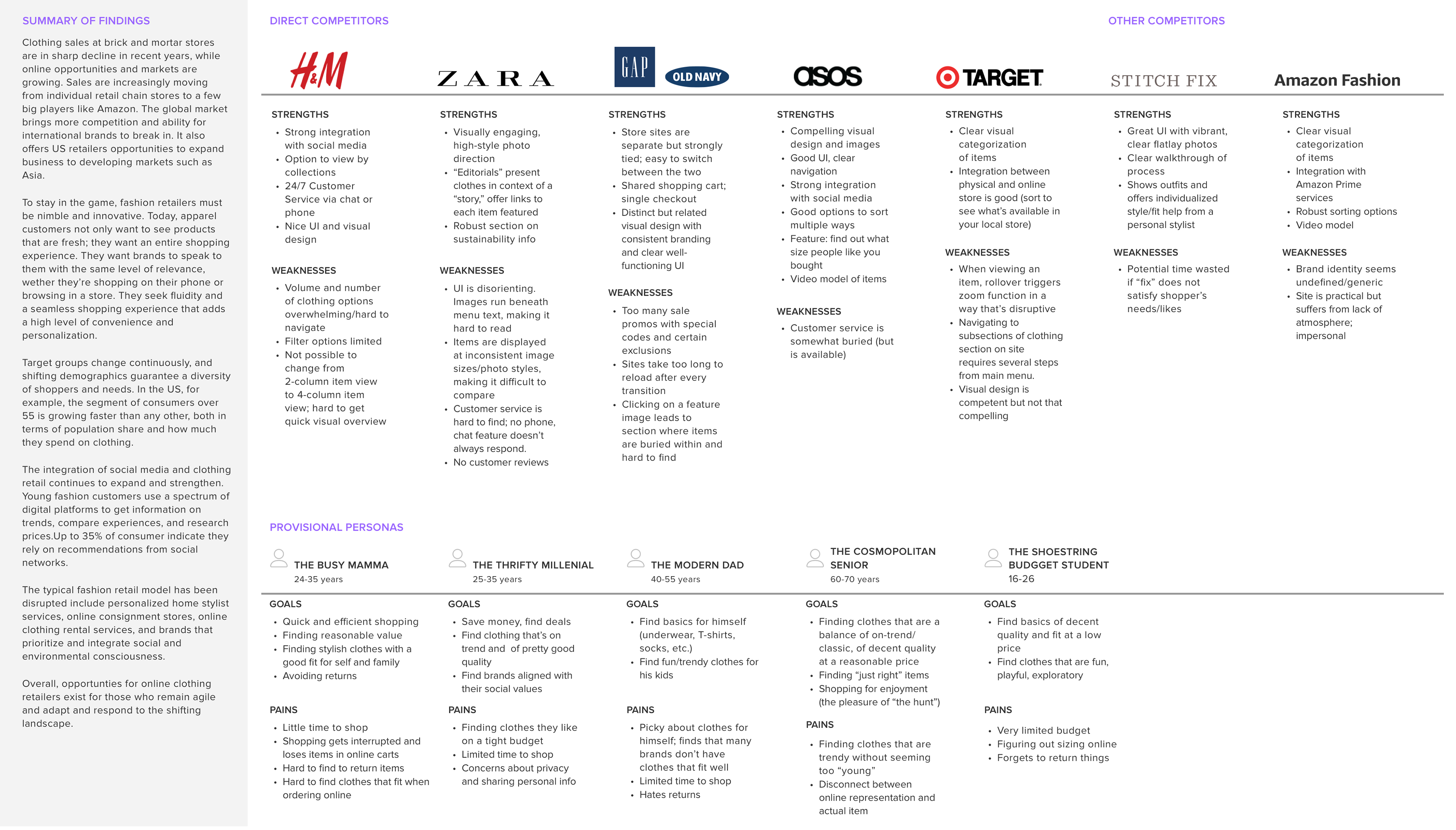
Market & Industry Research
Since Mirror had positioned itself outside of the e-commerce clothing retail landscape for so long, they were in a good position to observe and analyze the market in order to identify where and how to position themselves and where best to invest their resources. To aid in this, I began with a market analysis and competitive analysis. I conducted a quick overview survey of fashion retail industry in order to understand and identify indicators of success, audience and user expectations. I looked at the sites of Mirror's competitors to identify the strengths and weaknesses of existing online clothing stores. I also created provisional personas to begin thinking about who might make up Mirror's user base.
Insights
1) Today’s shoppers want a fluid and consistent shopping experience, whether they’re shopping on their phone or browsing in a store. They expect a high level of convenience and personalization, with the ability to move between digital and real environments seamlessly.
2) Shoppers increasingly rely upon a spectrum of social media resources to get information on trends, compare experiences, research prices and read recommendations and reviews.
3) Shoppers increasingly want a point of connection with a brand, want to understand how and when and where things were made, and appreciate brands aligned with their own social values.
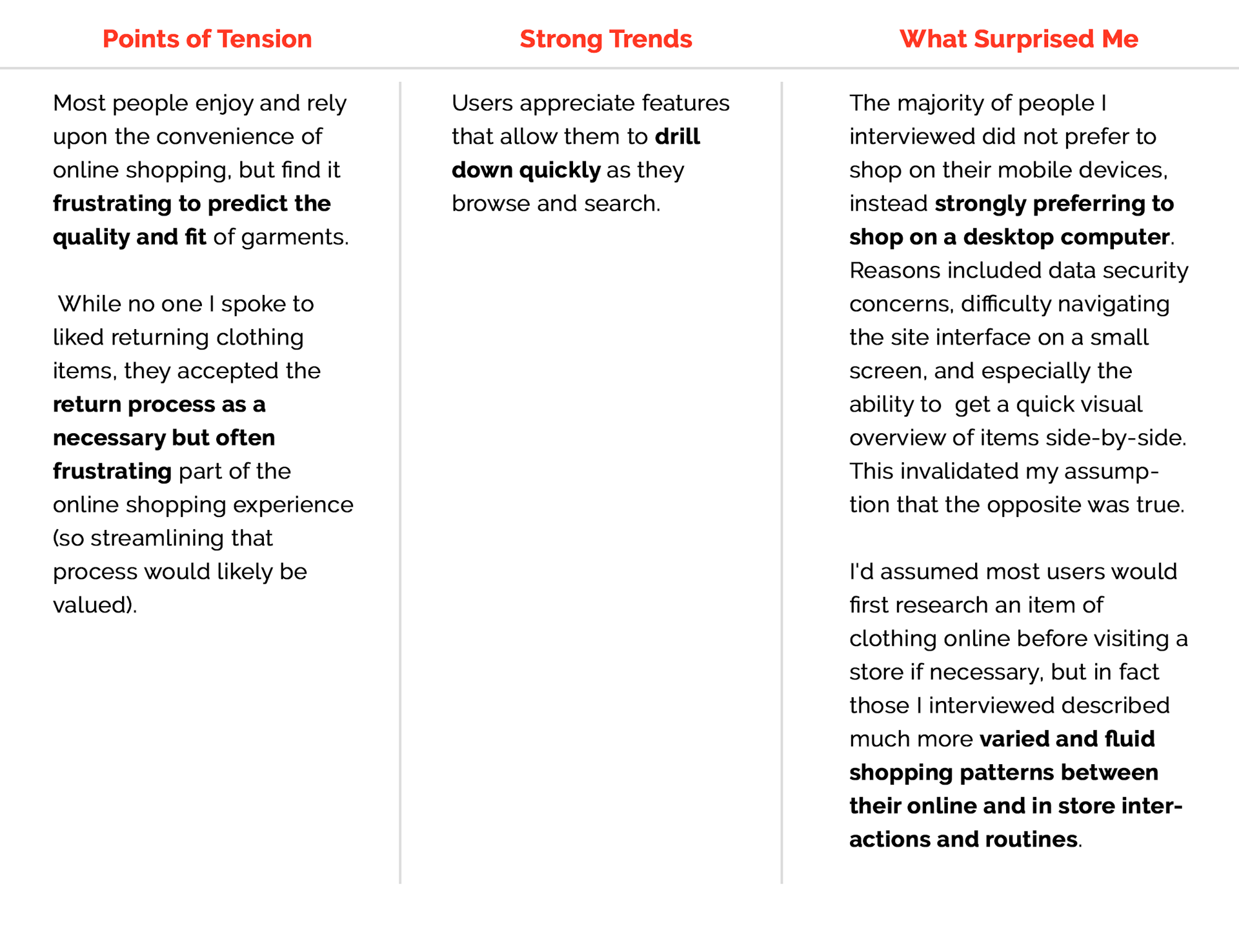
Interviews
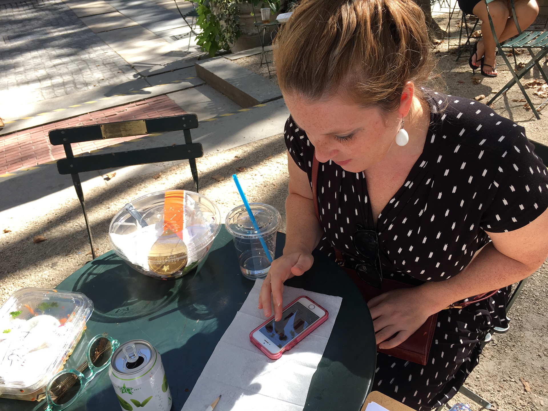
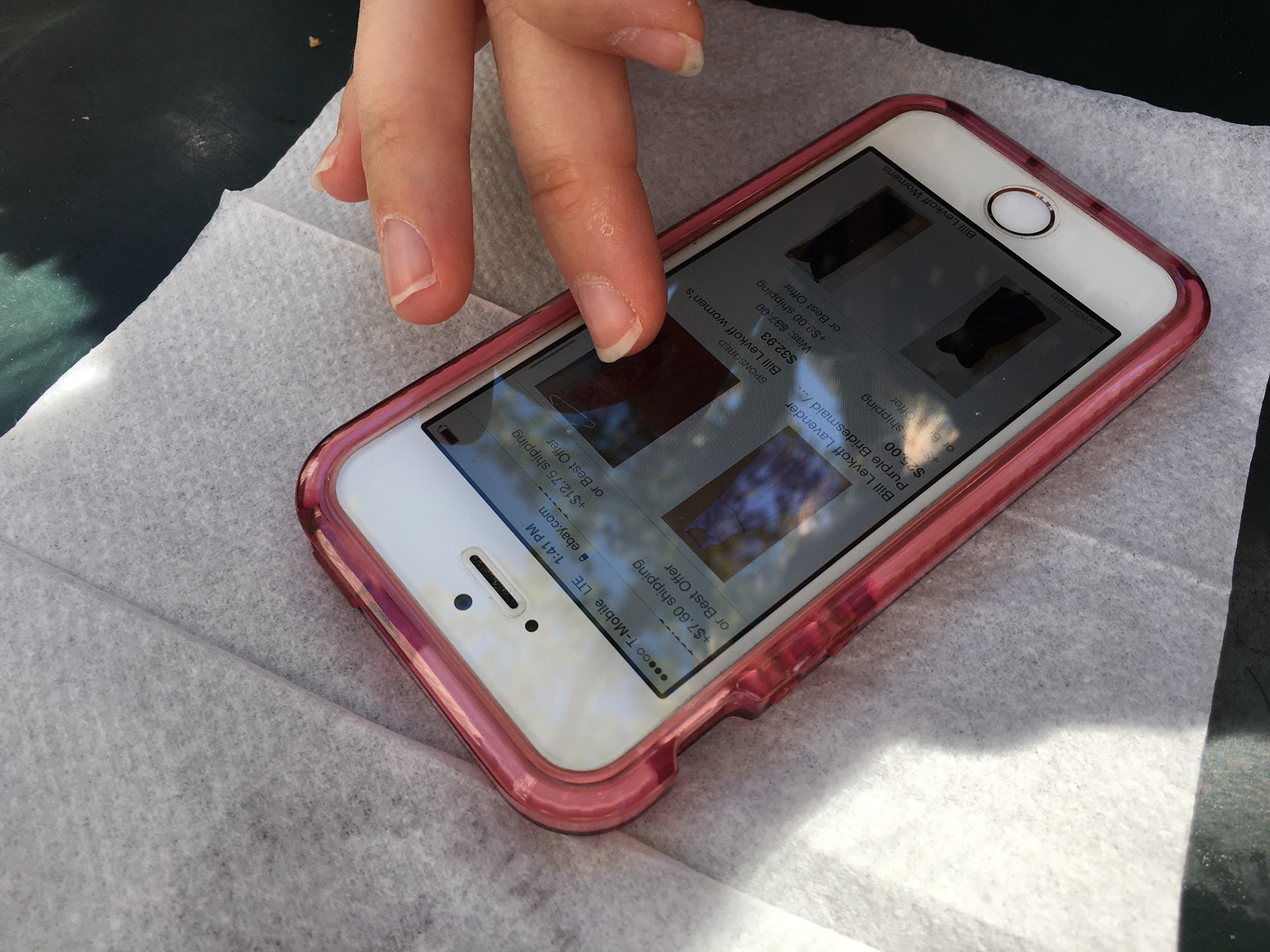
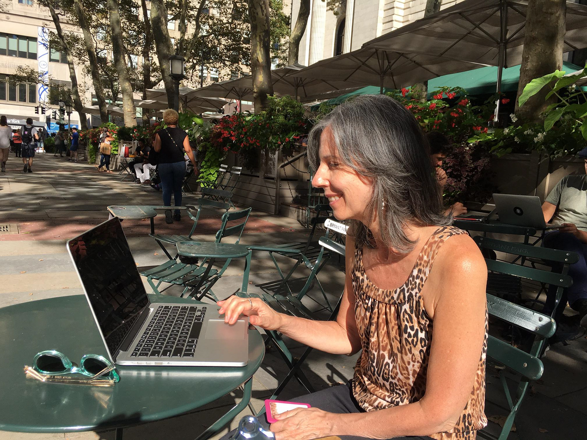
To better understand the pain points and goals of those who shop for clothing online and to test a few of my assumptions, I developed an interview script and conducted observational user interviews with participants who fell within the provisional persona profiles I’d established. I asked each subject some questions about their shopping habits and preferences. I also asked them to walk me through the process of browsing for an item on an online clothing store they frequently use. During the interviews, I recorded the audio of each and took notes as I asked questions and observed.
Assumptions i hoped to to validate or disprove:
1) The convenience and familiarity of mobile access would mean that users prefer to shop primarily on their mobile devices.
2) Shoppers would follow a pattern of first researching clothing items online before visiting a store if necessary (to examine fit, quality, etc.)
“Whenever I shop online for clothes, it’s for VALUE. So I’ll try on full price dresses [in store] all the time, then wait for it to wait for it to go on sale and get it online.”
...
“I find it difficult to use a mobile device to shop. I prefer to see more things at once— I like being able to see more things and let eye gravitate towards one of ten, instead of seeing them individually.”
...
“It can be exhilarating to shop online; you can do it late at night; but the disappointment with arrival is the drawback, when the quality’s not what you thought."
...
“I shop at night, after kids are asleep— that’s the time when I can sit with the computer and look.”
Takeaways
Synthesis + Defining
Tools used: interview synthesis table, variable mapping, primary persona, empathy map
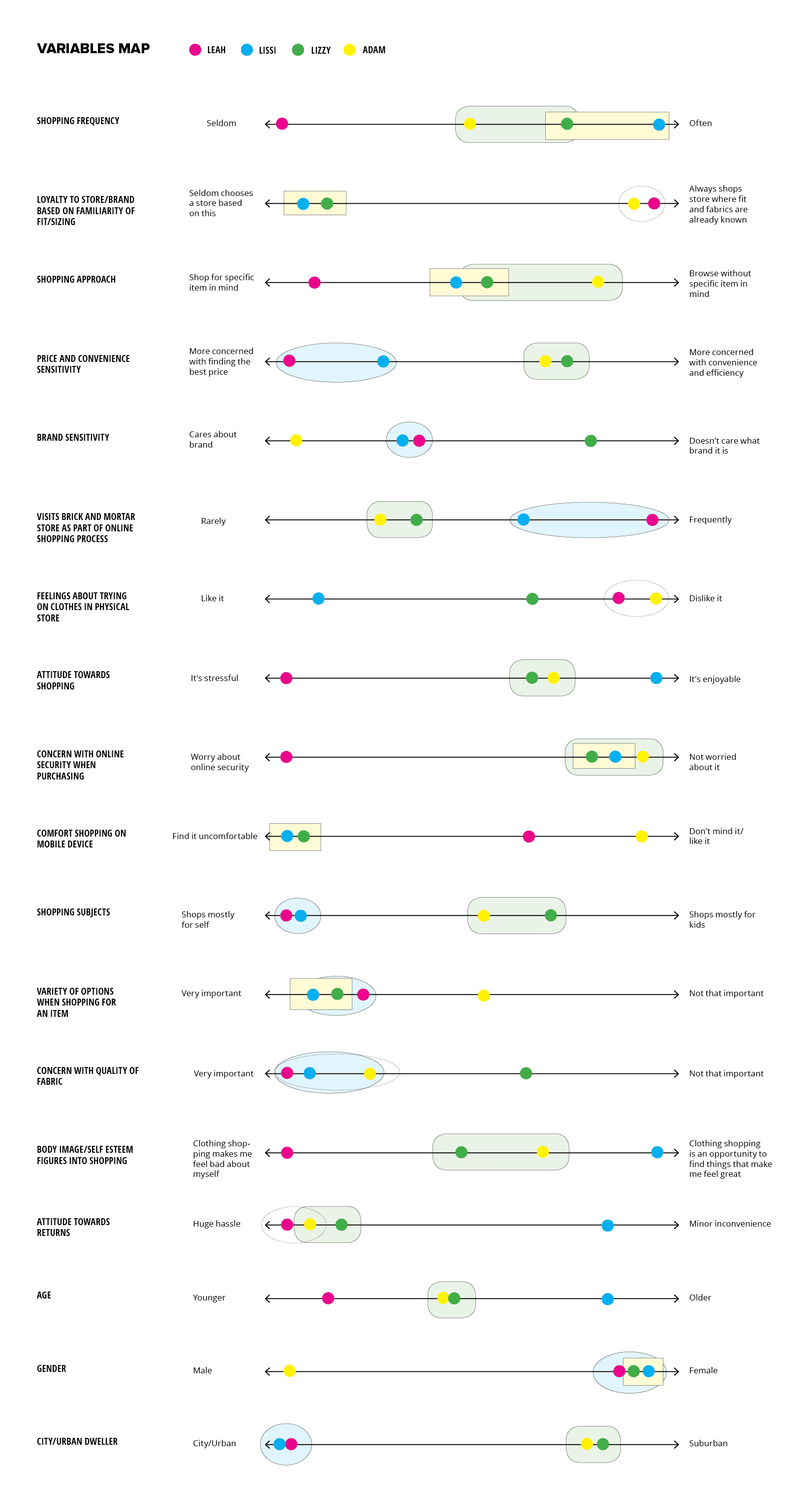
Following the interviews, I set about gathering, organizing, and looking for relationships within the information I'd gathered. I first transcribed the interviews and formatted the responses in an interview synthesis table, which allowed me to more easily see my notes for each user's response side-by-side. I flagged repeating or conflicting themes or patterns and included them in a variables map. Exploring the data in a visual way like this made it easier to spot behavioral relationships, which were then used for the foundation of my user persona.
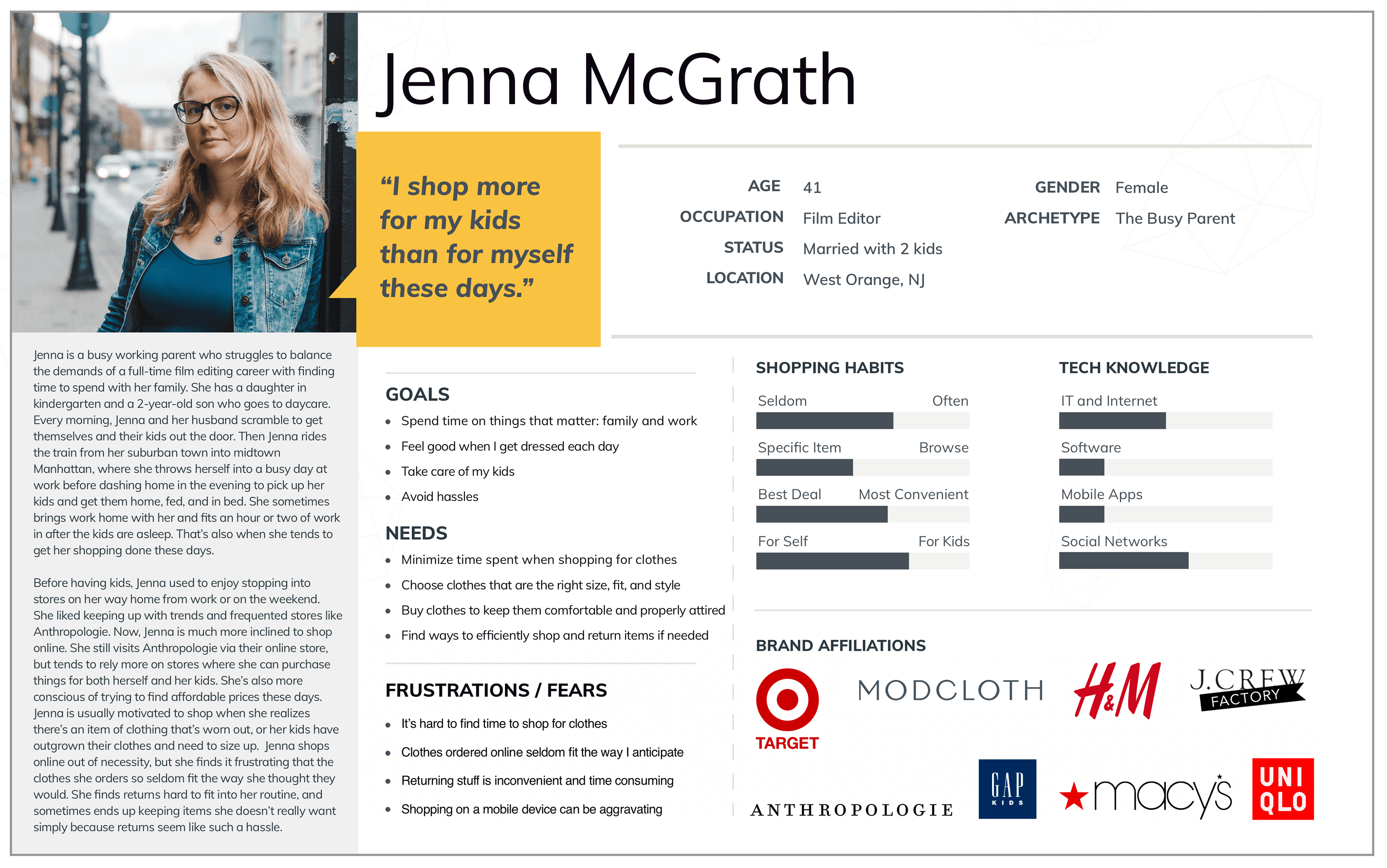
Jenna is the primary persona that emerged as a composite of my research findings. Jenna has her plate full with family and professional obligations, and time is in short supply for her. While Jenna enjoys browsing for clothes (and in the past spent quite a bit more time casually shopping), she most values a shopping experience that allows her to move quickly and efficiently so she can go on to spend time with the people and priorities that matter to her most.
To further explore relationships and develop the persona that emerged from the data I’d gathered and mapped, I created an empathy map made up of observations and statements from my user interviews. Empathy maps are tools that and can be implemented at various points in the research and design process. While at times I might create a map prior to a persona, in this case I found value in creating it afterwards. Doing so allowed me to check the details of Jenna against my original user interview data. It also provided a reference as I worked through later stages of the design where I could look back at specific quotes and details when thinking about priorities for the product I was designing.
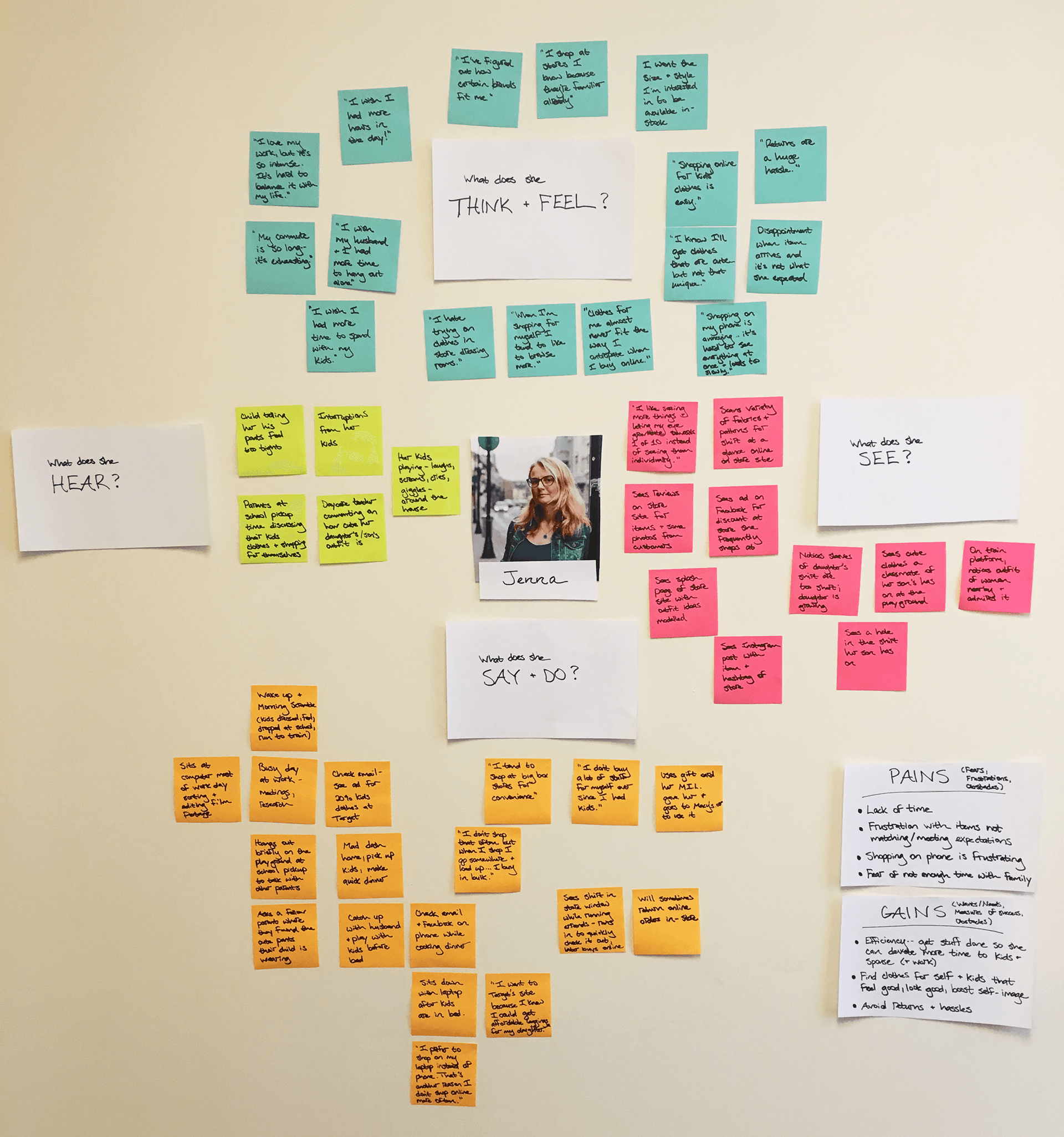
Key Insights
Shopping for clothing can be highly emotional. Those I interviewed expressed a range of feelings, from the exhilaration they felt when hunting for the perfect item, to intense anxiety about how the clothes might fit poorly and make them feel bad about themselves. While the individuals I spoke with varied in terms of their feelings about shopping, a common thread was a desire to minimize the time they spend shopping, while also being able to easily find exactly what they want (the perfect style, size and fit). On a very basic level, people want to feel confident about finding clothing that will work for them. This unified desire informed the "how might we" statement I crafted to guide my design:
"How might we organize, structure, and label Mirror's online content so that Jenna can quickly find and purchase clothing she's looking for while feeling confident about her selections?"
Project Strategy
Tools used: PROJECT GOALS MAPPING, FEATURES MATRIX, in-person + online card sort, SITE MAPPING
Comparing Business and User Goals
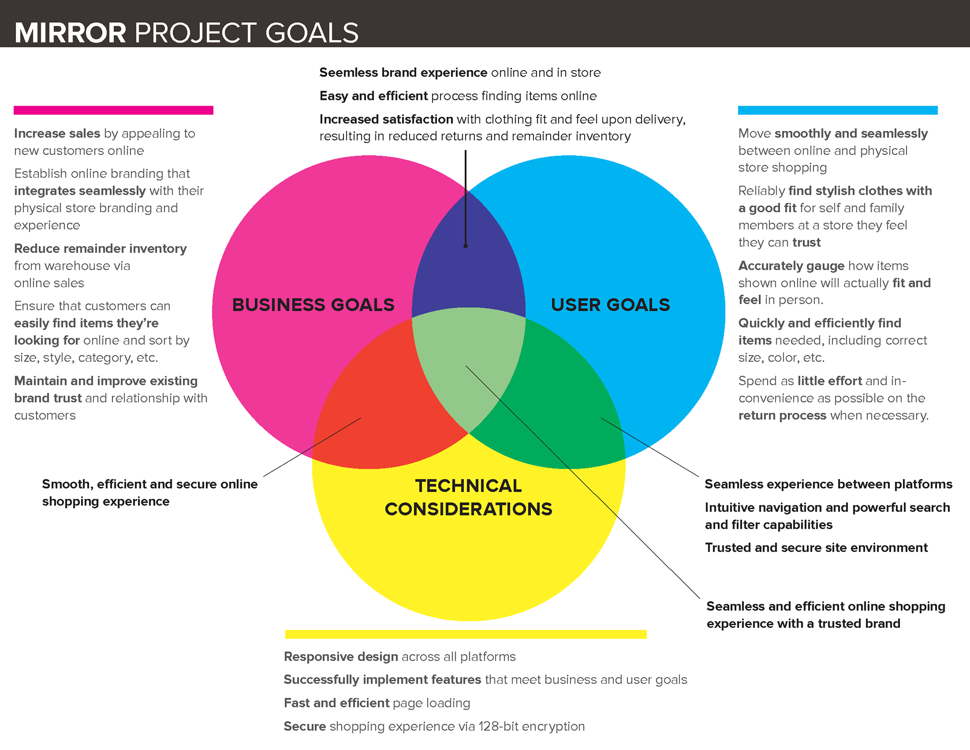
Moving from research and into the next stage of defining the product, I mapped the overlaps of business goals, user goals, and technical considerations. Identifying core project goals while considering technical aspects helps to define the sweet spot between finding viable solutions and prioritizing those which benefit the needs and desires of both the business and the users.
Defining and Prioritizing Features
With the project goals established, I generated a features matrix, with features presented in order of priority in terms of development, investment, and importance to business and user goals. Jenna's needs and priorities were used to focus the exercise. This served as a very useful roadmap and overview checklist throughout the project.
You can view the features matrix here >
Next, I conducted a combination of in-person and online card sorts. The online survey enabled me to survey a larger number of participants, and the in-person sorts gave me the opportunity to observe those I met with to see how they approached the exercise and gain more empathetic insights. In total, I surveyed: 3 participants in person and 10 participants online (via Optimal Sort). Both situations were set up as an open sorts, in which participants were asked to sort items into as many categories as they liked and to create their own category labels.
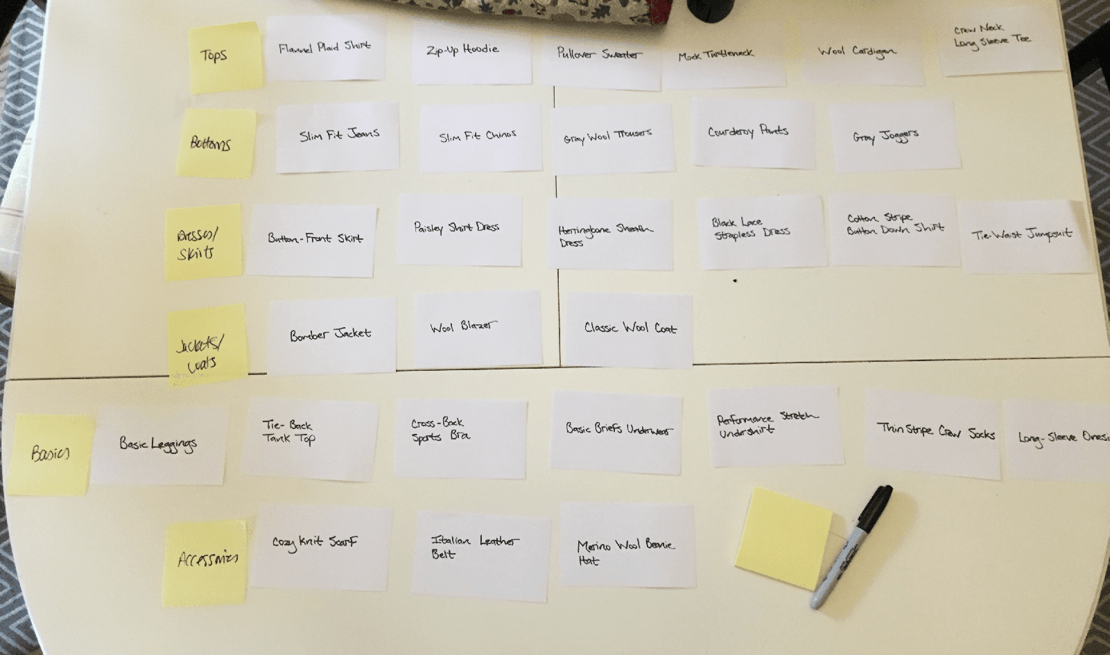
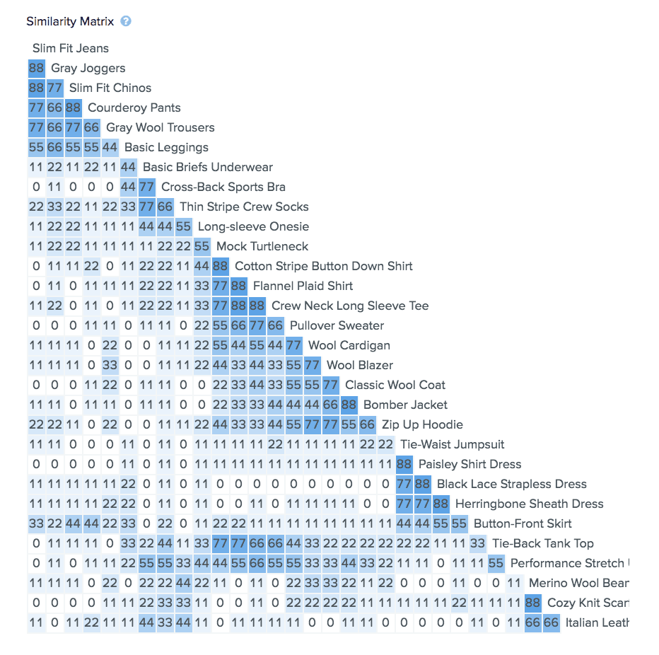
The Similarity Matrix above shows the results of the online sort, and provides a quick visual read into how participants grouped cards together most frequently.
Summary
Collectively, the categories created and patterns identified in this study provided helpful insight into how people within the parameters of Mirror's customer base think about clothing categories and helped inform my decisions about how to organize the categories on Mirror's site. With a goal of help users (like Jenna) find what they're looking for in order to complete a purchase smoothly and efficiently, this exercise was valuable in terms of confirming user expectations and preferences. With more time, I would've liked to follow up with a closed card sort exercise, as well as a card sort with a larger number of items included.
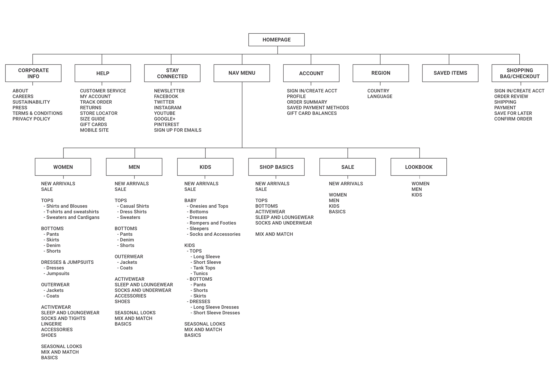
Site Map
Based on the results of the card sorts, I created a site map outlining the relationship of content on Mirror’s site, with the goal of creating the most simple and intuitive navigation possible.
INTERACTION DESIGN + TESTING
Tools used: User flow map, sketching, wireframing in sketch, prototyping in invision
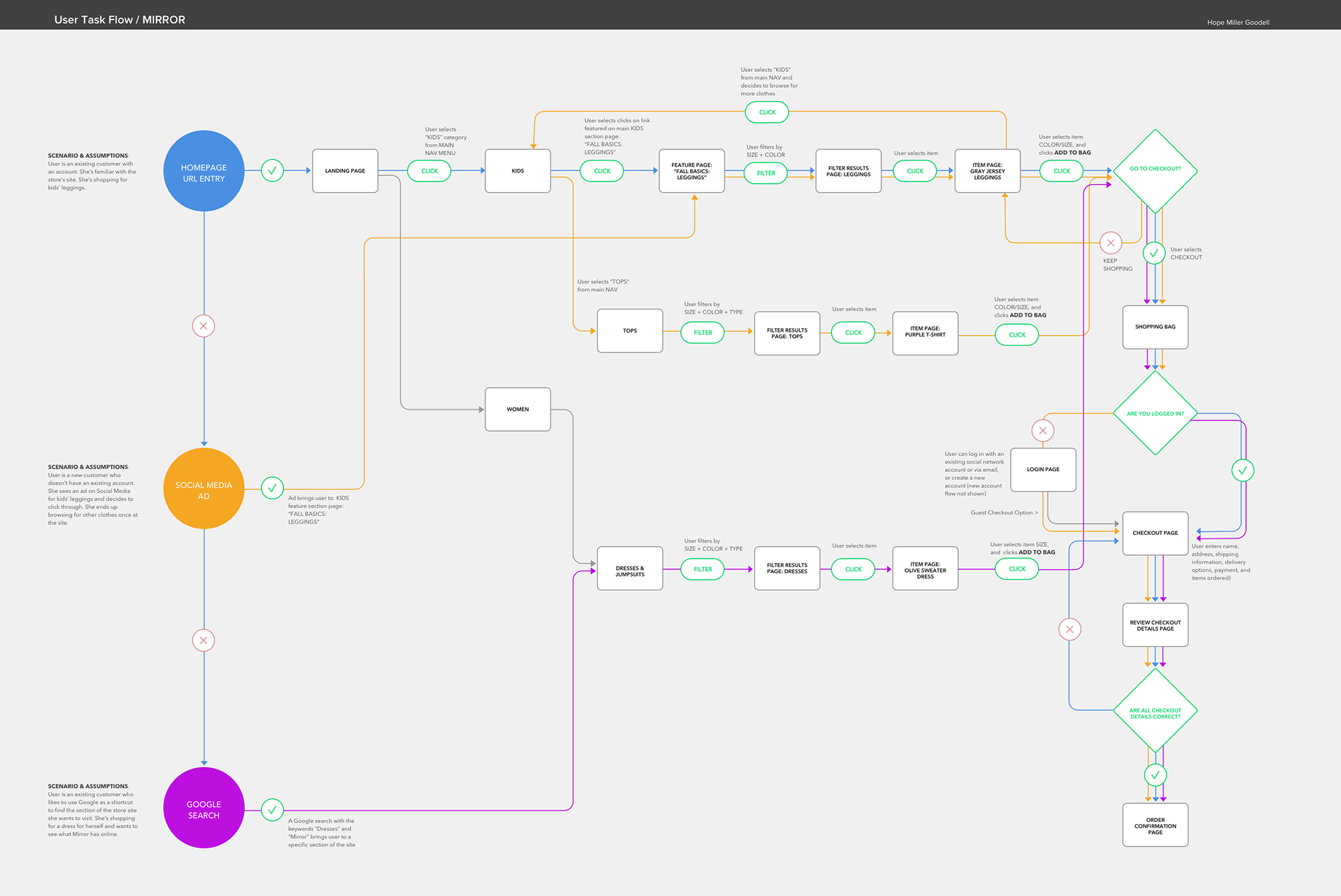
Equipped with the content foundation of the site map, I moved into ideation. I created a user flow to think through paths a user might take through Mirror in order to complete tasks related to completing purchases on the site. In this diagram, Jenna moves through three scenarios and tasks, mapping her user journey from each possible entry point to checkout. Mapping this user flow helped me hone in on the key screens to prioritize as I began wireframing and prototyping.
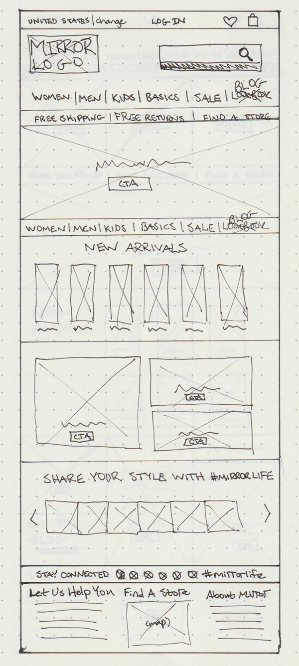
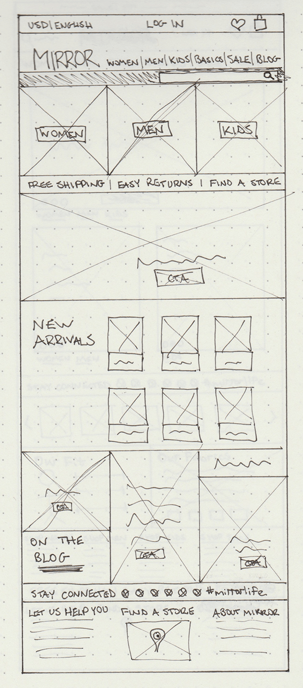
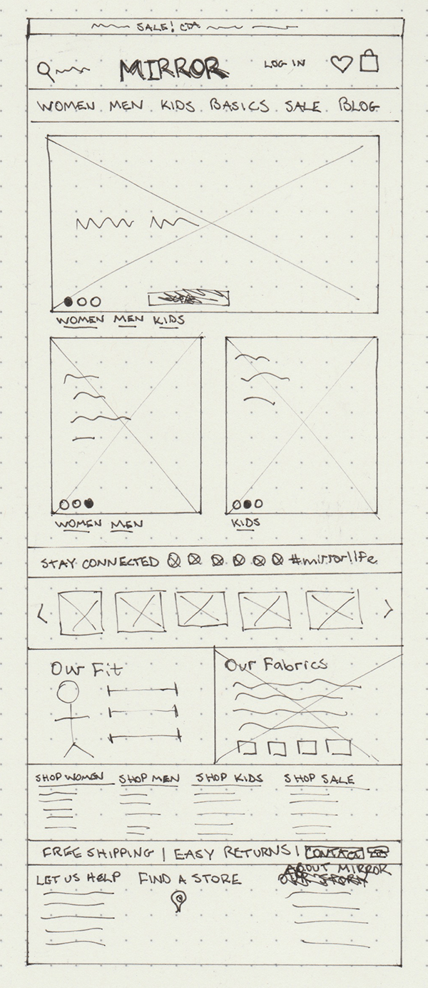
Sketching
Before moving into digitally sketching wireframes, I began with some hand-sketched concepts for the Mirror home page. This gave me an opportunity to think through which direction might best meet the needs and wants of Jenna, as well as meeting Mirror's priorities and business goals.
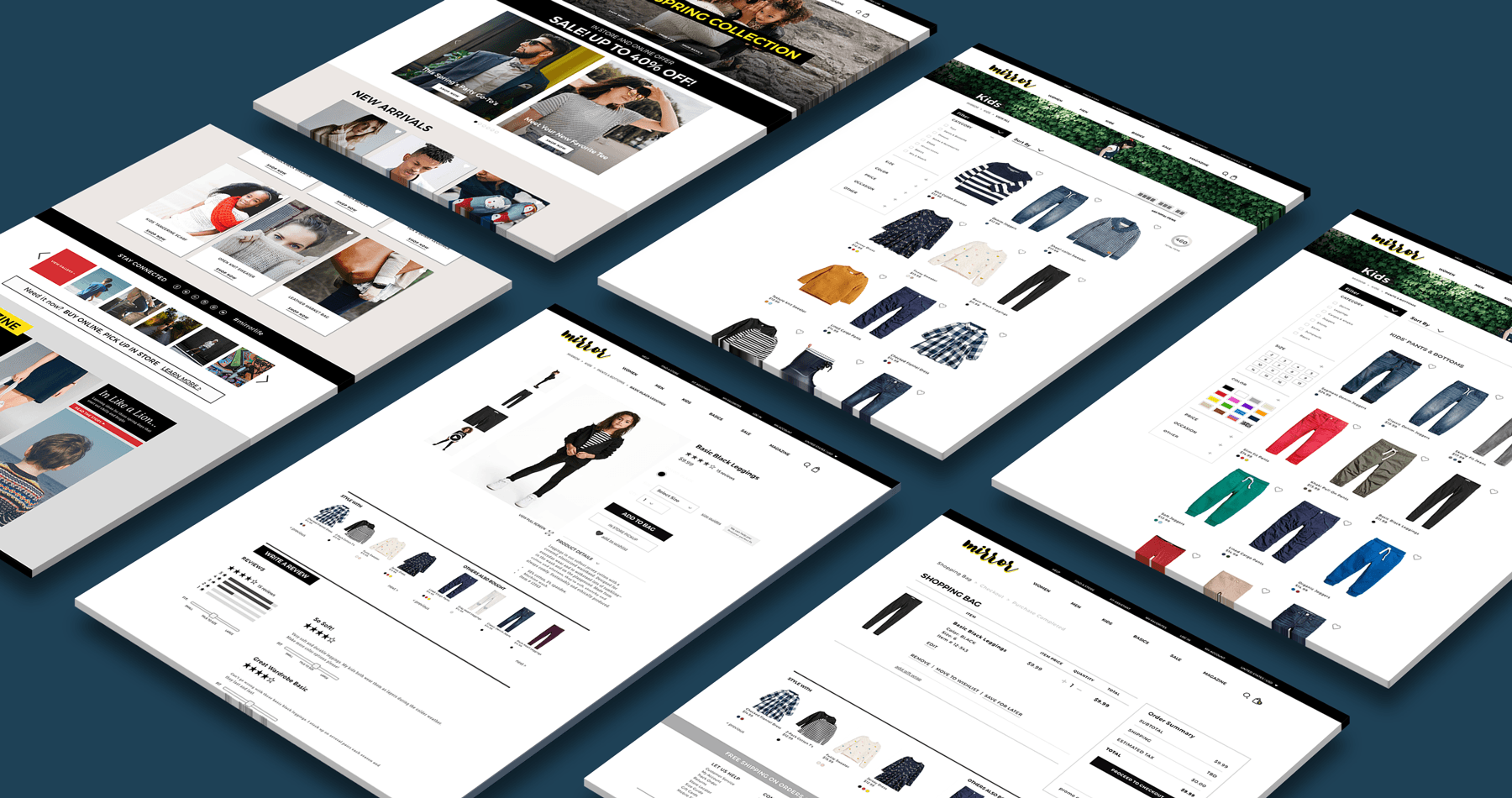
Wireframing
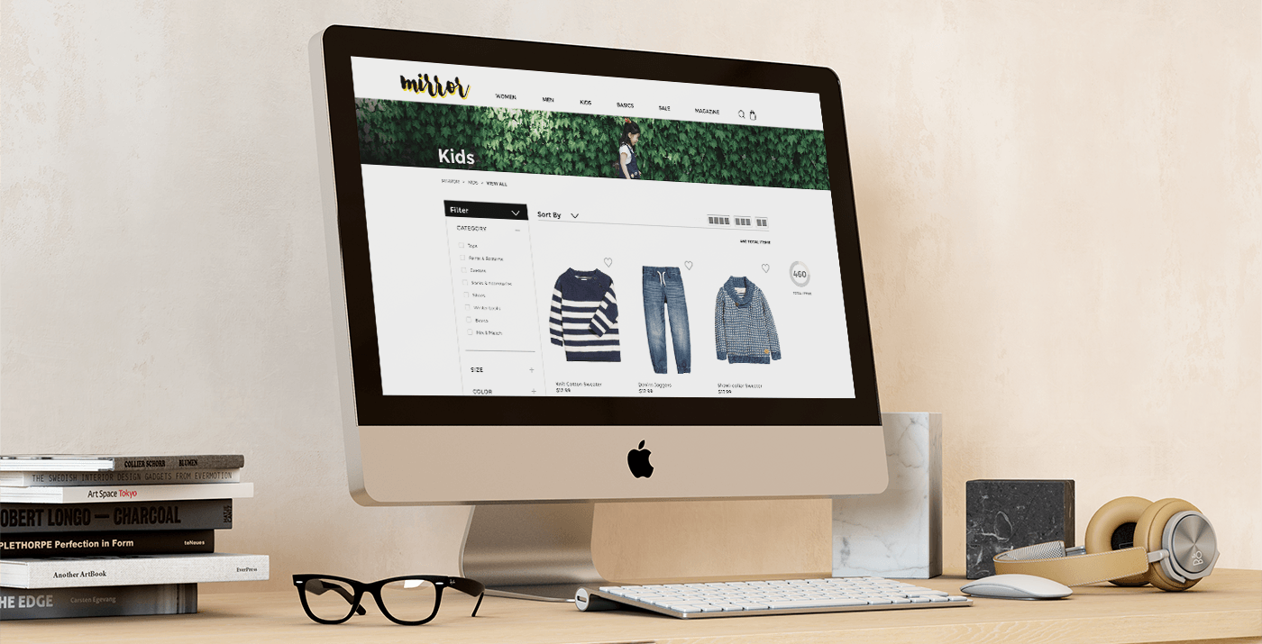
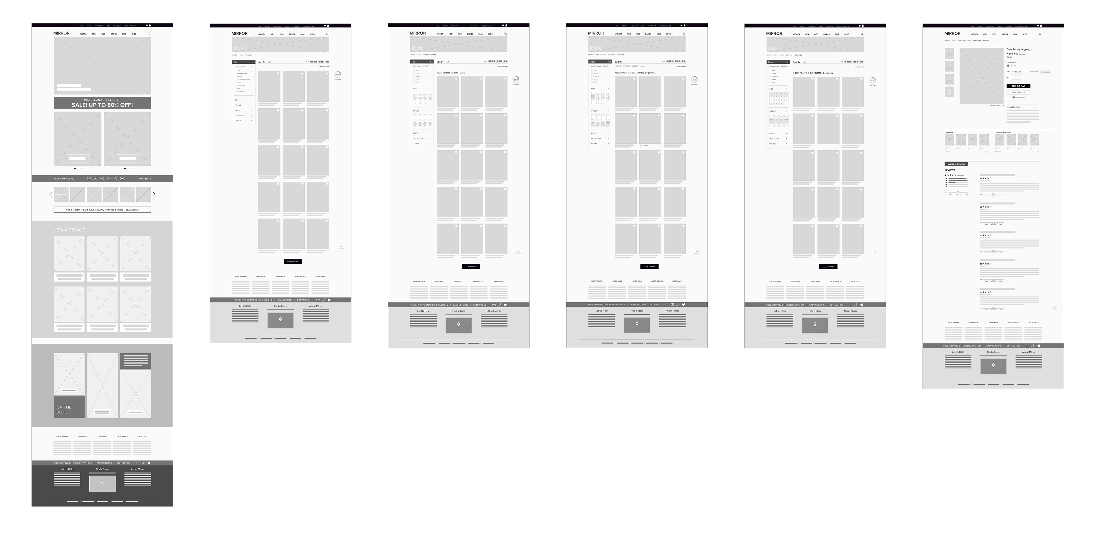
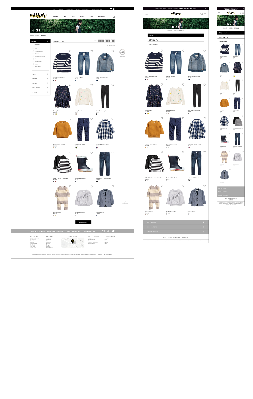
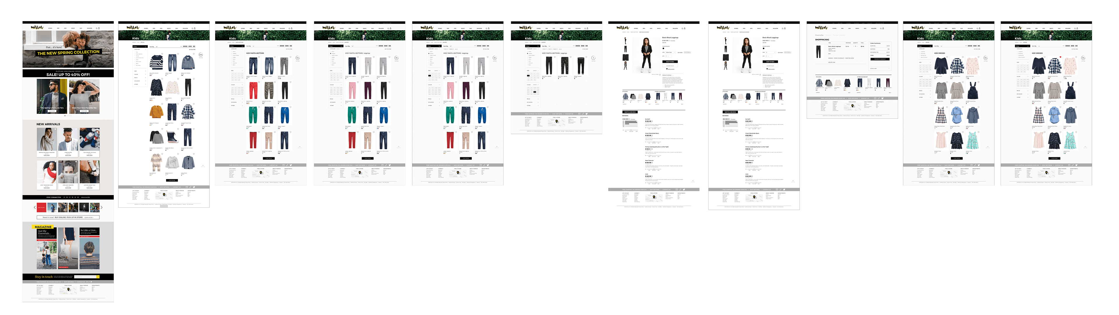
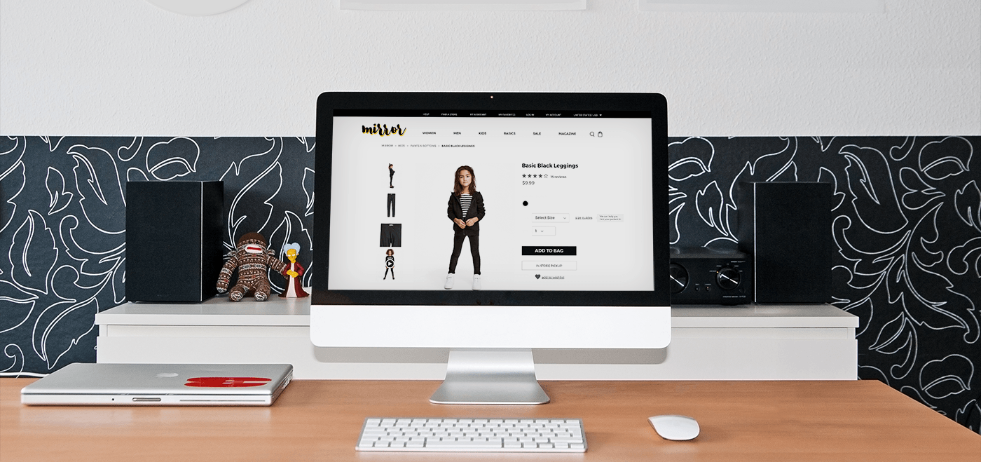
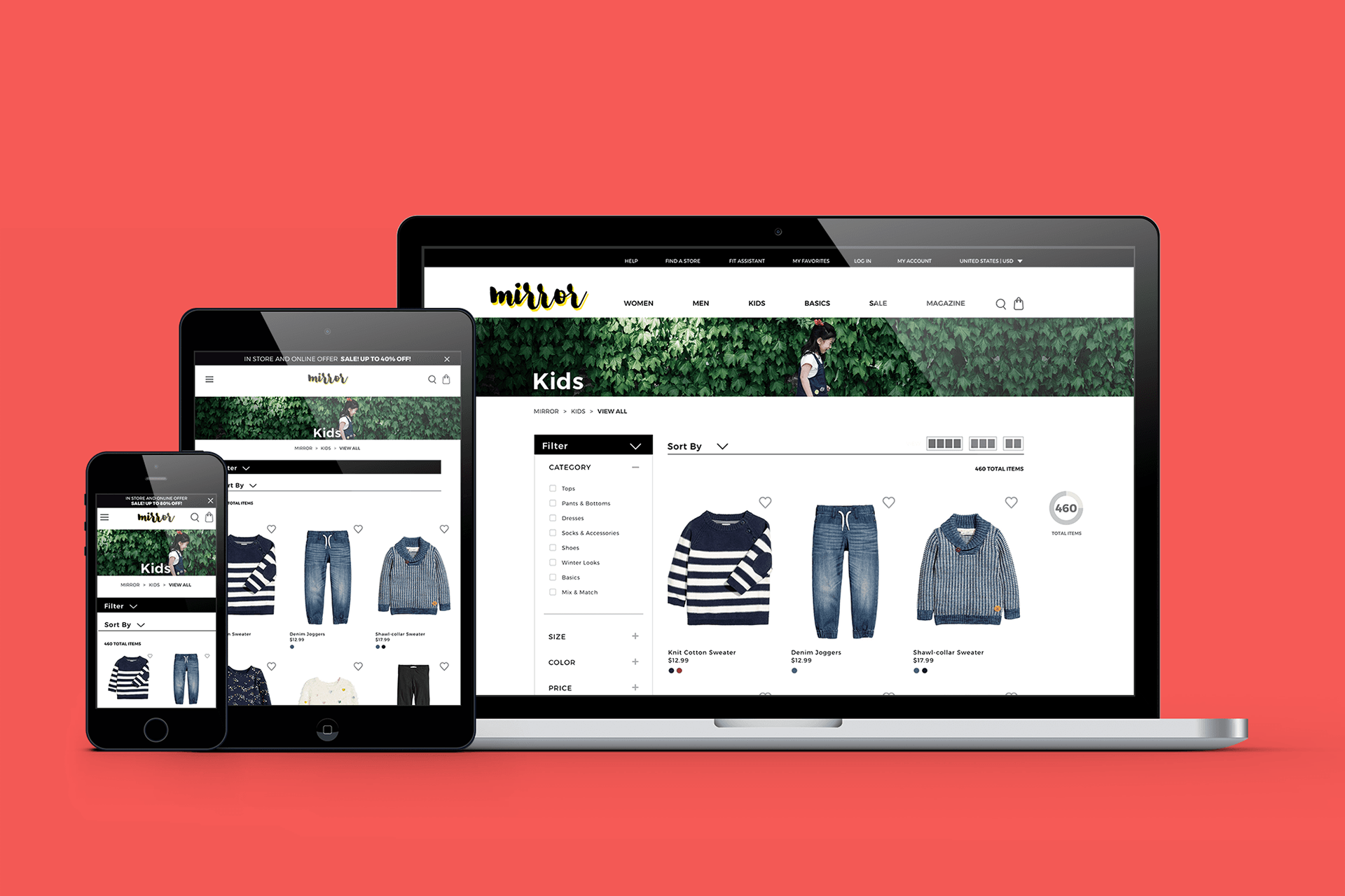
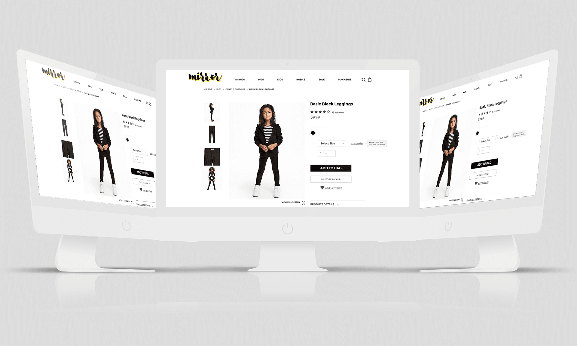
After establishing some initial UI requirements, I began wireframing some key pages informed by my user flow. This set of initial wireframes shows the site pages that a user would encounter as they progress from entering the site on the home page towards purchasing an item of clothing (specifically for this flow: purchasing a pair of black size 6 kids’ leggings). These frames were developed with the goal of quickly translating them into a prototype, so that I could begin testing my design early in the process.
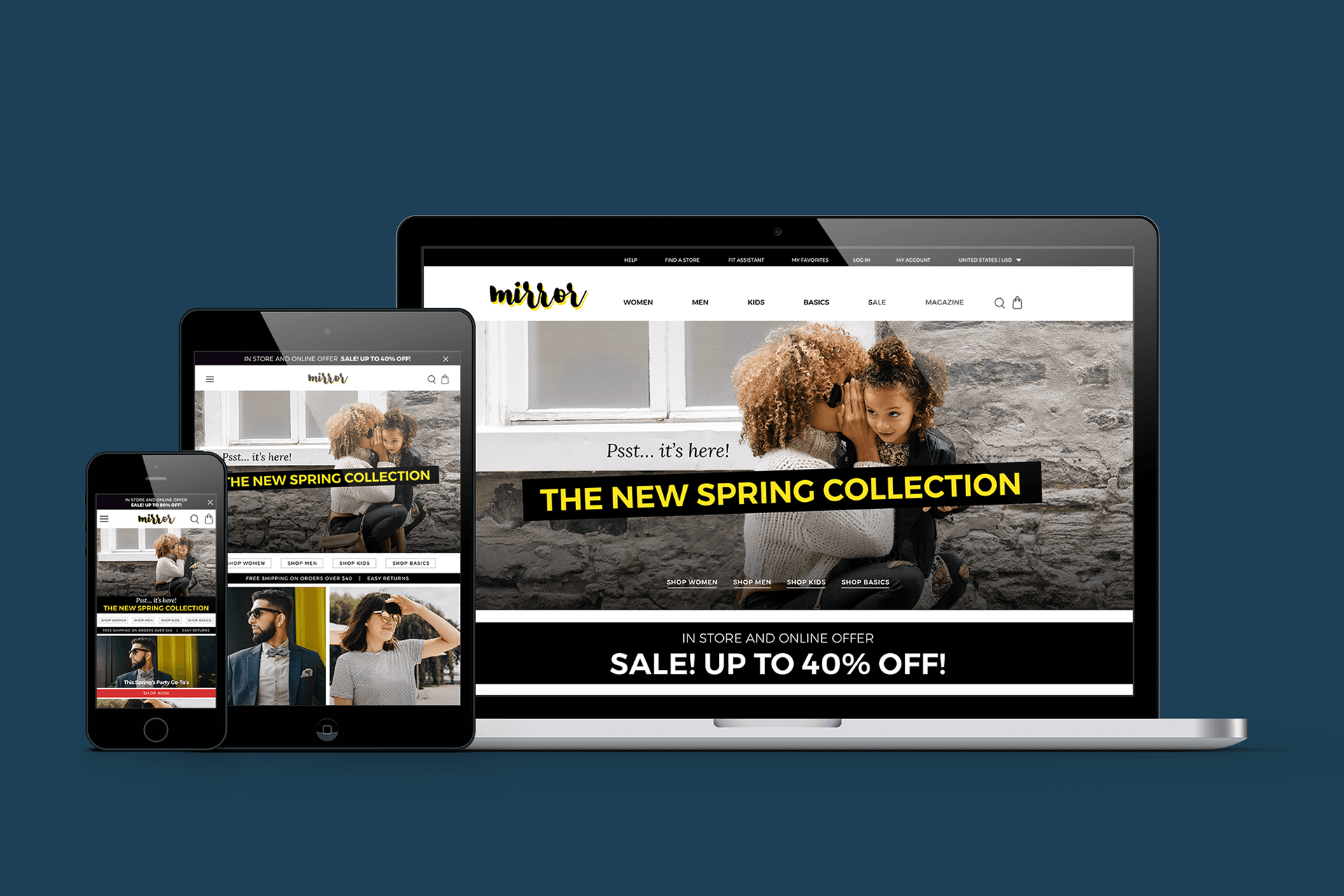
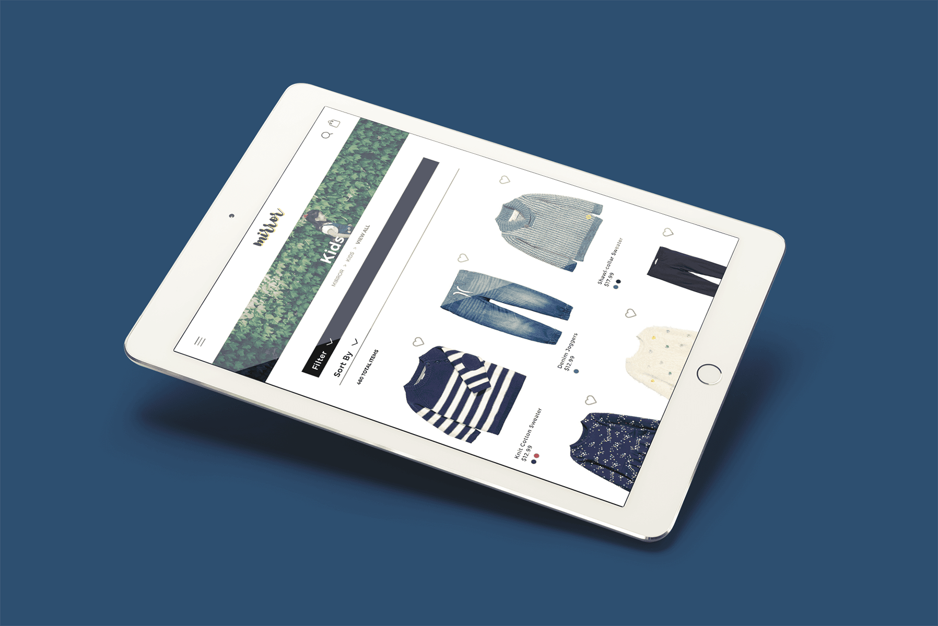
Responsive Design
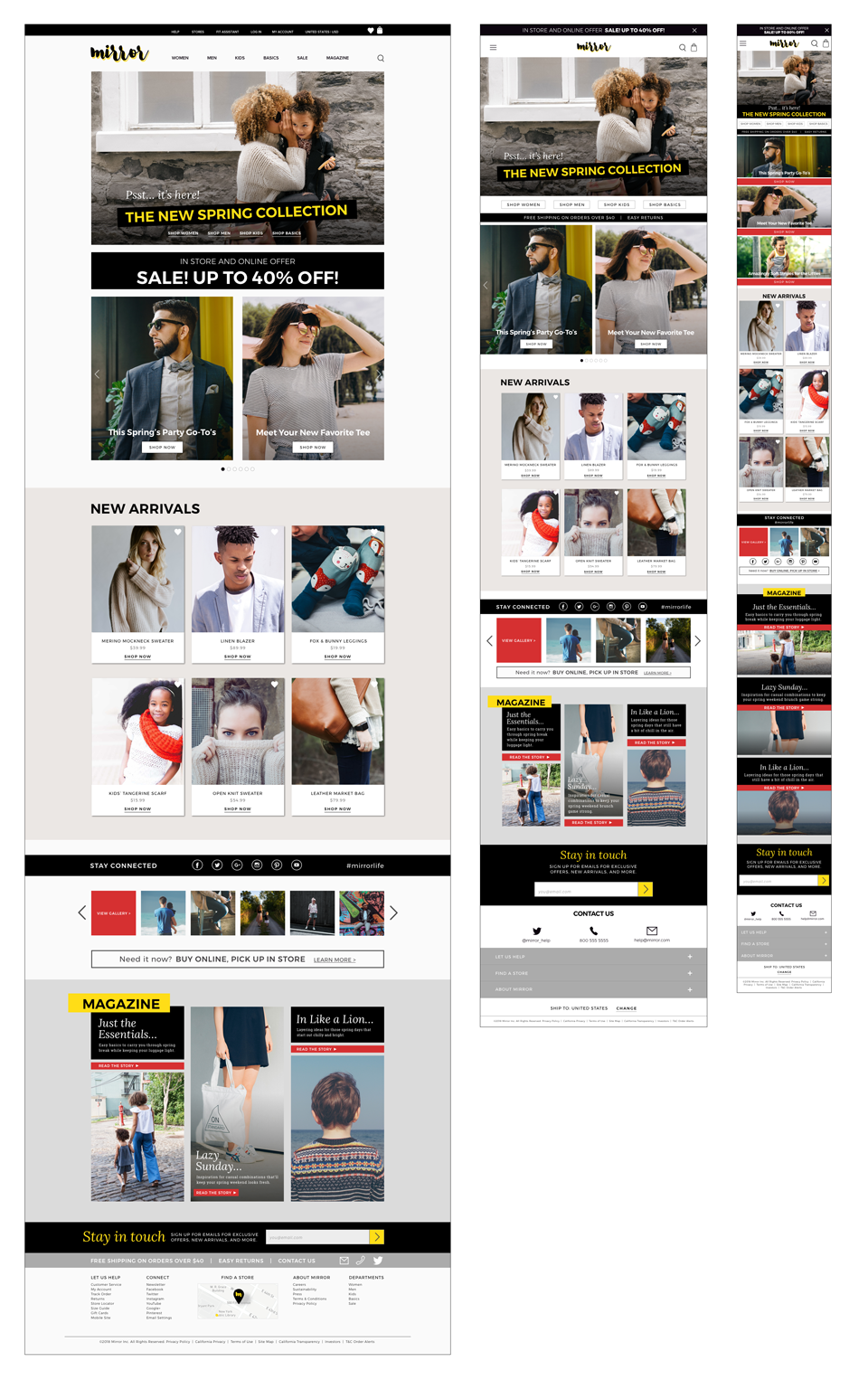
To begin thinking about how Mirror's content and layout would adapt and adjust across different viewport sizes, I began sketching of responsive layouts for the home page. Both the low fidelity wireframes and high fidelity mockups are shown here.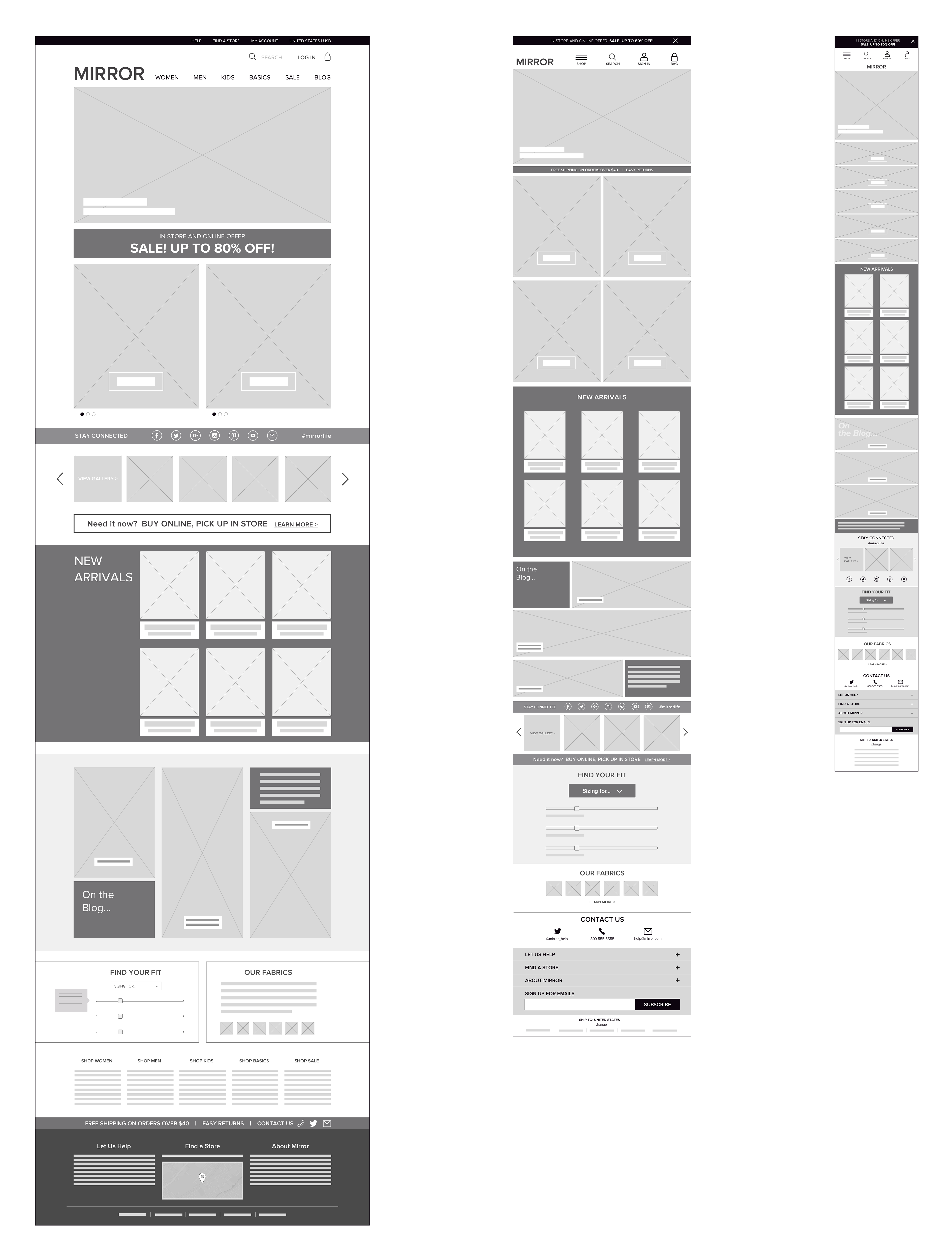
Low-Fidelity Prototype
I employed prototyping multiple times in the course of designing the new site for Mirror. In this first lightweight, low-fidelity prototype, I quickly brought my wireframe screens into InVision and built a lo-fi prototype to share with users. This allowed me to gather feedback early in the design process and test my design and assumptions before before progressing further.
This Invision Prototype is currently archived. Let me know if you'd like to view it.
High Fidelity Prototype
After creating the high-fidelity wireframes and iterating based upon feedback gathered from the first prototype, I created an updated, higher-fidelity prototype and tested again.
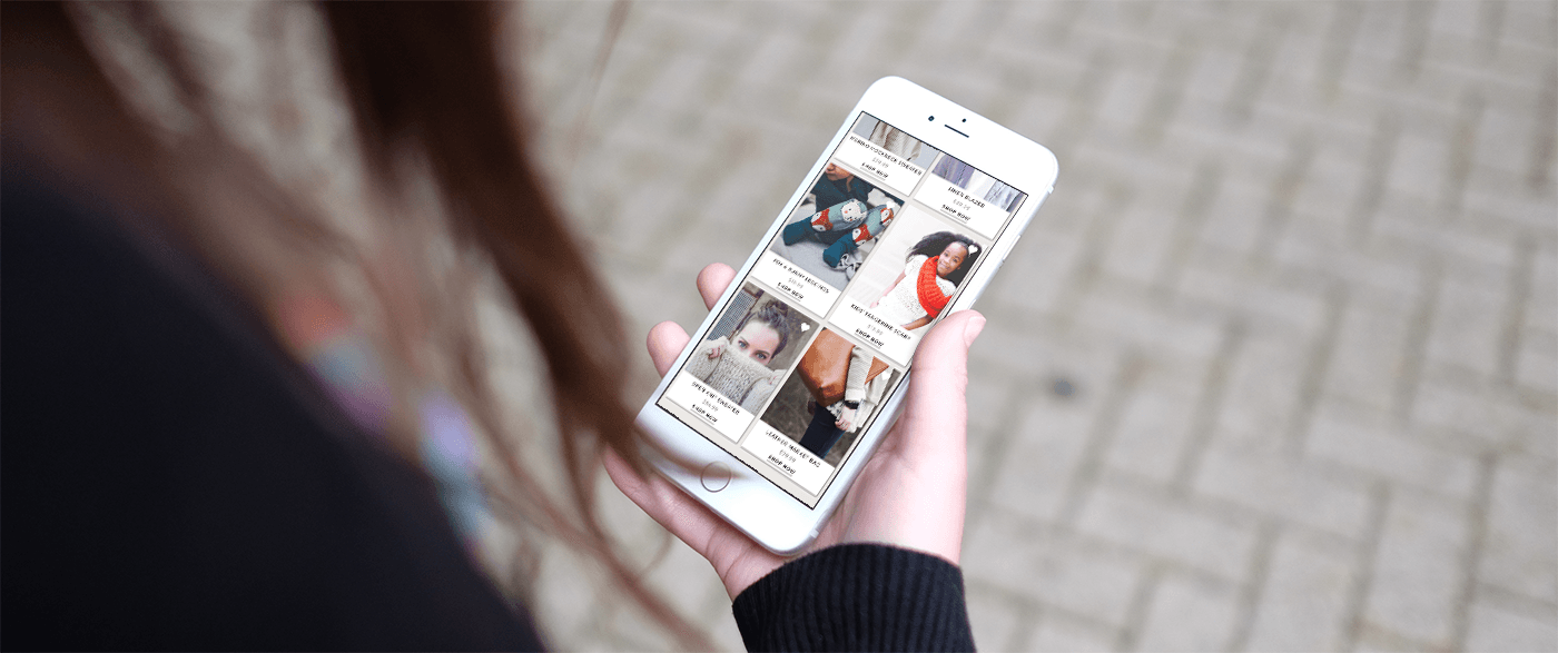
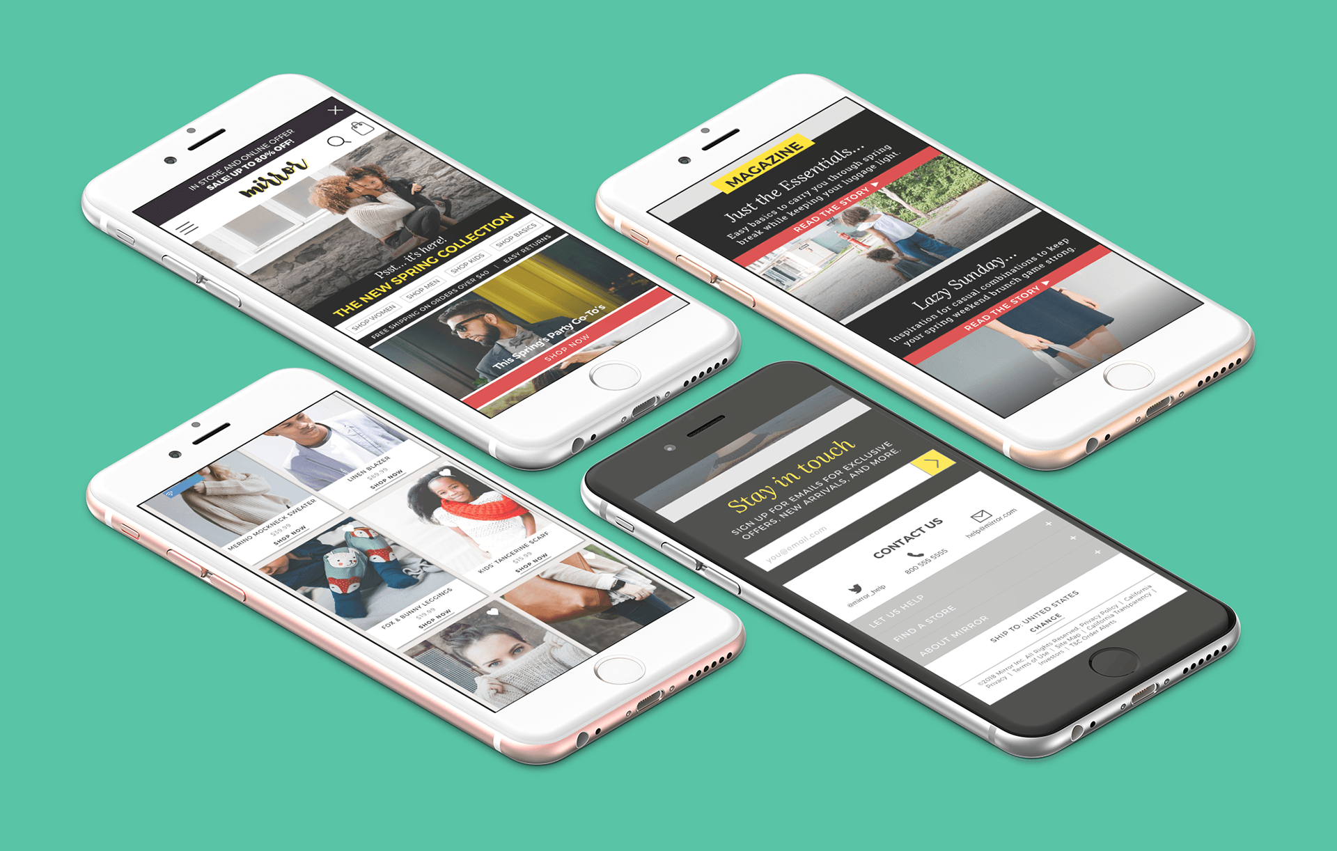
Mobile Prototype
I also created a quick mobile prototype with pen, paper and Marvel. This was another opportunity to gain insight on users interacted and navigated the way I'd structured Mirror's content, as well as thinking through how the site might translate into an app in the future. (And, let's be honest-- it gave me a chance to play around with Marvel for the first time and discover just how quickly one can put together a prototype! I'm a fan.)
Usability Testing
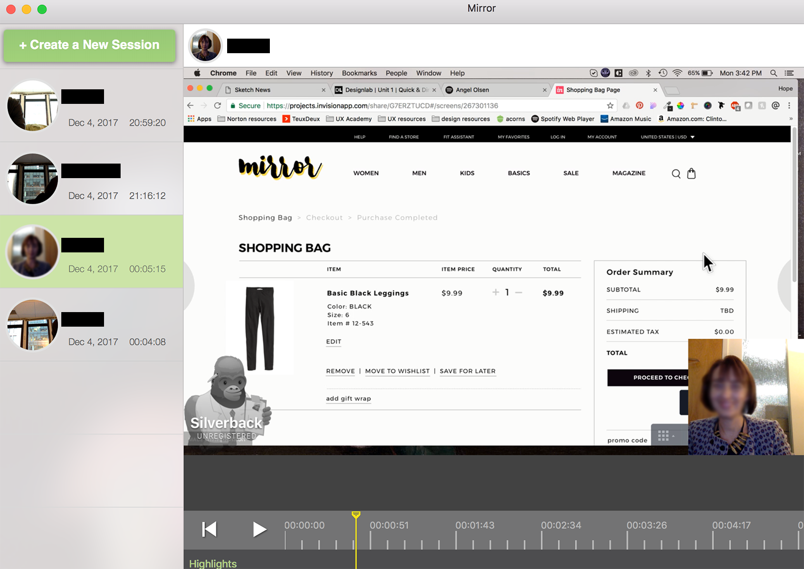
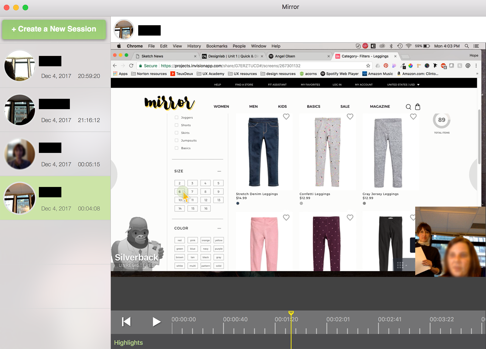
Tools used: testing plan and script, invision prototype, silverback , google hangouts
Seven participants were asked to walk through the prototype. I asked each participant to complete three tasks according to the information in three scenarios I provided. I observed each and took notes as they navigated the site. I also recorded each in-person session with the app Silverback, which records both the screen and the test subject’s face and voice as they navigate through the screens.
Priority Task:
Shop for a pair of size 6 black leggings for your daughter and add them to your shopping bag.
You can see my full testing plan here.
To synthesize the results and observations of the testing, I created an affinity map as a way of interpreting and prioritizing my findings. The insights gleaned from my observations inform the recommendations outlined in the far right column (2nd page). I ordered these from highest to lowest priority. If limits to time or budget necessitate choosing some recommendations to pursue while putting others on hold, this prioritization can inform those choices.
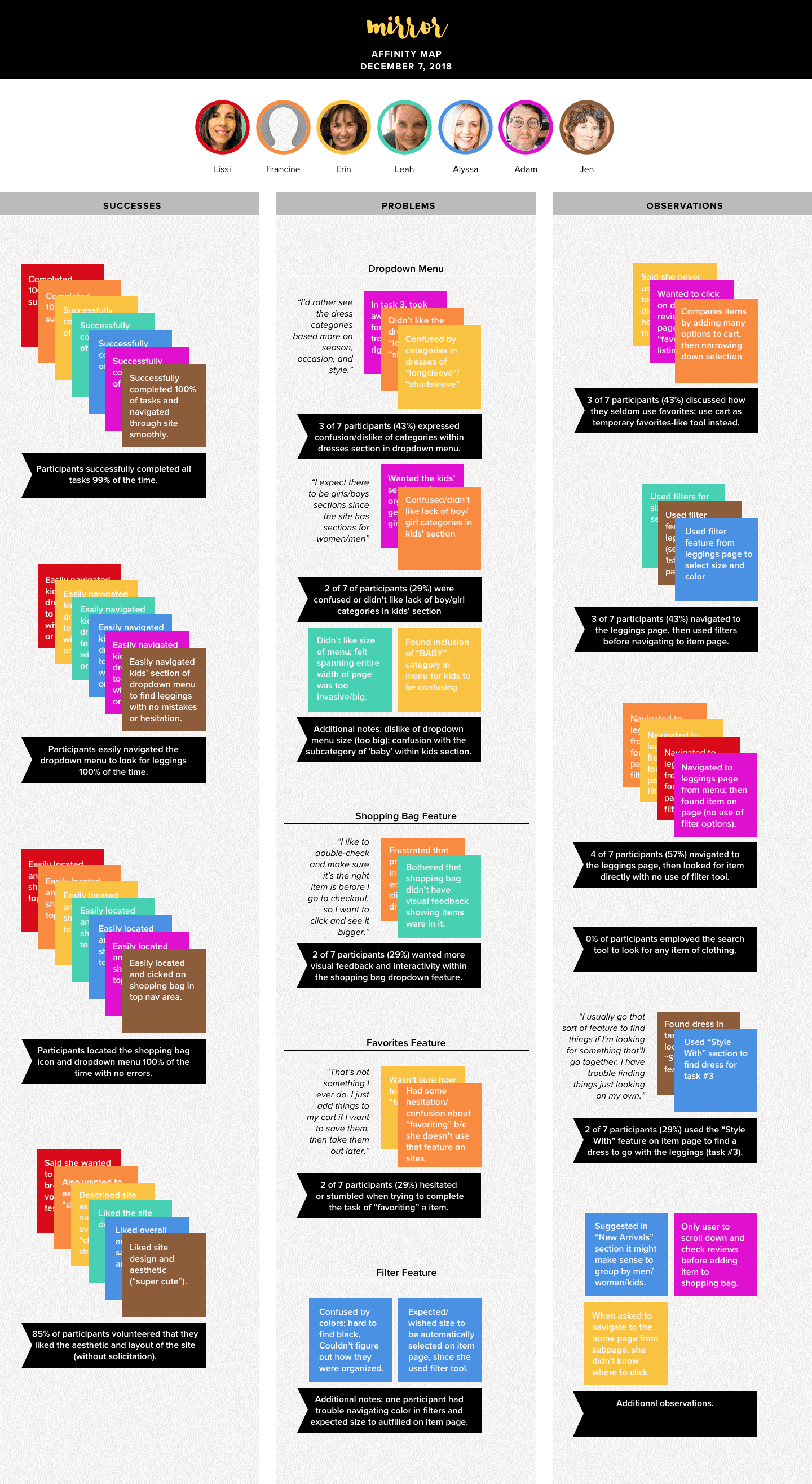
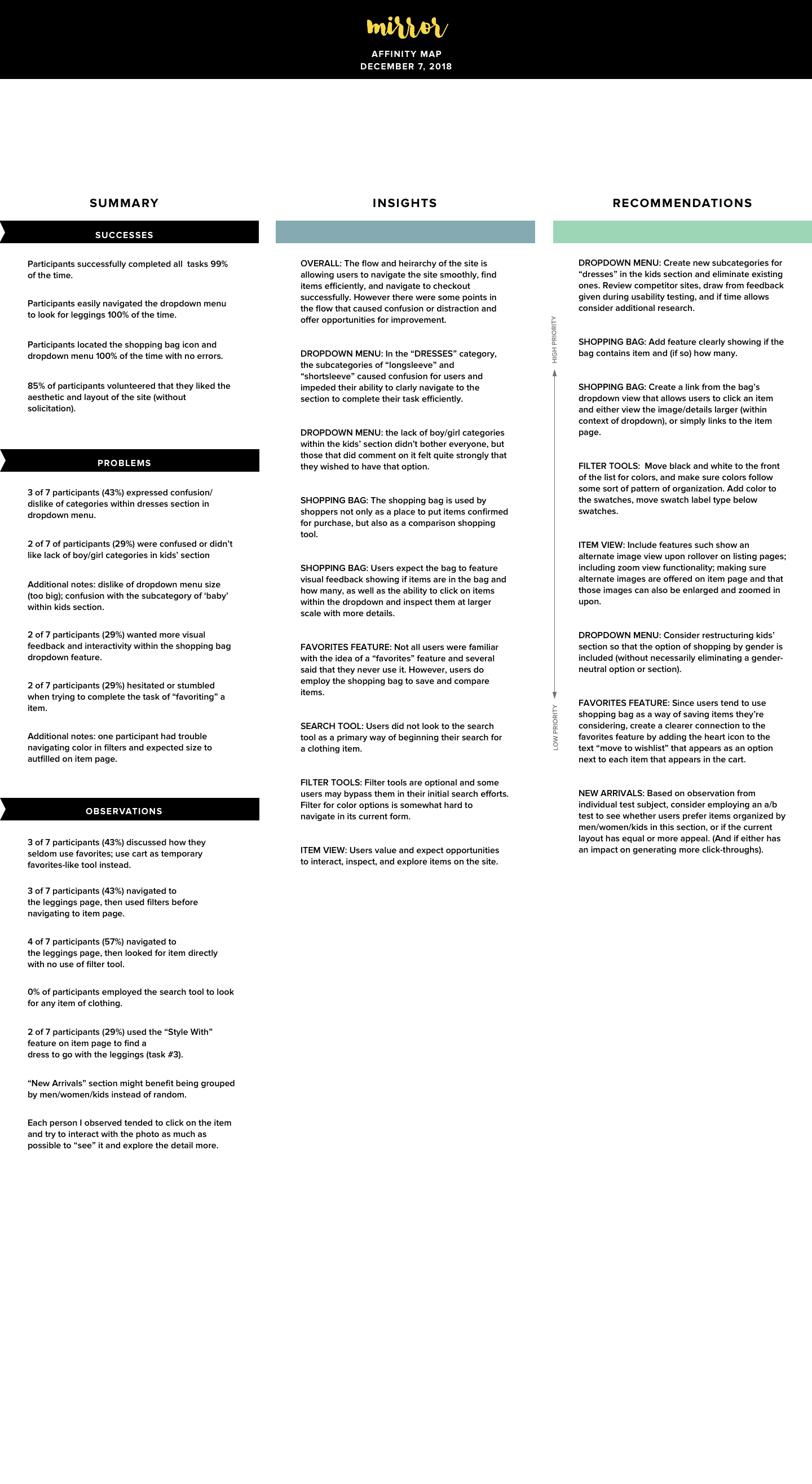
Takeaways
Overall, users were able to navigate the site smoothly, find items efficiently, and navigate to checkout successfully. However there were some points in the flow that caused confusion or distraction, including a section of the dropdown menu (categorizing dresses by "longsleeve" and "shortsleeve" confused people, and a few users were bothered by the fact that the kids' section was not categorized by gender, which went against their expectations). Additionally, the prototype failed to meet some user expectations in terms of the shopping bag feature. While this was mostly due to the nature of the prototype having limited functionality due to scope, the level of concern expressed gave me insight into how much users rely upon and value that feature (which, of course, is central to their ability to successfully purchase clothing). The details identified through user testing helped greatly in identifying what changes should be made, how they should be prioritized, and which features should be given priority in future stages of design and development.
Next Steps:
VISUAL DESIGN
Tools used: pencil sketching, sketch, styletile, pinterest (for moodboard)
Brand Identity
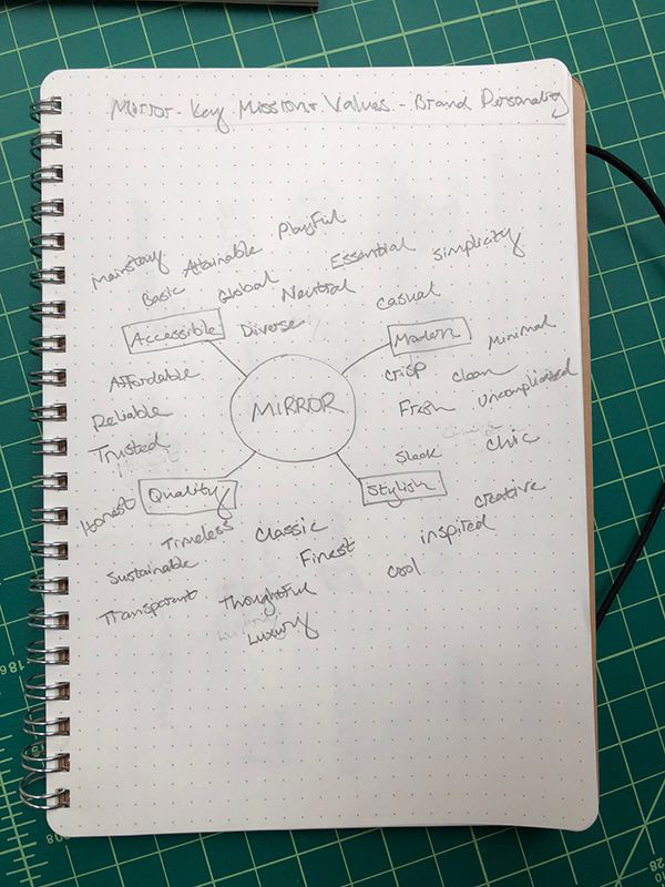
For Mirror's visual design, I began by defining the brand attributes, which were informed by the project brief and my user research. The attributes were anchored around 4 central characteristics of the brand:
MODERN / ACCESSIBLE / QUALITY / STYLISH
MINIMAL / CRISP / ESSENTIAL / TIMELESS / TRUSTED / HONEST /
MAINSTAY / DIVERSE / NEUTRAL / CLASSIC / SUSTAINABLE /
UNCOMPLICATED / CHIC / INSPIRED / COOL / PLAYFUL
I began collecting some brand style inspiration via Pinterest, then created a mood board.
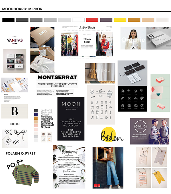
In creating a logo for Mirror, I sketched ideas which explored the concept of reflection: the angles of light hitting and bouncing off a surface, reflected forms of letters and shapes, etc. I also explored some more straightforward, simple directions that were based upon a distinct wordmark/typeface, since so many of the brand attributes alluded to simplicity and a neutral, classic sensibility. While sketching, I kept logos of competitors in mind and considered how Mirror's identity would position in that context (both in terms of fitting within certain conventions and how to ensure that the logo would appear distinct and be easy to differentiate).
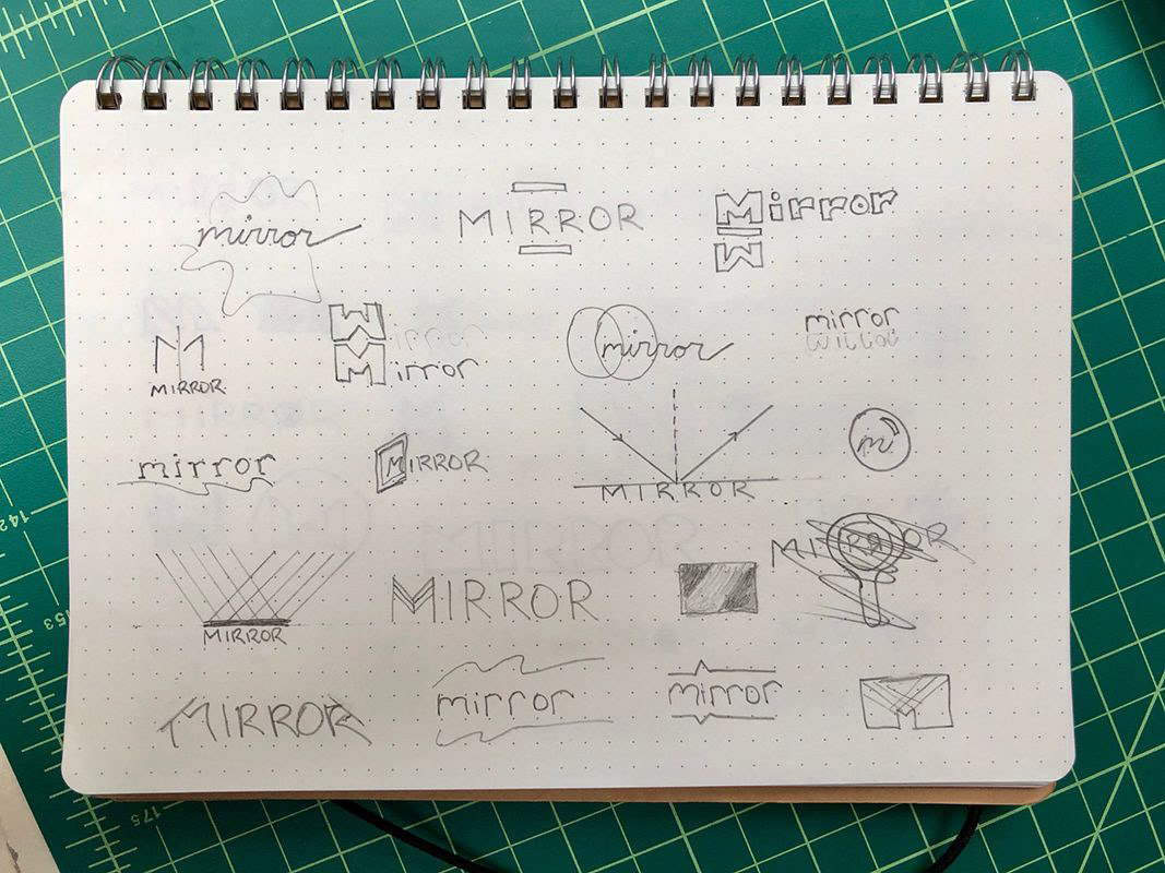
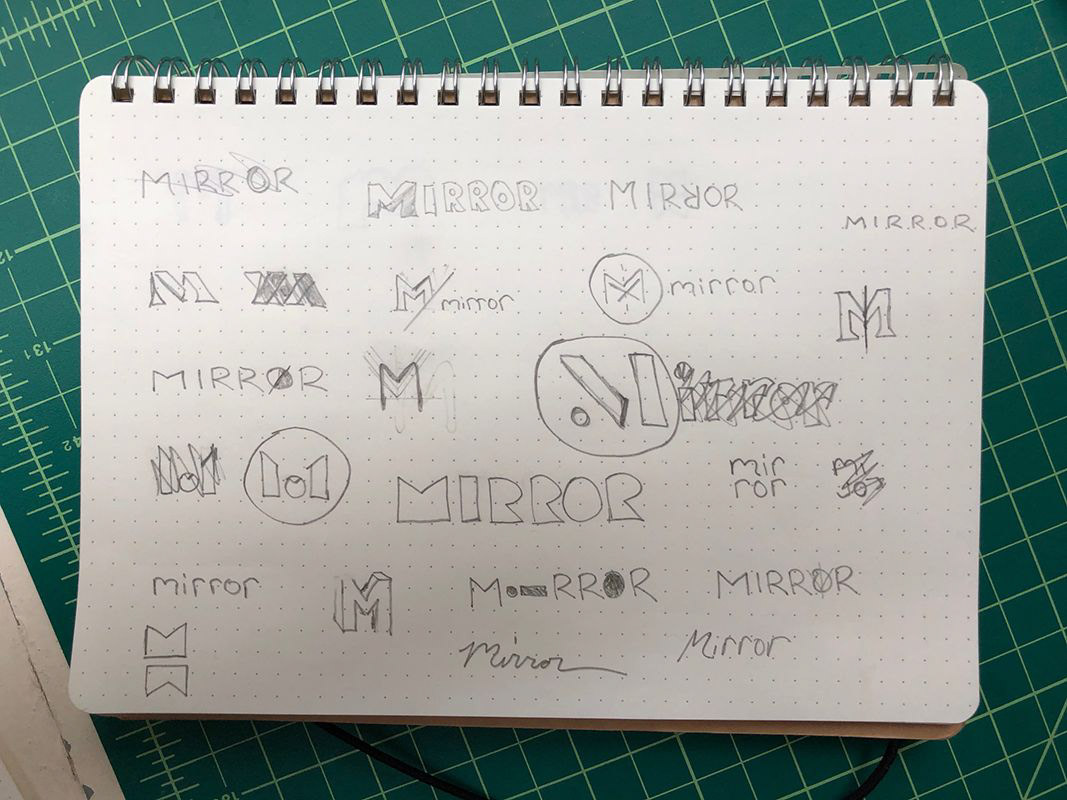
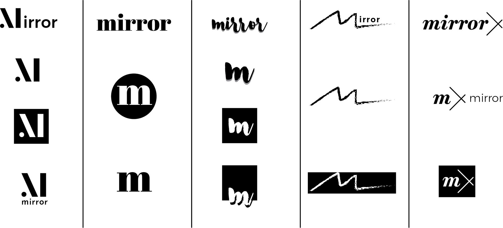
The initial, unrefined explorations shown above helped me hone in on a few different directions I might pursue. Reflecting once again upon Mirror's brand attributes, I determined that a brush script logotype best conveyed the feeling of a brand that was chic yet accessible, modern, playful, and uncomplicated. It stood out from the direct and indirect competitors I'd identified in the initial project research, while also maintaining a look that fit within the market. Further, I felt it would be a good match in terms of appealing to the aesthetics of my primary user audience (Jenna, my persona), as well as the broader customer base that Mirror aims to attract.
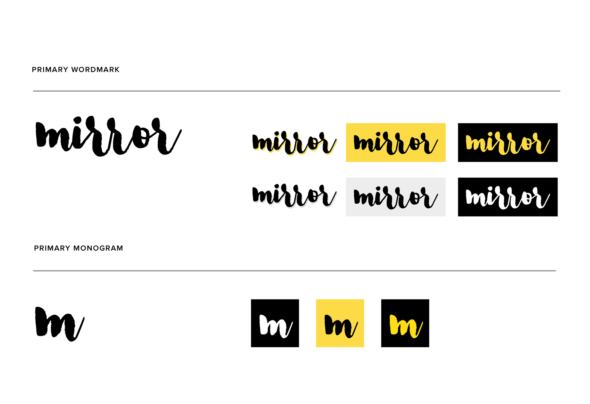
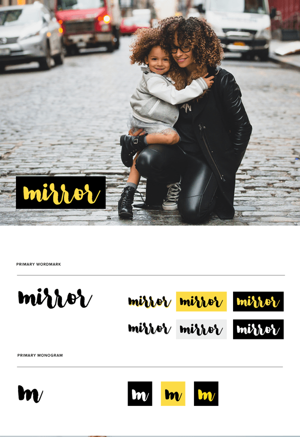
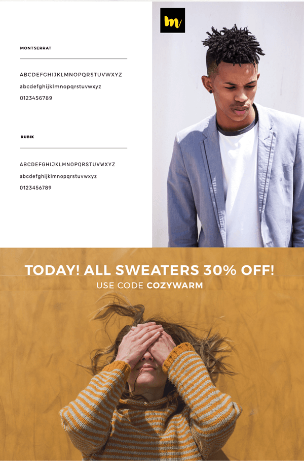
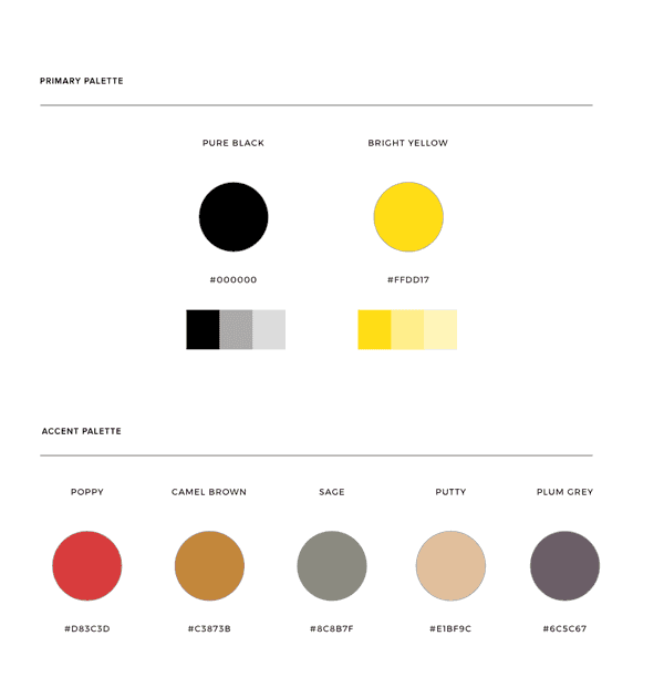
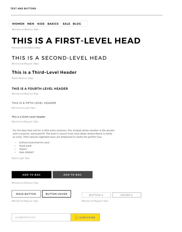
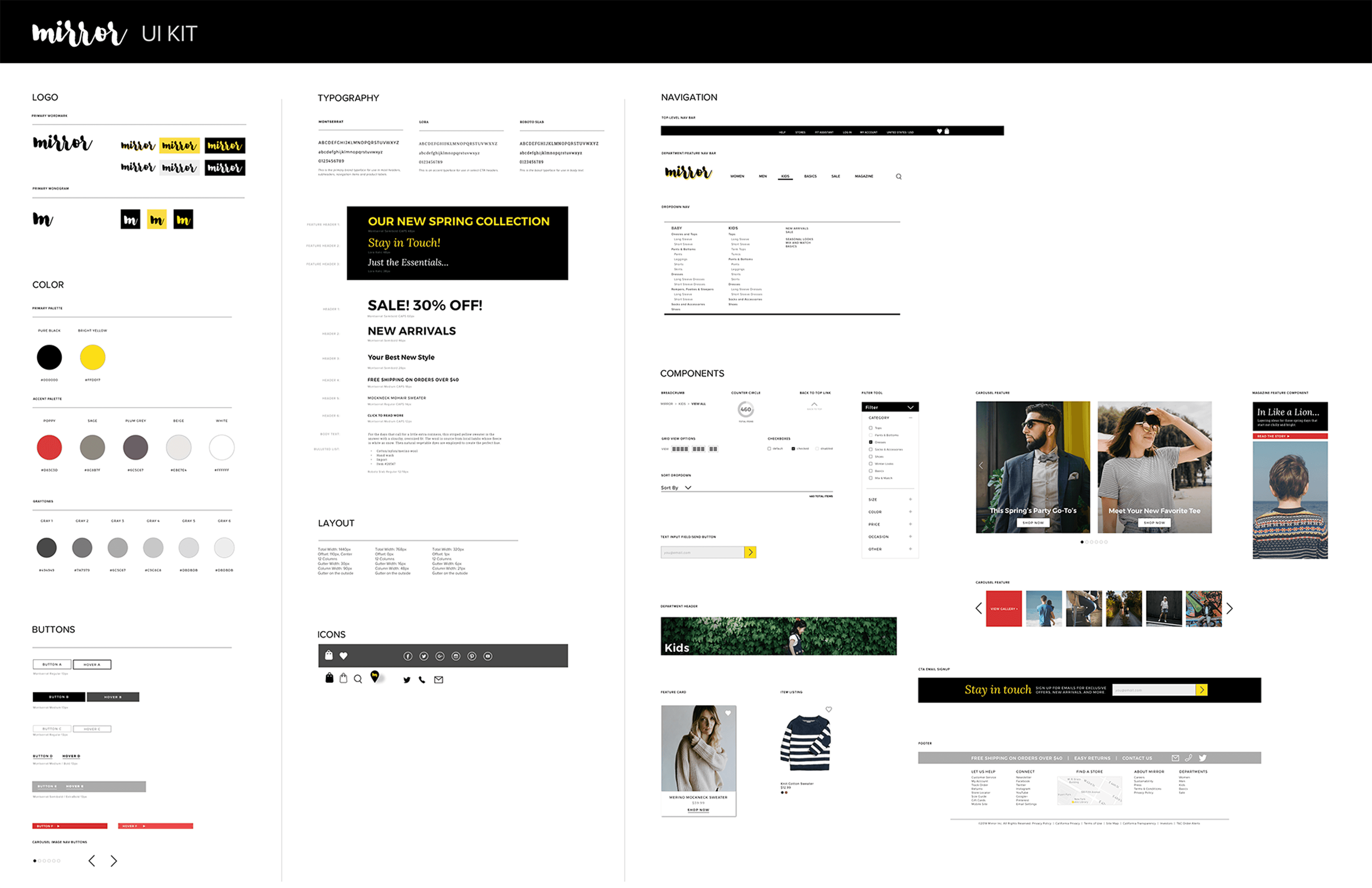
Style Guide + UI Kit
With the design direction established, I created a Style Guide and UI Kit for Mirror. These are living documents which can be updated and added to as the site (and brand) develops and evolves. By documenting the UI patterns and components we use in the design, we can better ensure that they are repeated and, therefore, consistent across the product.
Handoff + Implementation
I used Zeplin to create specs for the handoff of the design. This offered an opportunity to review the design's cohesiveness once more and tighten up any discrepancies.
PROJECT Takeaways
In the end, organizing the structure and content of Mirror's site in a similar way to many other fashion retail sites proved to be the best way to enable Jenna to quickly find and purchase the clothing she's looking for. Testing revealed that users expect certain conventions in terms of categorization and labelling, and when the information architecture departs from that, it can cause confusion and impede users' ability to successfully navigate. And of course, if users can't easily find and purchase what they're looking for, the basic functionality of the site is broken.
By basing the design for Mirror on research, grounding design decisions in empathy, and testing often throughout the process, I had a compass to help me navigate and continue moving closer to my goal of creating a design that actually works for people and makes the routine experience of purchasing clothes smooth, easy, and enjoyable.
Exploring and leveraging existing design patterns and user expectations within the retail clothing space allowed me to build upon the successes and failures of others who have worked to solve similar problems before me. And testing my own interpretations and combinations of them within the context of Mirror's site helped me determine if the overall design was working for Mirror's customer and user base.
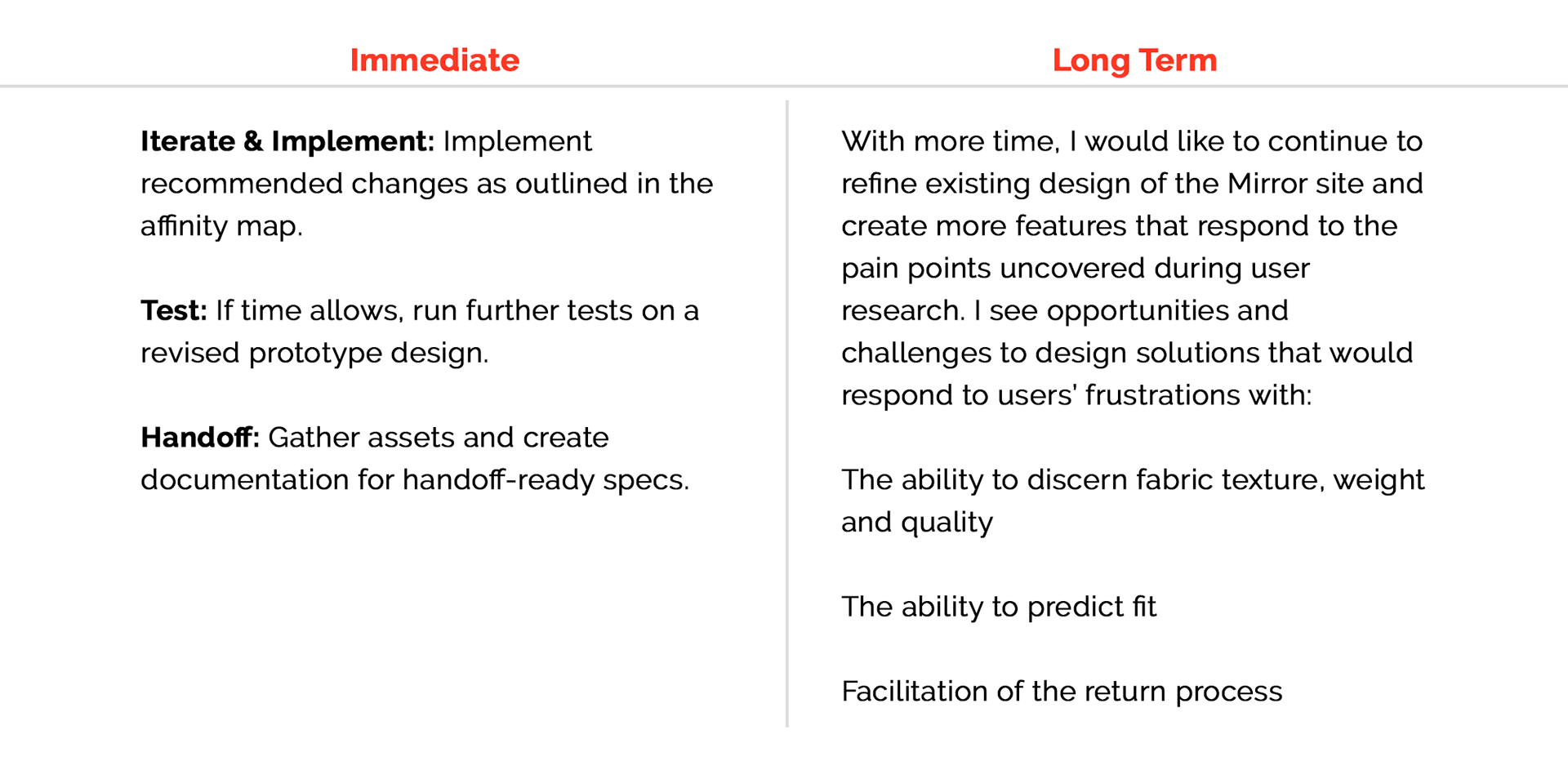
Next Steps
With more time, I'd like to iterate further and develop the full site design. The challenge of enabling users to feel confident about their selections is one I'd like to pursue further. Many questions remain. What features would help users feel more informed and trusting when it comes to the quality and fit of the clothing they're considering? How best might we find ways to reduce the rate of returns and increase sales? How can we improve upon the basic functionality and features of the site, to take them to a higher level of proficiency and inspiring delight? The process of ongoing research, ideation, testing and iteration allows for ongoing growth, and I'm confident that further iterations would yield further discoveries and improvements.