

Spotify Case Study
RESEARCH + DISCOVERY | DEFINE | IDEATION + STRATEGY | PROTOTYPE | TEST | ITERATE
ROLE: Lead UX+UI Designer (RESEARCH, INTERACTION DESIGN, VISUAL DESIGN)
CLIENT: SPOTIFY (elective proposal project)
TIMELINE: 80 hours over 4 weeks
TIMELINE: 80 hours over 4 weeks
THE CHALLENGE
Conceptualize and design a new feature for Spotify that will help improve user engagement and retention by expanding social capabilities.
THE OUTCOME
A reimagined social feature for Spotify’s mobile app that builds upon the desktop app’s social feed while increasing opportunities for users to engage with friends in a more meaningful and fulfilling way.BACKGROUND
Spotify is the leader in streaming music providers — and it wants to stay that way. For this reason, they want to improve engagement and retention in their app by expanding their social capabilities. The goal for this initiative is to determine the best way moving forward in that direction, and to provide Spotify with a prototype of the feature that can be integrated seamlessly within the app.
RESEARCH + DISCOVERY
Tools used: COMPETITIVE ANALYSIS, APP AUDIT, PROVISIONAL PERSONAS, USER INTERVIEWS
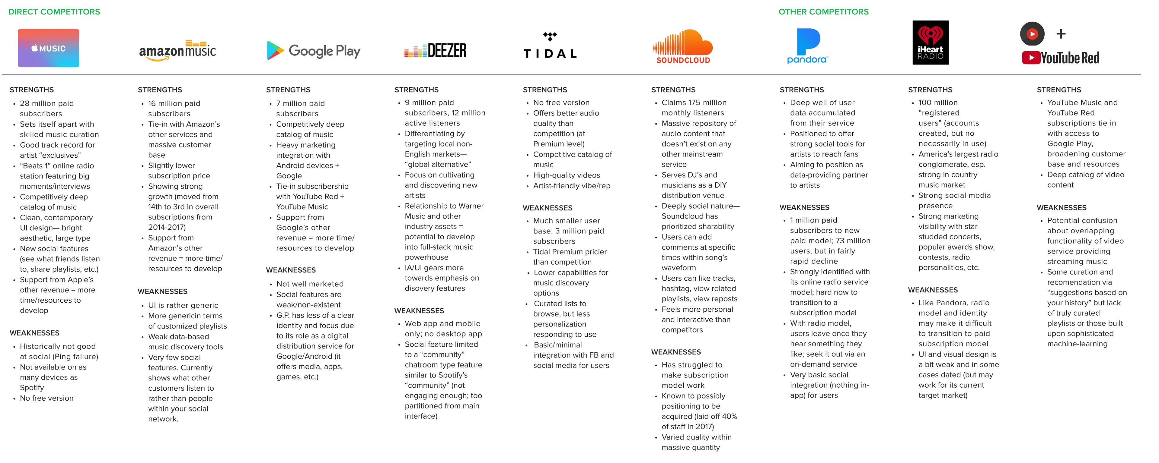
Market & Industry Research
To begin, I conducted a rapid research session of secondary sources. I spent a few hours getting a sense of Spotify’s place within the landscape of streaming music providers and gathering enough information to help determine the focus and scope of my research. I identified some key challenges and opportunities and made a list of initial assumptions and questions. From there, I conducted a competitive analysis comparing competitors’ strengths and weaknesses, as well as identifying where opportunities for Spotify to differentiate itself with a social feature might exist.
App Audit
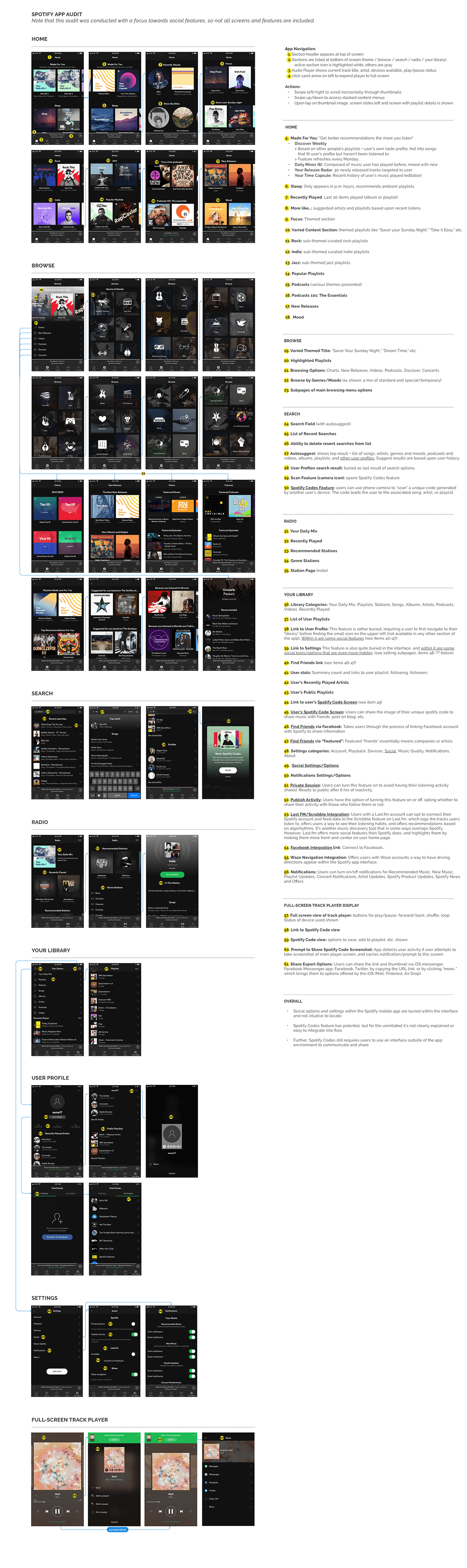
In my research, I found that Millenials comprise 72% of Spotify listeners. Millenials are also listed as top smartphone users, with a 98% ownership rate. Based on this information, I made the initial assumption that Spotify’s users might prefer to connect and communicate socially through Spotify via the mobile app. I wanted to become thoroughly familiar with Spotify’s mobile product, so I conducted an app audit. This helped me gain a clear grasp of the app’s architecture, hierarchy and content, which I felt was important to establish before considering how a new feature might integrate within the design.
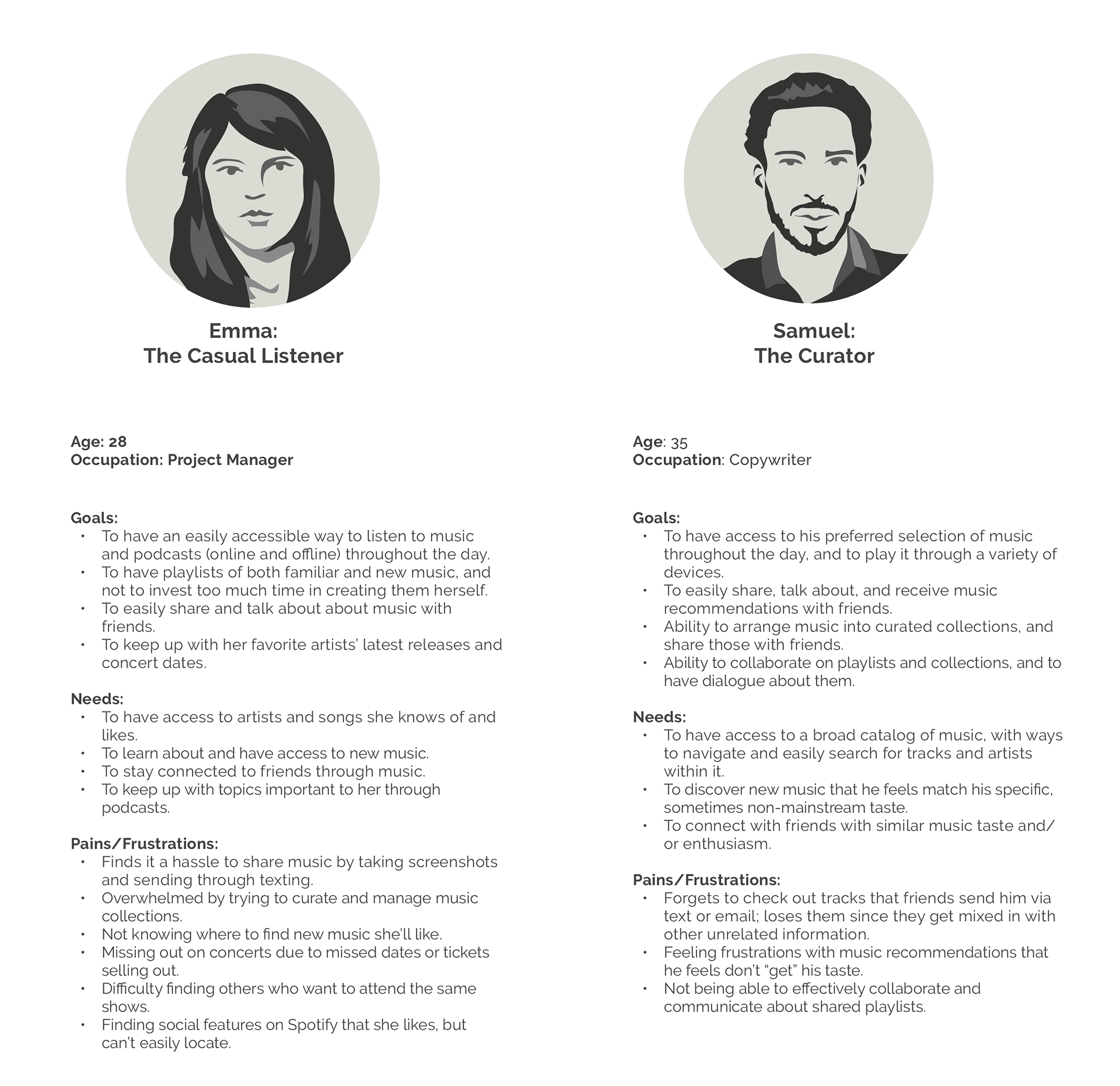
Provisional Personas
I also created two provisional personas which embody demographic and behavioral traits that match Spotify's core user base and market. These helped me identify people who might be ideal interview subjects and consider how I might want to frame my interview questions and planning.
User Interviews
Drawing from the list of questions and assumptions I drafted during my secondary research and research plan, I crafted questions to ask participants about their music listening and sharing habits. The interview guide and script I developed can be found here >. I interviewed 9 people over 2 days (2 in person, 7 via Skype). Participants ranged in age from early 20’s to 40 years old, resided in major US cities, and reported listening to music daily.
Assumption i hoped to to validate or disprove:
1) People would like to connect socially over music via Spotify.
2) Spotify users may primarily use the mobile app to access the service.
Synthesis + Defining
Tools used: interview synthesis table, user journey map, primary persona, POV + HMW STATEMENTS, BRAINSTORMING + storyboarding
Uncovering Insights + Identifying Needs
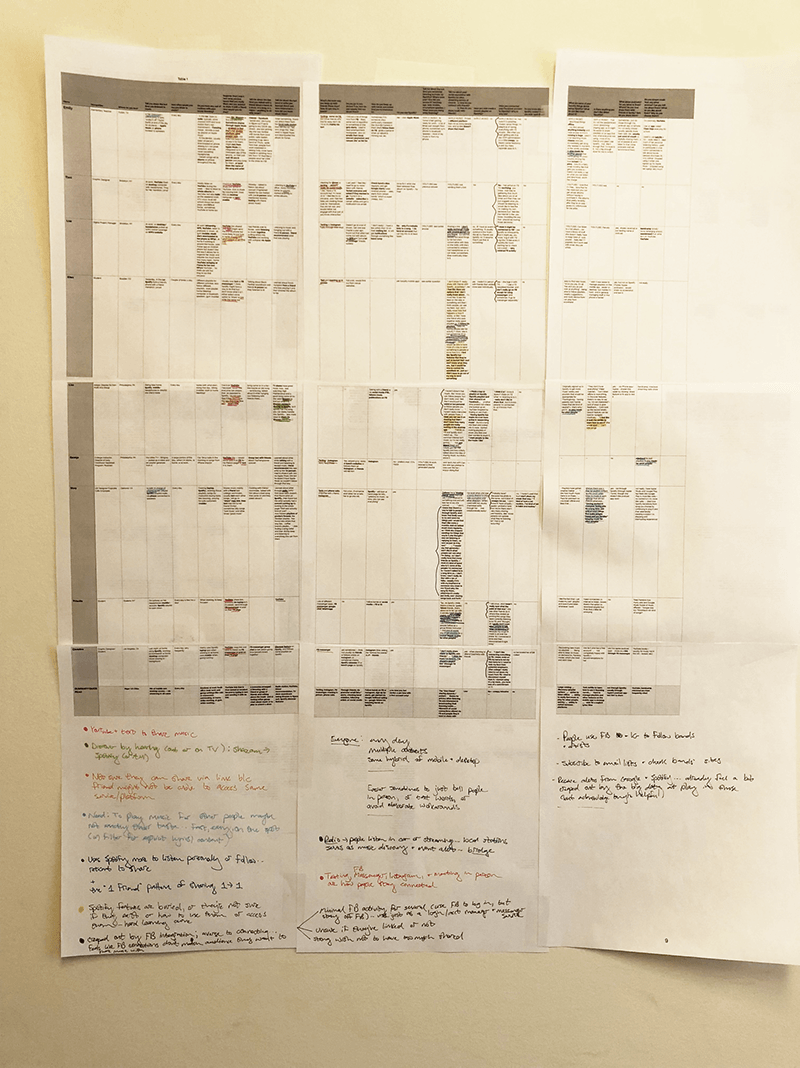
Following the interviews, I created an interview synthesis table to process the information gathered during my contextual inquiry. I looked for patterns, similarities, and contrasts in order to uncover insights from my observations and move towards identifying implicit user needs.
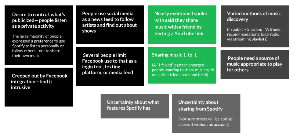
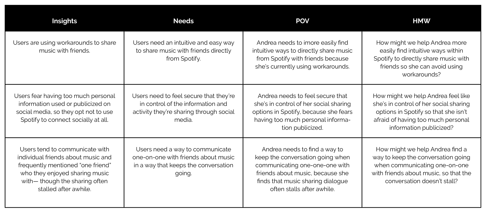
INSIGHTS
• People prefer to share music with one or just a few friends.
• Efforts to keep dialogues on music going tend to stall.
• They don’t want to compromise their privacy to access social features or share music.
• They will use workarounds if necessary to avoid being pushed into unwelcome sharing.
• They’re largely unaware of Spotify’s sharing and social features.
• Currently they’re leaving Spotify and going to YouTube to share songs.
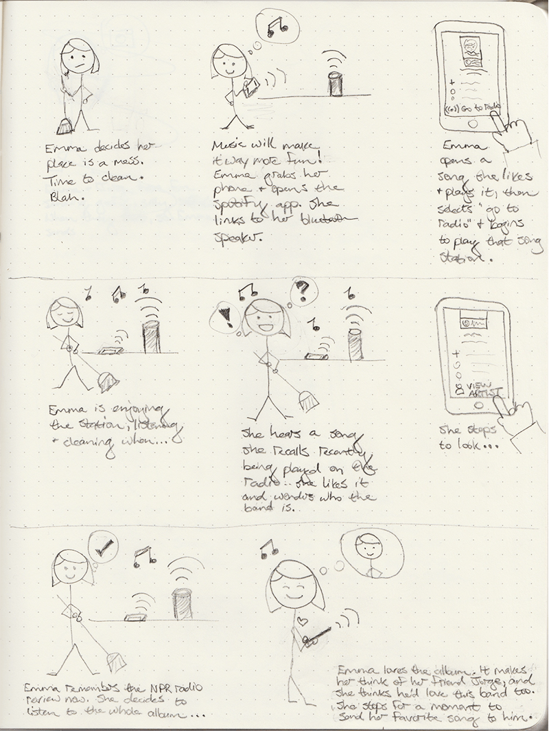
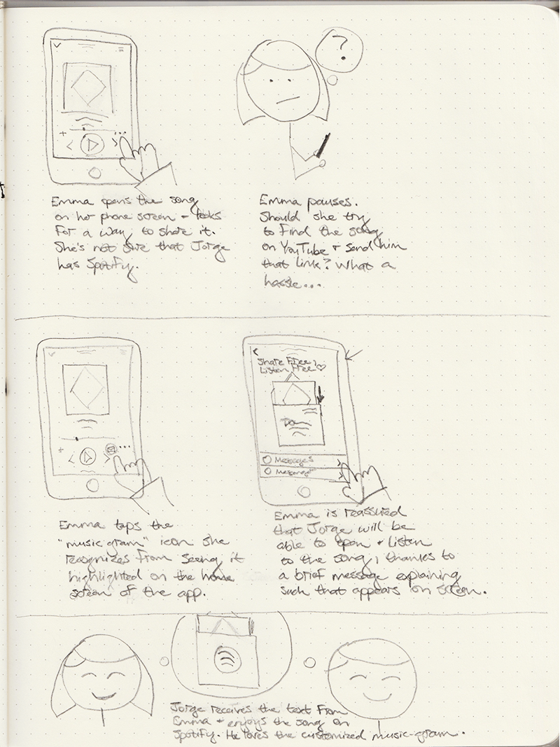
Storyboarding
To clarify the details and flow of the user's existing sharing scenario, I sketched out a storyboard. I identified a commonly expressed need (share music with a friend), behavior, and workaround (text a YouTube link) during my primary research. I storyboarded the user’s current experience, as well as a scenario in which a user could find a solution within the Spotify app instead of using the workaround.
User Journey Map
I also created a user journey map to trace a user's steps through the process of discovering and using a new music sharing feature within Spotify. Outlining the process in this way provided a deeper exploration of the actions, motivations, possible stumbling points, and potential outcomes of adding a new feature from a user's perspective.
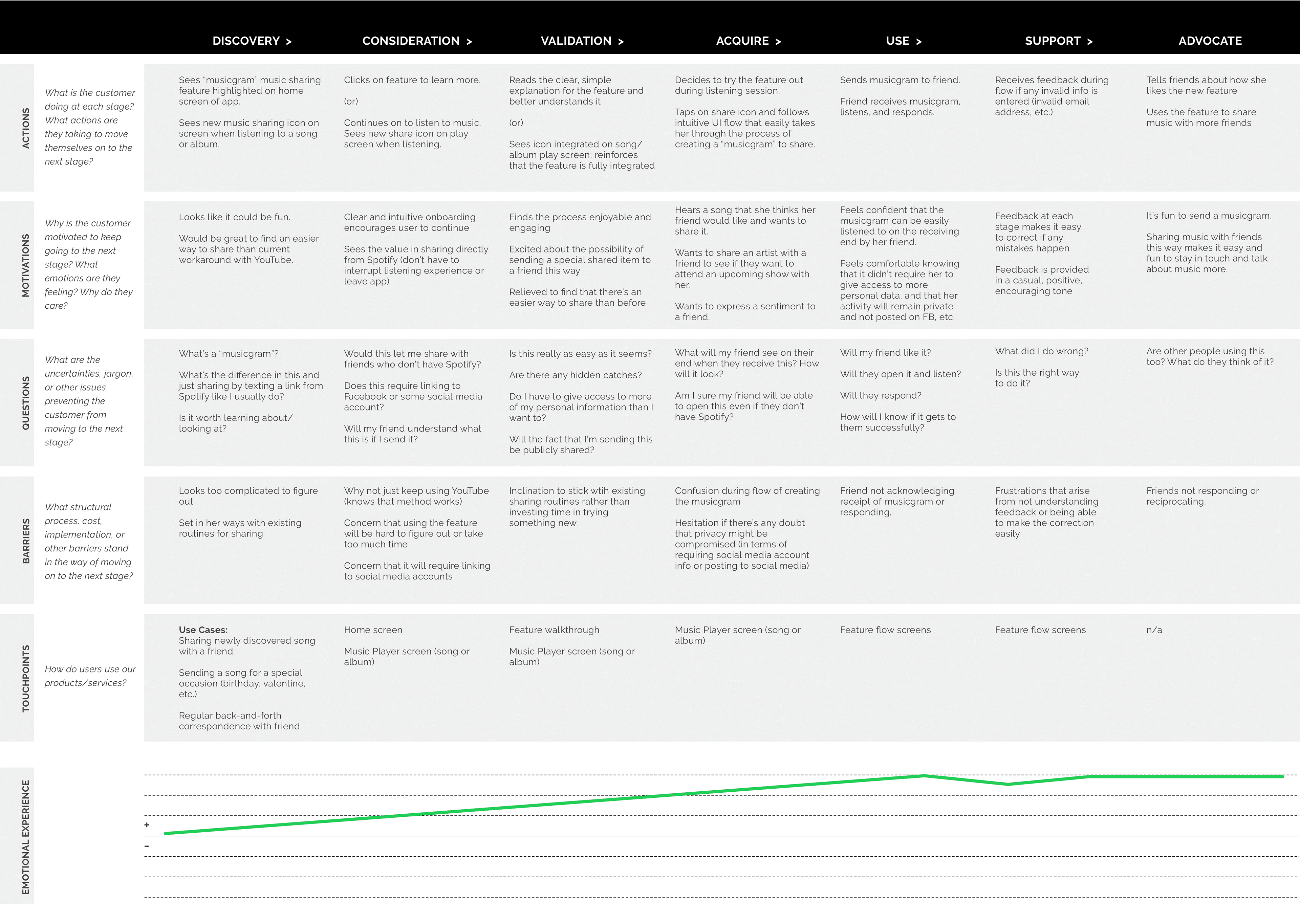
To be honest, I’d intended to use the storyboarding and journey map as tools to help consider the current experience of users as revealed in my research. When I found myself jumping ahead to ideation, however, I stepped back, to take a more methodical approach, and to establish a primary persona for the project.
Primary User Persona
Based on the insights and needs discovered through my primary research synthesis (including storyboarding and a user journey map), I established a primary user persona: Andrea Mir. Andrea enjoys connecting with individual friends via music, but she’s wary of social sharing apps that broadcast more information than she wants. She needs to feel that she’s in control of the information and activity she shares through social media.

Defining the Design Problem
With my primary persona established, I began crafting a set of "How Might We" questions to guide my design. Now I felt I was back on track. Reframing the insights and needs identified in my research allowed me to turn them into clearer invitations and challenges for design. At last, I was ready to move into ideation.
How might we help Andrea find a way to keep the conversation going when communicating one-on-one with friends about music, so the conversation doesn't stall?
Brainstorming + Ideation
I led a casual brainstorming session with 4 participants (and a few kid illustrators). We focused on two of “How Might We” questions. We then discussed and brainstormed further as a group. The opportunity for multiple perspectives from people new to the topic offered the chance to gather fresh ideas and play off each other's thoughts, creating a unique momentum.
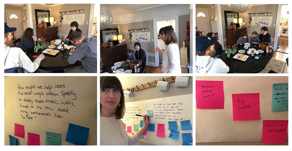
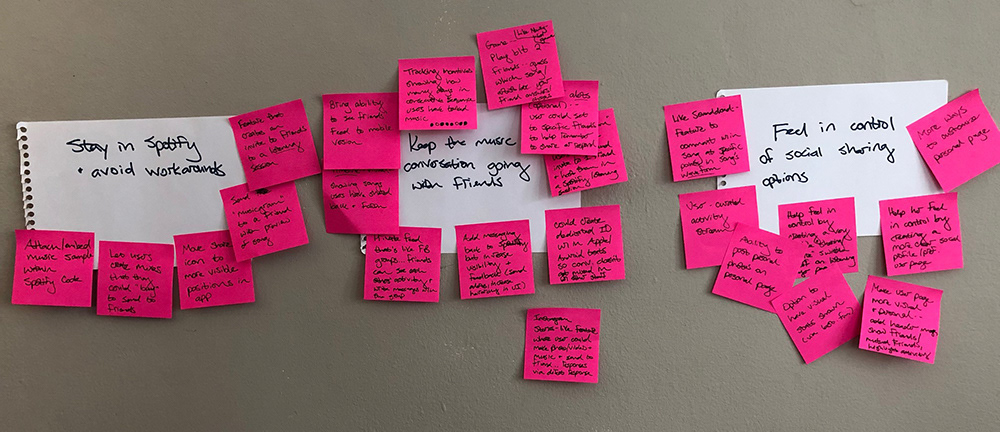
I I wanted to generate as many ideas as possible before determining which direction to pursue next, so I also conducted a solo brainstorming session following the group session. Again focusing on the HMW questions, I first came up with responses and quickly jotted them on post-its, which I put up in groups around each question. I then typed up the results and chose a few directions to sketch out as I considered how these ideas might play out within the Spotify mobile app.
Project Strategy
Tools used: PROJECT GOALS MAP, PRODUCT ROADMAP, APP MAP
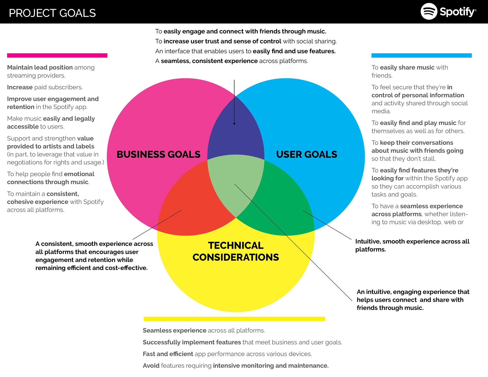
Comparing Business and User Goals
Moving into the next stage of defining the new feature for the Spotify app, I mapped the overlaps of business goals, user goals, and technical considerations. This helped keep the priorities of Spotify in view as I considered how best to design solutions that would satisfy Andrea’s goals as well.
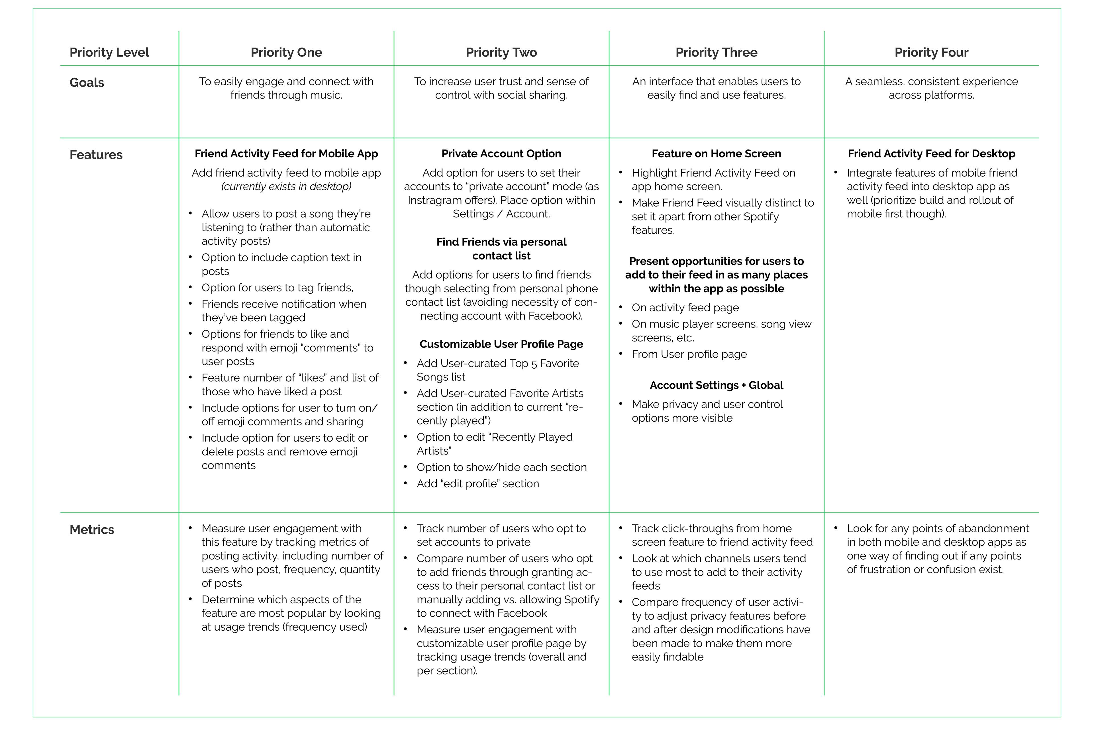
Product Roadmap
Noting the shared user and business goals, I looked back at ideas generated during brainstorming and determined which ones could be further developed into a social feature that would respond to the needs of both parties. I then outlined specific details for each and prioritized them.
App Map
Informed by the features and priorities outlined in my product roadmap, I created a revised app map for Spotify, showing how the new social feature would integrate within the existing architecture of the app.

INTERACTION DESIGN
Tools used: User flow map, sketching, wireframing in sketch, prototyping in invision
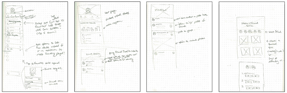
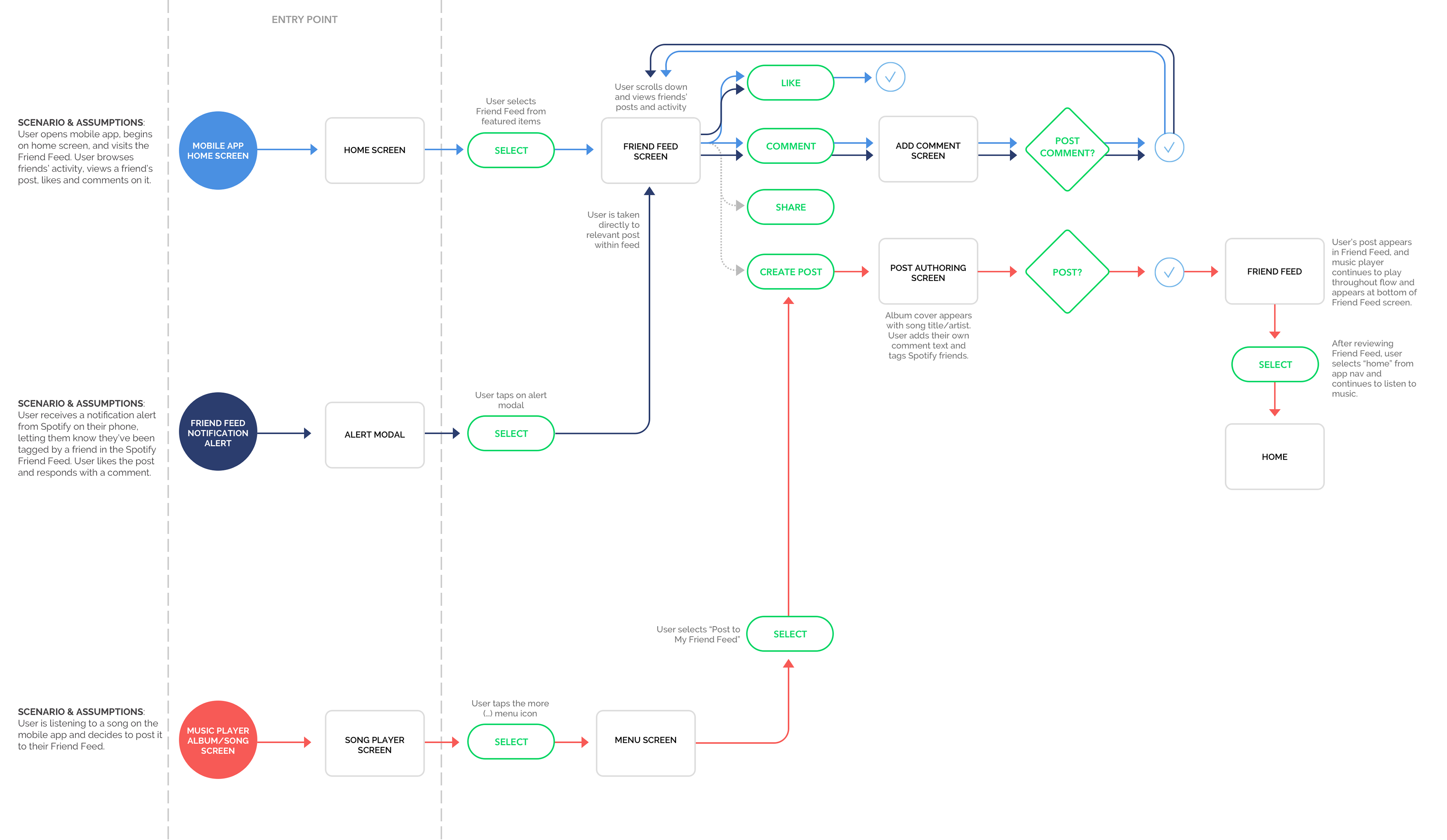
Referencing the site map, I thought through 3 scenarios, showing 3 possible ways a user might interact with the new Friend Feed feature. I sketched the flows first in pencil and paper, then rendered them in Sketch. Thinking through the flow for each of these tasks and scenarios helped me identify key screens to design for the prototype I planned to design and test.
UI Requirements
I then considered what details each screen should include, and outlined them in a UI requirements document. This document served as an outline and checklist for me as I designed the key screens for the user flows, and it conveyed the planned functions and design elements to project stakeholders. You can view the UI requirements list here >.
Wireframing
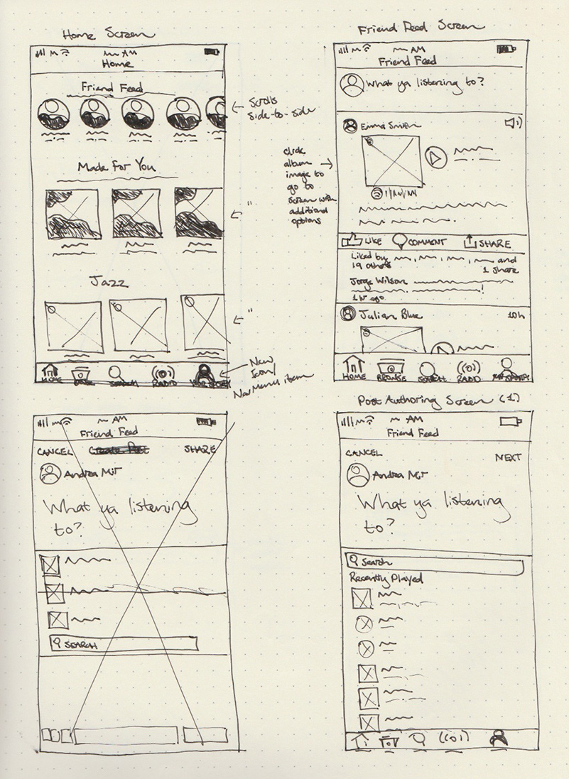
I created low-fidelity wireframe sketches of key frames within the user flows I’d mapped out. These sketches helped me think through the integration of the new feature and layout before moving into digital renderings.
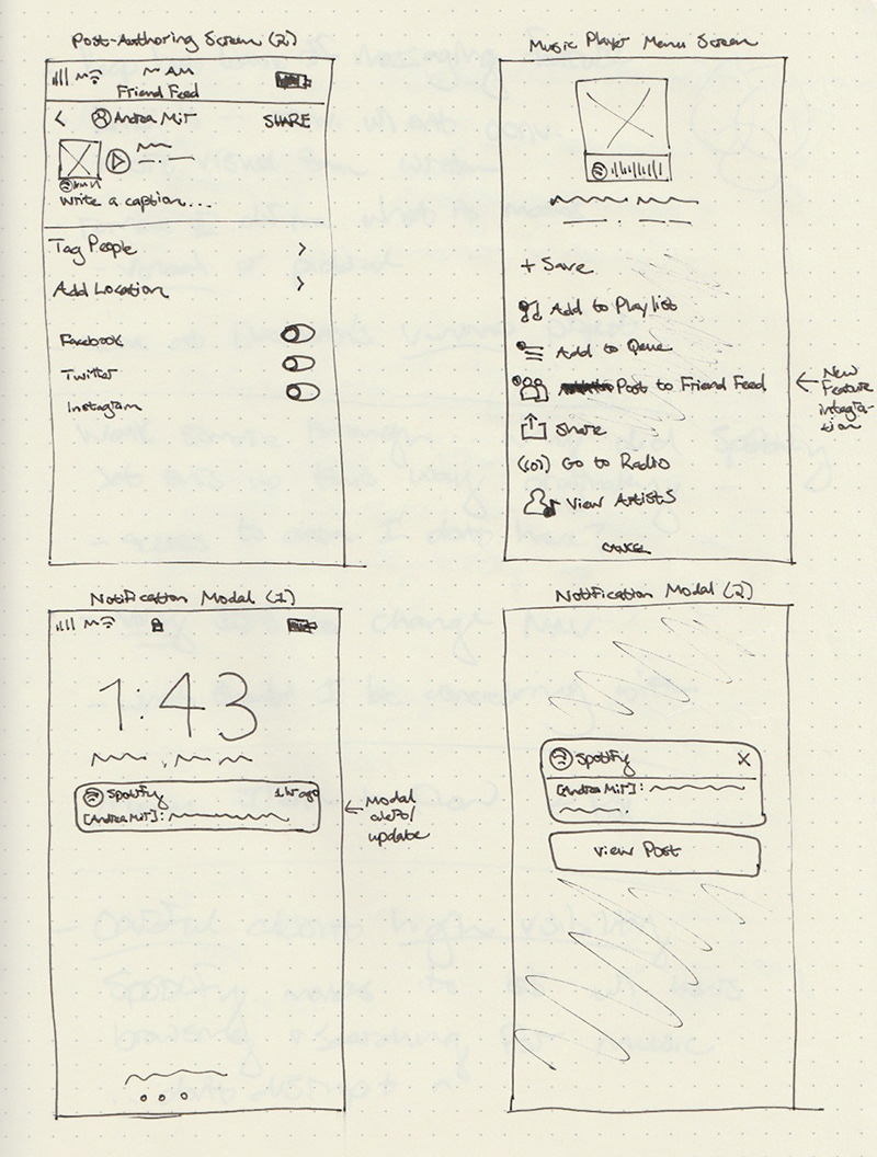
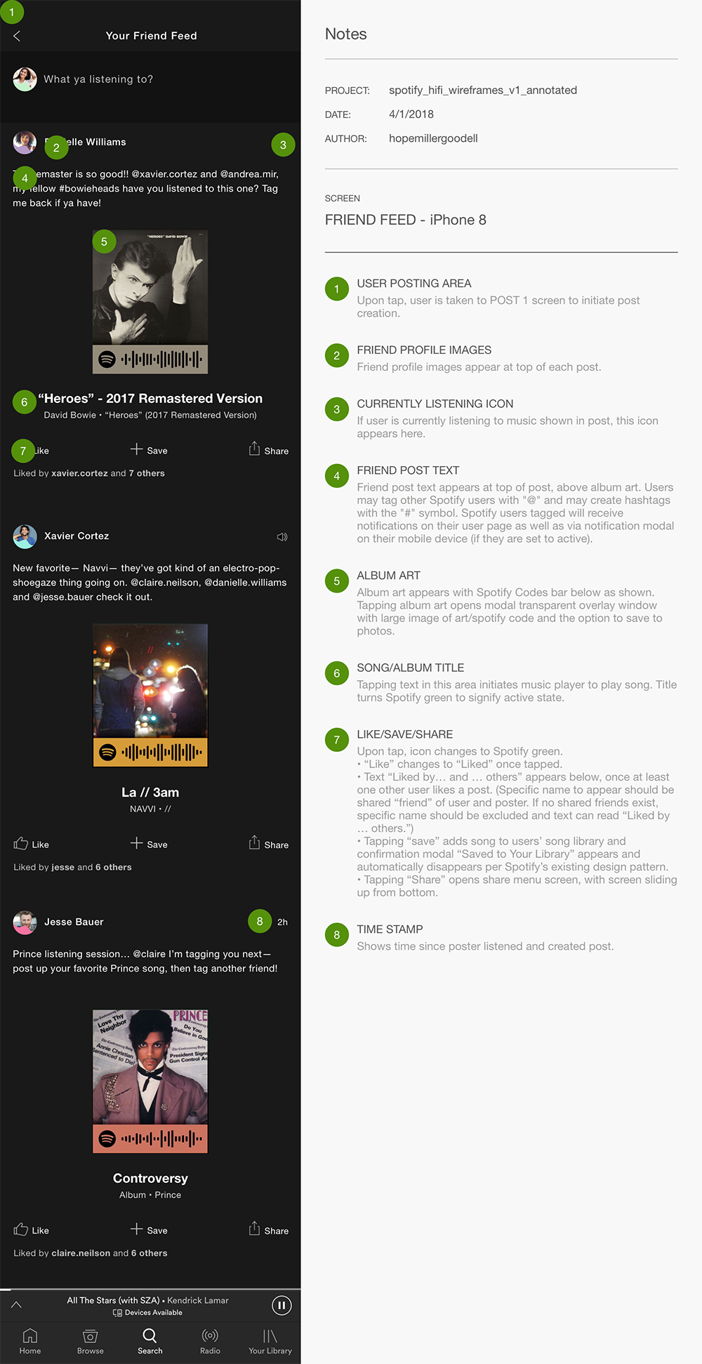
I then moved directly into creating high-fidelity wireframes since I was able to work with Spotify’s existing UI and I wanted to develop a prototype that would allow me to test users’ interactions with the new feature in a context as authentic as possible to the real experience of the app.
I included annotations for these wireframes to help create thorough documentation on how the new feature could integrate within the existing interface. Below is one of the screens and the accompanying notes.
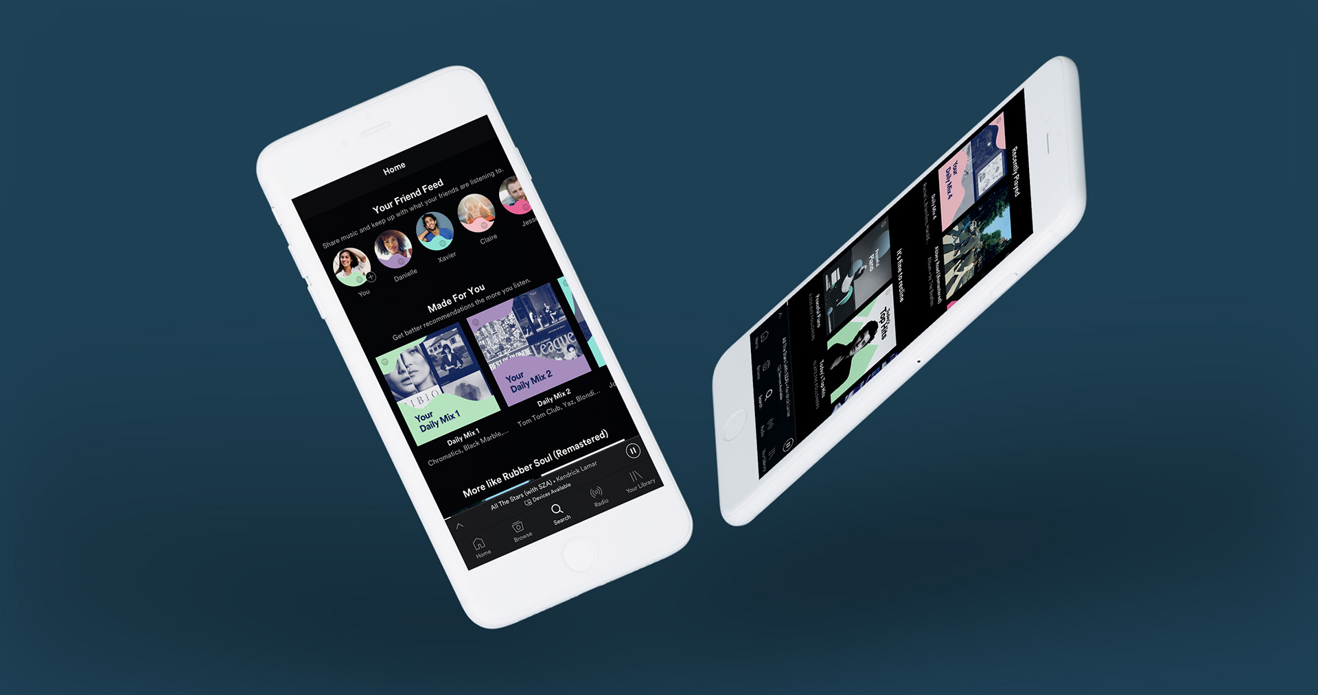
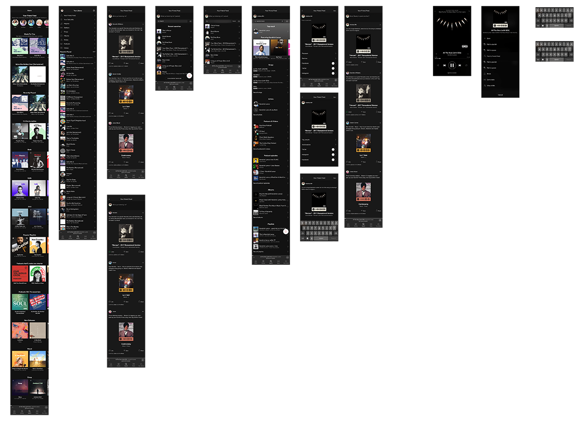
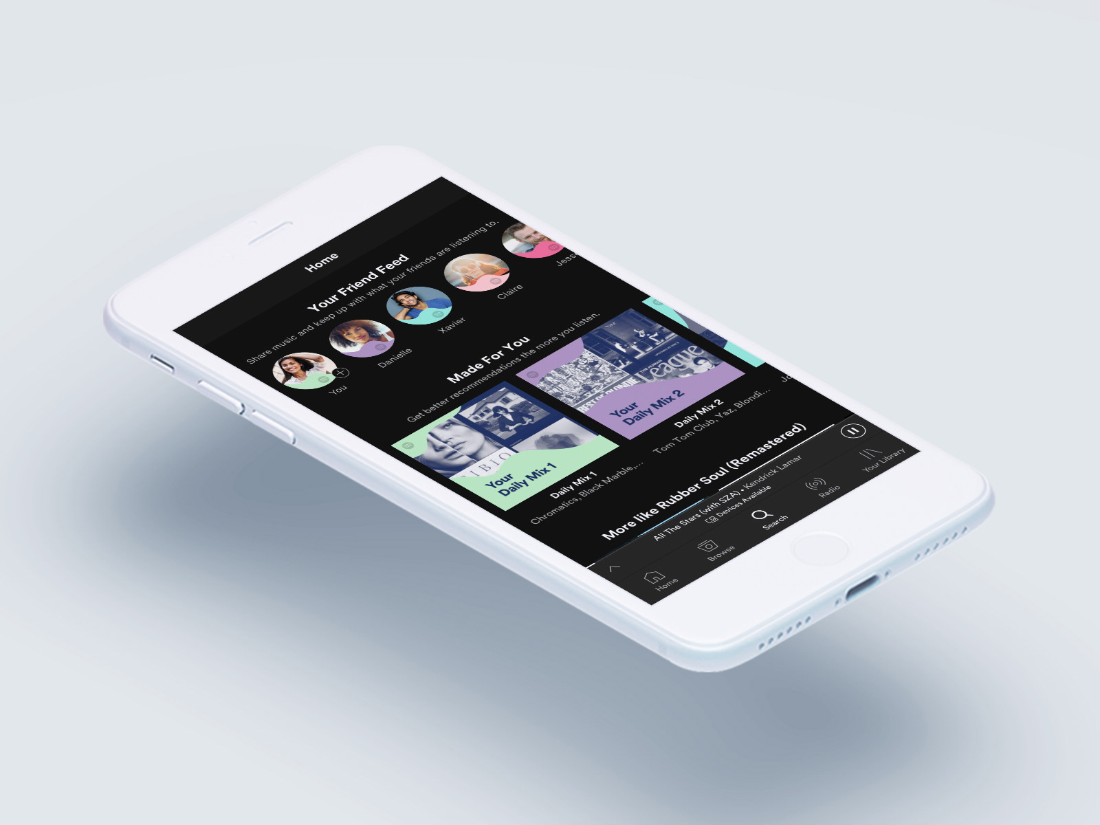
High-Fidelity Prototype
I brought my wireframes into InVision and created a high-fidelity prototype to share with users. Click around below to explore the new Friend Feed!
Usability Testing
Tools used: testing plan and script, invision prototype, AFFINITY MAP
I developed a usability testing plan to outline my test objectives, goals and procedures. You can see the full plan here >. I asked participants to navigate through the prototype with the goal of completing three tasks according to the scenarios I provided. I wanted to find out if they could navigate to the feature and create their own posts. I observed and took notes as they moved through the app.
Scenario 1:
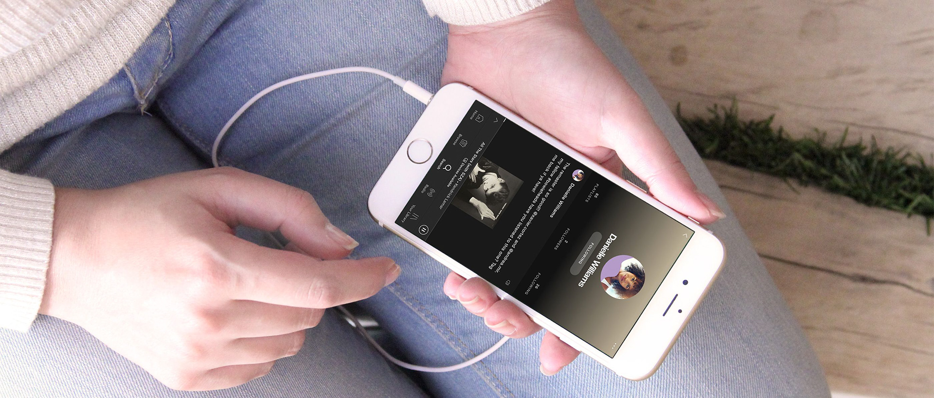
You open up your Spotify on your phone and notice there’s a new social sharing feature called “Your Friend Feed.” You decide to check it out. Please navigate to the feature and “like” the post from your friend Danielle.
Scenario 2:
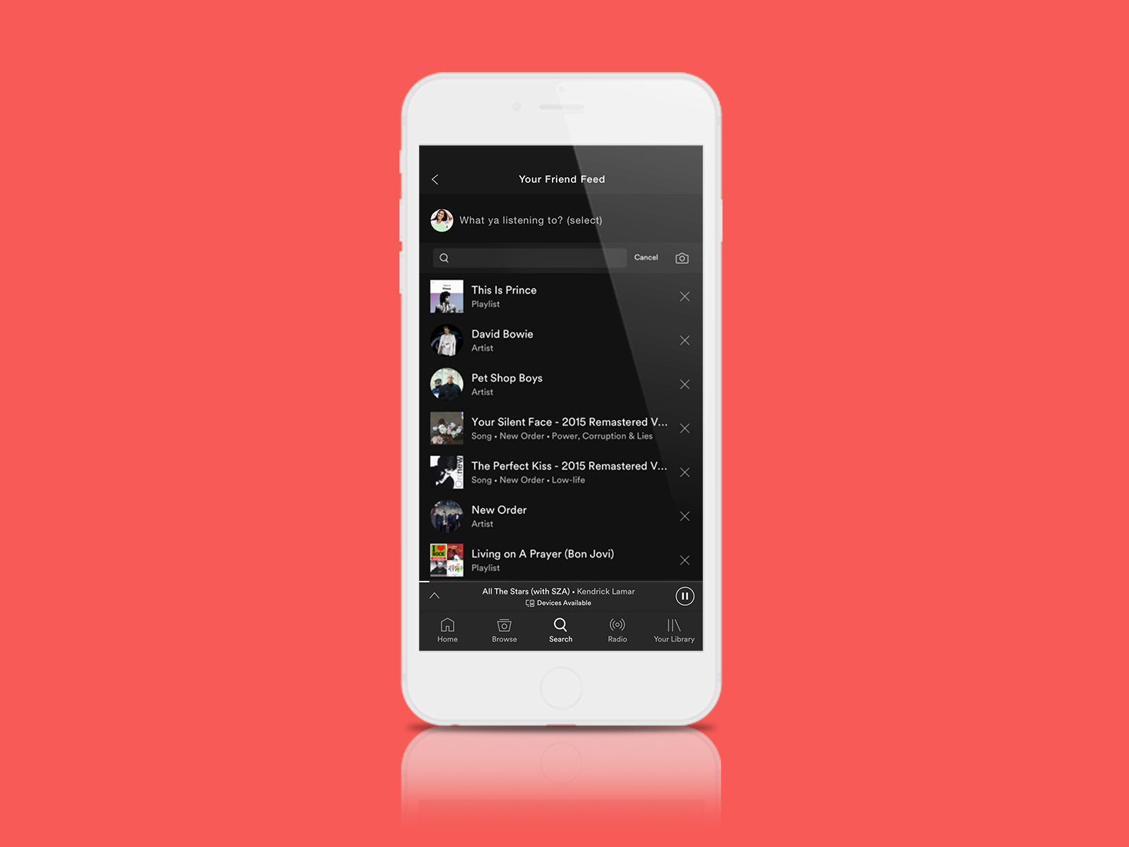
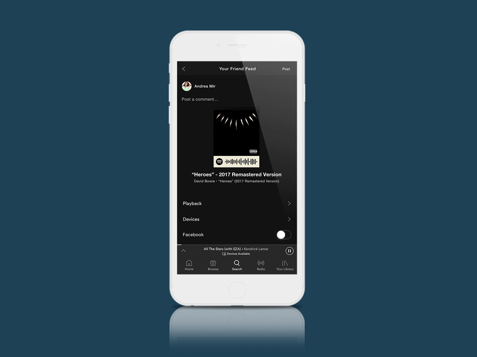
From the same screen (Friend Feed), you decide you’d like to create a post of your own. Please go through the process of creating a post. Specifically, please post about Kendrick Lamar’s “All The Stars.”
Scenario 3:
Say you’re listening to the song “All The Stars” as shown on the player at the bottom of the screen. You want to create a post about it and decide to do so directly from the song player’s full screen. Please pull up that screen and create a post to Your Friend Feed about the song from there.
Overall, the flow and hierarchy of the app met user expectations in terms of fitting within the Spotify mobile app design. The users I tested liked the idea of the app and were able to navigate through it and accomplish tasks successfully. However, there were a few points that caused confusion and didn’t meet user expectations and offer opportunities for improvement.
“This feels like it could be part of Spotify… it seems like something they might really add.” “Oh… hmm. I thought it would be only be Danielle’s page when I clicked on her image…” “I’d definitely use a feature like this. I’d want to check out certain friends’ pages and see what they’re listening to.”
Insights + Recommendations
Referring to the notes taken during user testing, I created post-its with observations and notes for each test subject, I looked for patterns and trends and sorted accordingly. I then created an affinity map as a way of translating my observations to insights and recommendations.
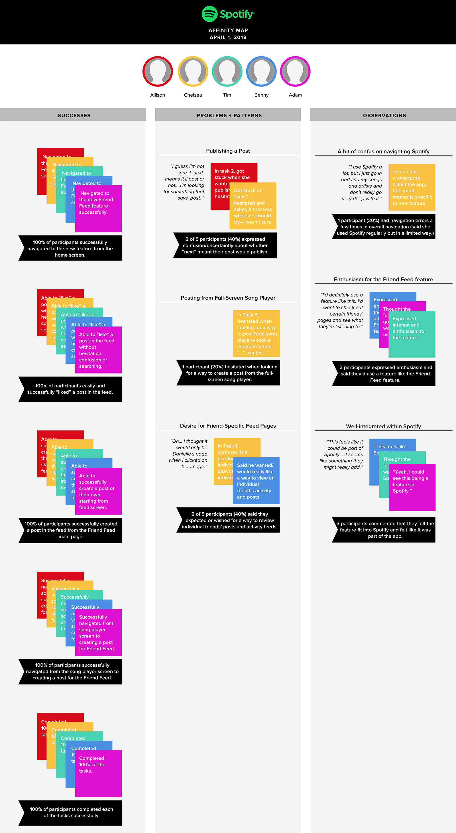
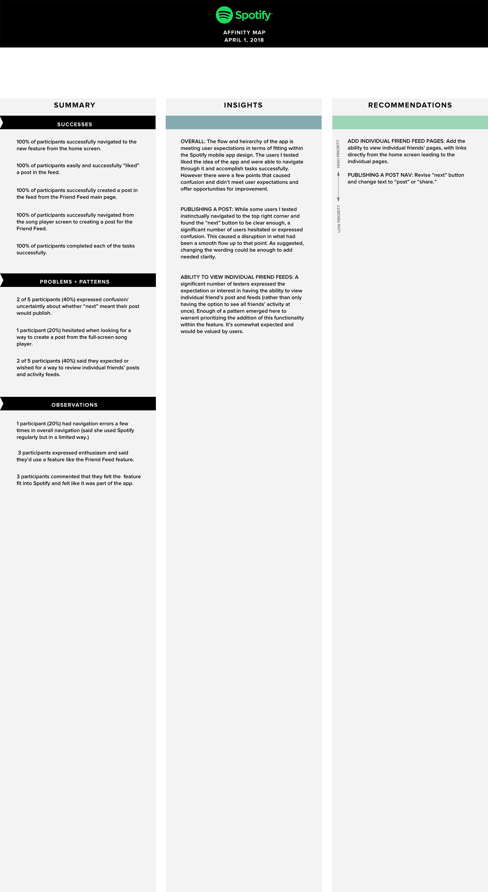
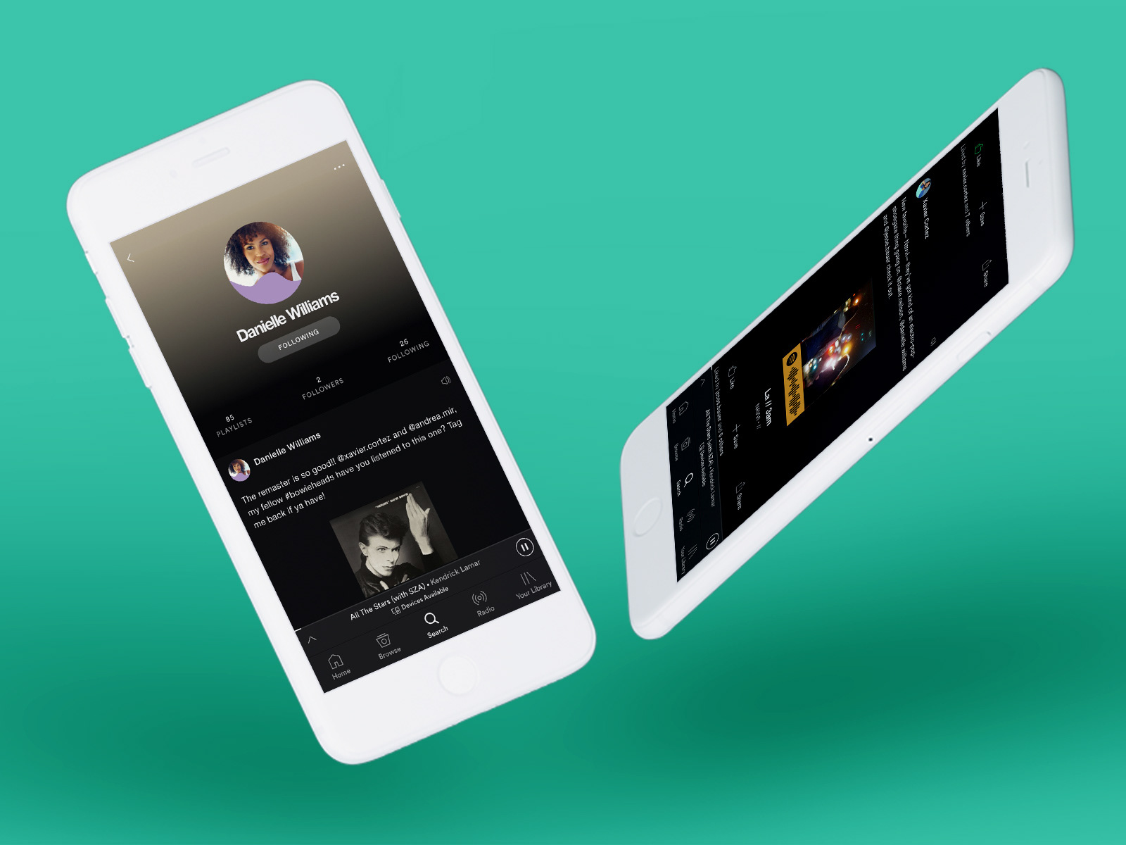
Since a significant number of testers expressed the expectation or interest in having the ability to view individual friend’s post and feeds, I prioritized adding the ability to view friends’ profile pages, with links directly from the home screen leading to the individual pages. This was a feature included in the product roadmap, and the clear demand/expectation for it was reinforced during user testing. (Note that the prototype above includes the revisions that were made following user testing).
UI DESIGN
Tools used: moodboard, style GUIDE, Ui kit
Visual Direction
Spotify's visual design is well-established. So in creating a moodboard, I thought specifically about how the new feature would fit within the existing visual design of the Spotify app. This allowed me to focus on specific influences and goals for the feature design.
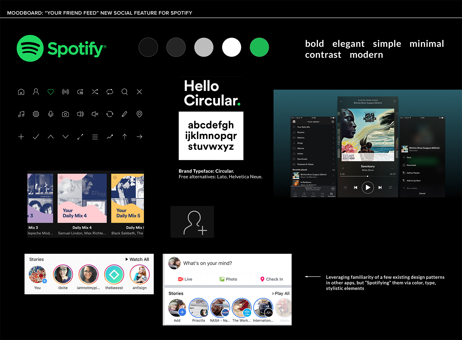
Pulling from Spotify's branding guidelines, I created a style guide from their existing color palette, type, and styles, adding new elements as needed specific to the Friend Feed feature.
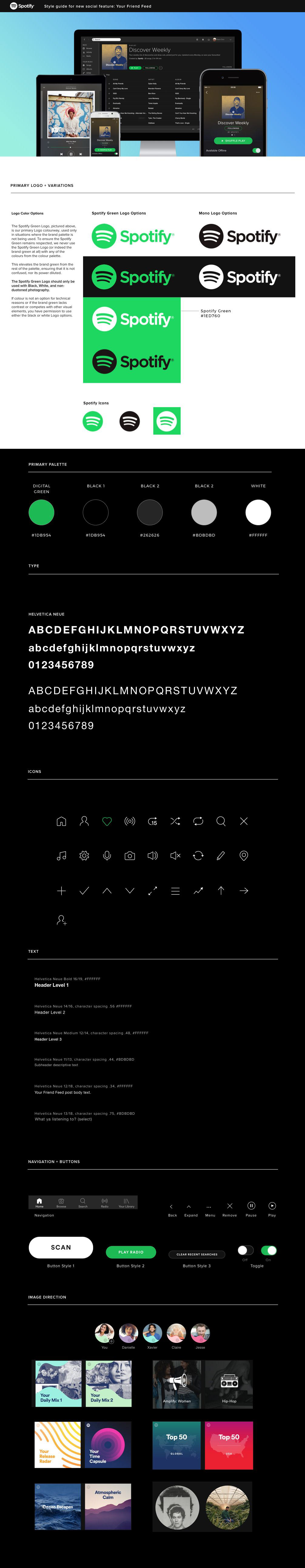
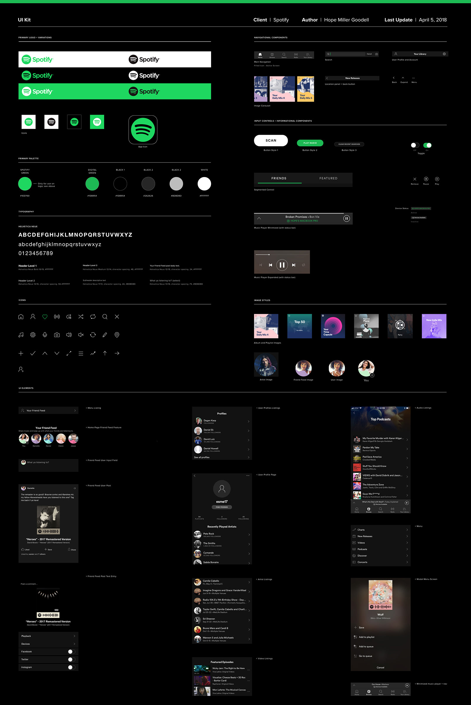
I also assembled a UI kit, drawing upon existing Spotify styles and UI elements and adding new styles and elements specific to the Your Friend Feed feature. This provided an opportunity to audit styles, design patterns, and UI elements to review for consistency and efficiency.
Iteration
As noted above, based on the recommendations in my affinity map I added a User Profile page to the Friend Feed flow and implemented a few other small changes.
PROJECT Takeaways
Working to improve an existing product by identifying and designing a new feature was an exercise in finding creative solutions within a specific set of constraints. I felt a deep responsibility to become thoroughly acquainted with Spotify before trying to introduce anything new. In my research, I tried to learn as much as possible about the company’s priorities and where they’d already been in terms of offering social features. I gave much thought to the fact that Spotify had decided to end their social messaging feature. While they cited low use, I wondered if it might also have to do with the fact that social messaging features require a great amount of resources in order to monitor and maintain them.
It has become increasingly apparent that social features of apps can take on a life of their own and be leveraged in ways hard to anticipate by those who create and manage them. As such, the Friend Feed feature was intentionally limited and minimal in certain aspects. I wanted to find a way to allow users to create posts and connect with friends on an individual level without creating the responsibility of monitoring comment threads.
Next Steps
With more time, I’d like to tackle additional features outlined in my product roadmap, particularly the expansion of the Friend Feed to Spotify’s desktop app. And I’d love to spend some time working out the nuances of how to offer users options for controlling their preferred level of privacy, since one of the strongest themes that emerged from my primary research involved the desire to feel in control of one’s information and activity shared through social media.