

Case Study: The Able Baker
RESEARCH + DISCOVERY | DEFINE | IDEATION + STRATEGY | PROTOTYPE | TEST | ITERATE
ROLE: Lead UX+UI Designer (RESEARCH, INTERACTION DESIGN, VISUAL DESIGN)
CLIENT: The Able Baker (Concept Design)
TIMELINE: 80 hours over 4 weeks
TIMELINE: 80 hours over 4 weeks
THE CHALLENGE
Help a popular local bakery improve their site usability and update their online presence while maintaining and expanding upon current branding.
THE OUTCOME
An all-new responsive website design concept which makes it easier for customers to find information, contact the bakery to place orders, and feel connected to the bakery's role in the community.BACKGROUND
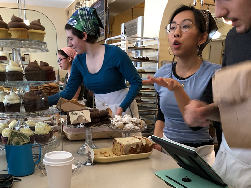
The Able Baker, located in Maplewood, NJ, is a local bakery and cafe. Over the past decade, it's grown from a home-based venture with a staff of 2 to a beloved town destination with a staff of 30. The bakery's current website was created by the owners when they first began. It's difficult to find some key information on the site, and site hierarchy is confusing. In terms of social media, the bakery maintains an active Instagram account to feature their current offerings and creations. Their branding is well-established and needs to be kept.
RESEARCH + DISCOVERY
Tools used: MARKET TREND analysis, competitive analysis, SITE AUDIT, PROVISIONAL PERSONAS, CONTEXTUAL INQUIRY
Market & Industry Research
I began my research for this project with a quick secondary scan of market trends, which helped me contextualize The Able Baker's situation. What I learned:
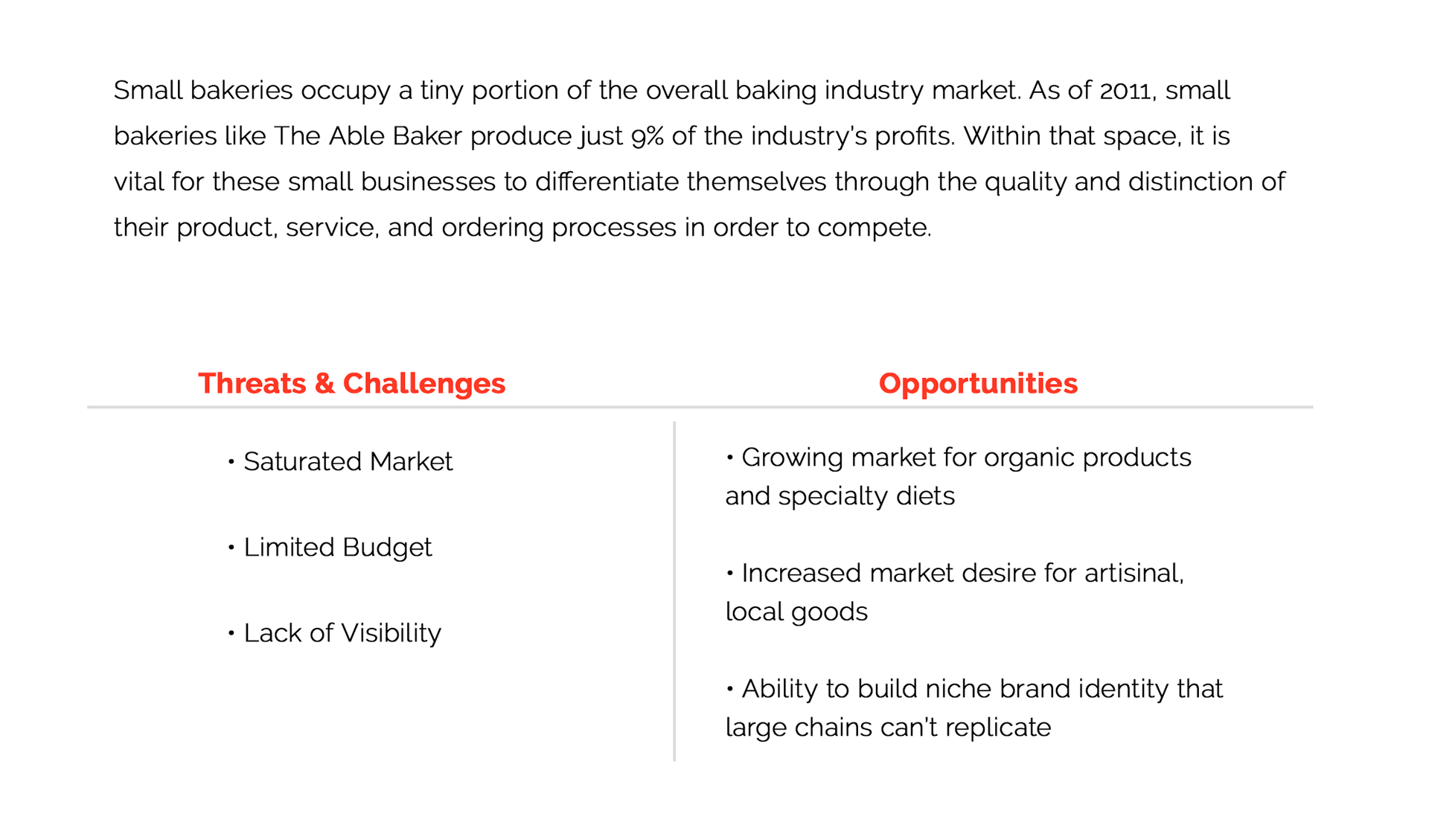
The Able Baker occupies a tight market for sure. To get a more specific sense of what the local competition is like, I reviewed websites and Yelp reviews of other bakeries to identify the strengths and weaknesses of competitors in town, as well as considering indirect competitors like Starbucks and Whole Foods. (You can find the summary of my secondary research including the competitive analysis here >.)
Site Audit
In addition to looking at competitors, I conducted a quick site audit of The Able Baker's current website to help familiarize myself with its content, visual style, hierarchy and usability. The idiosyncrasies of the site's design seem to serve as a testament to the bakery's growth and evolution, with certain pages buried within the navigation of select others, and lots of visual inconsistencies. That said, the warmth and personality of the business does come through (something important to maintain in the new site design).

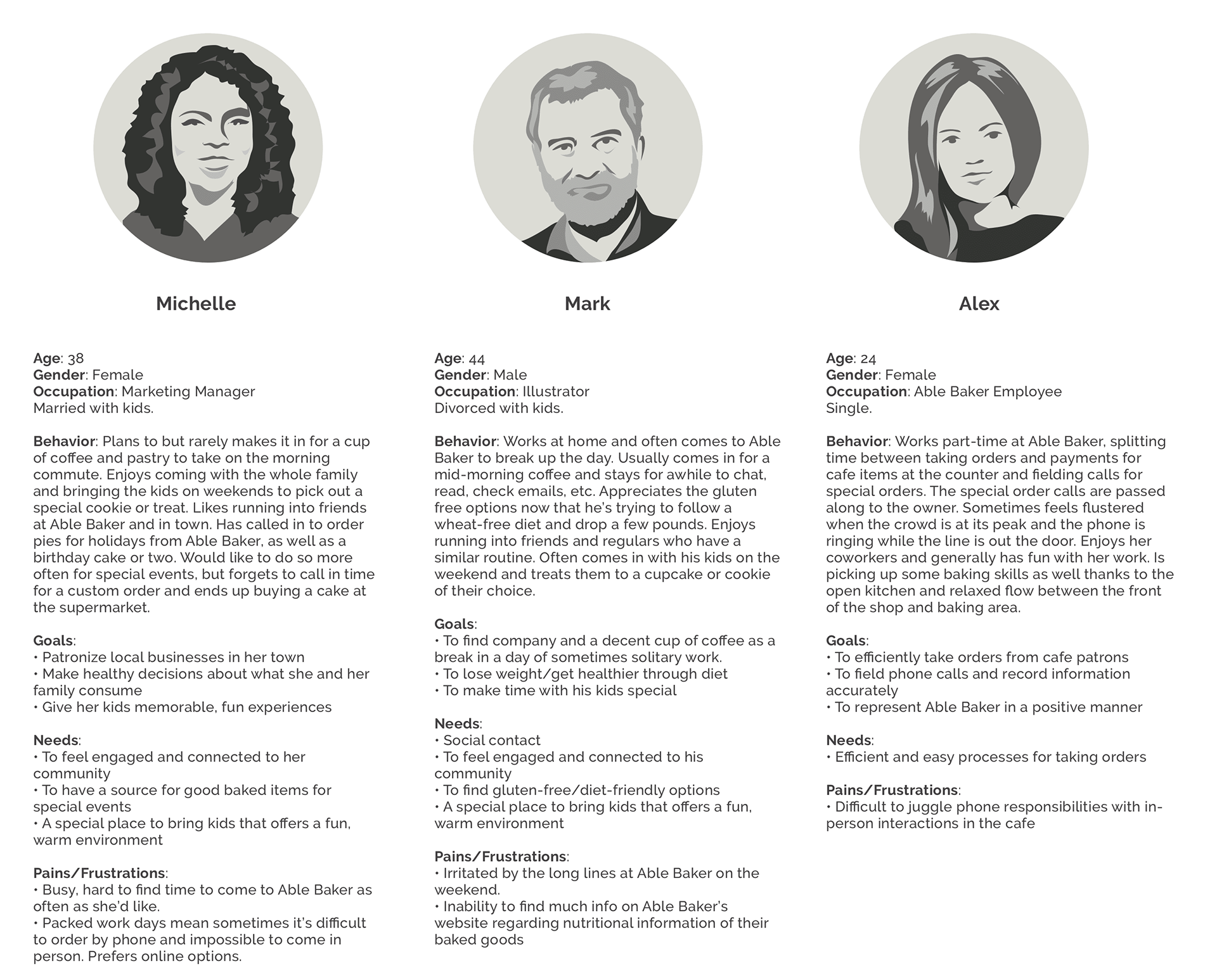
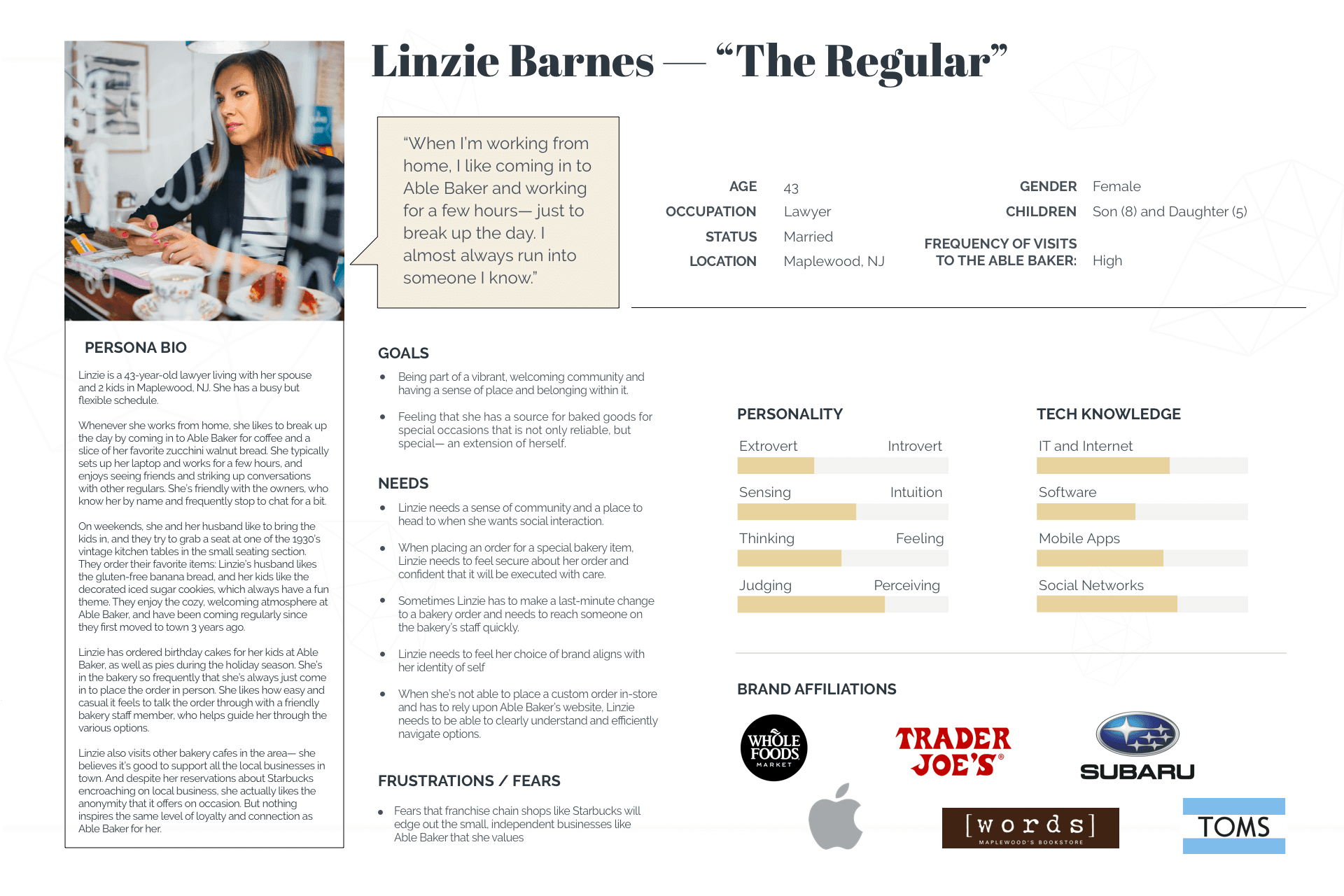
Provisional Personas
Guided by my secondary research, I based each persona around behavioral patterns. I created provisional personas to begin thinking about who might make up The Able Baker's customer base. These rough sketch personas helped bring focus to my contextual inquiry questions and allowed me to have a starting point for testing my hypotheses and assumptions regarding the goals, needs and frustrations of users.
Contextual Inquiry
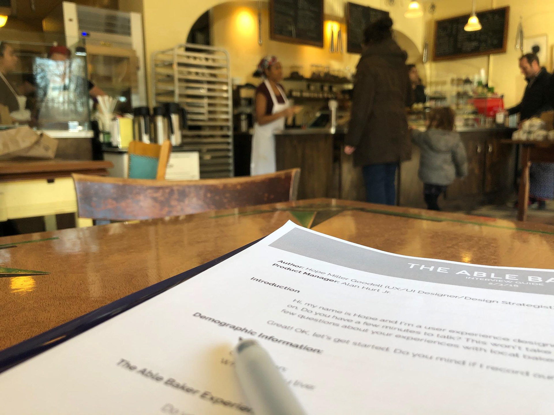
Informed by my secondary research, I developed a list of questions and an interview guide to structure my contextual inquiry. On a busy Saturday morning and early afternoon, I sat at a table in The Able Baker. Armed with my coffee and scone (not a bad gig!), I struck up conversation with people and persuaded them to talk to me for few minutes about their experiences with The Able Baker, other local bakeries in town, and bakery special orders. During the interviews, I recorded the audio of each and took notes as I asked questions and observed. You can find my interview guide here >.
Assumption i hoped to to validate or disprove:
1) Customers are busy and find it difficult to come to The Able Baker as frequently as they might wish.
2) Some customers might find placing a special bakery order by phone or in person inconvenient.
3) Customers value The Able Baker for the social aspect of the cafe.
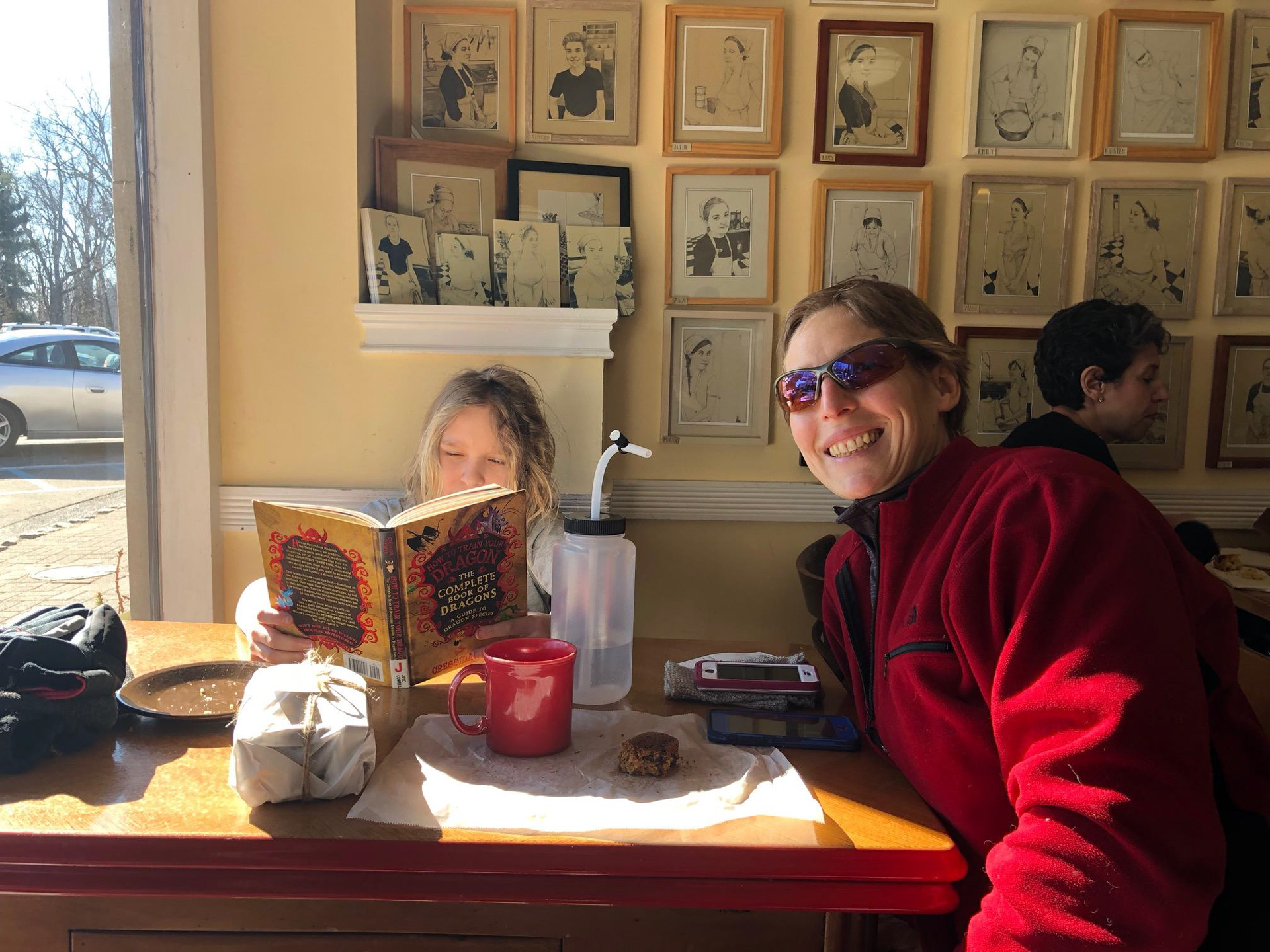
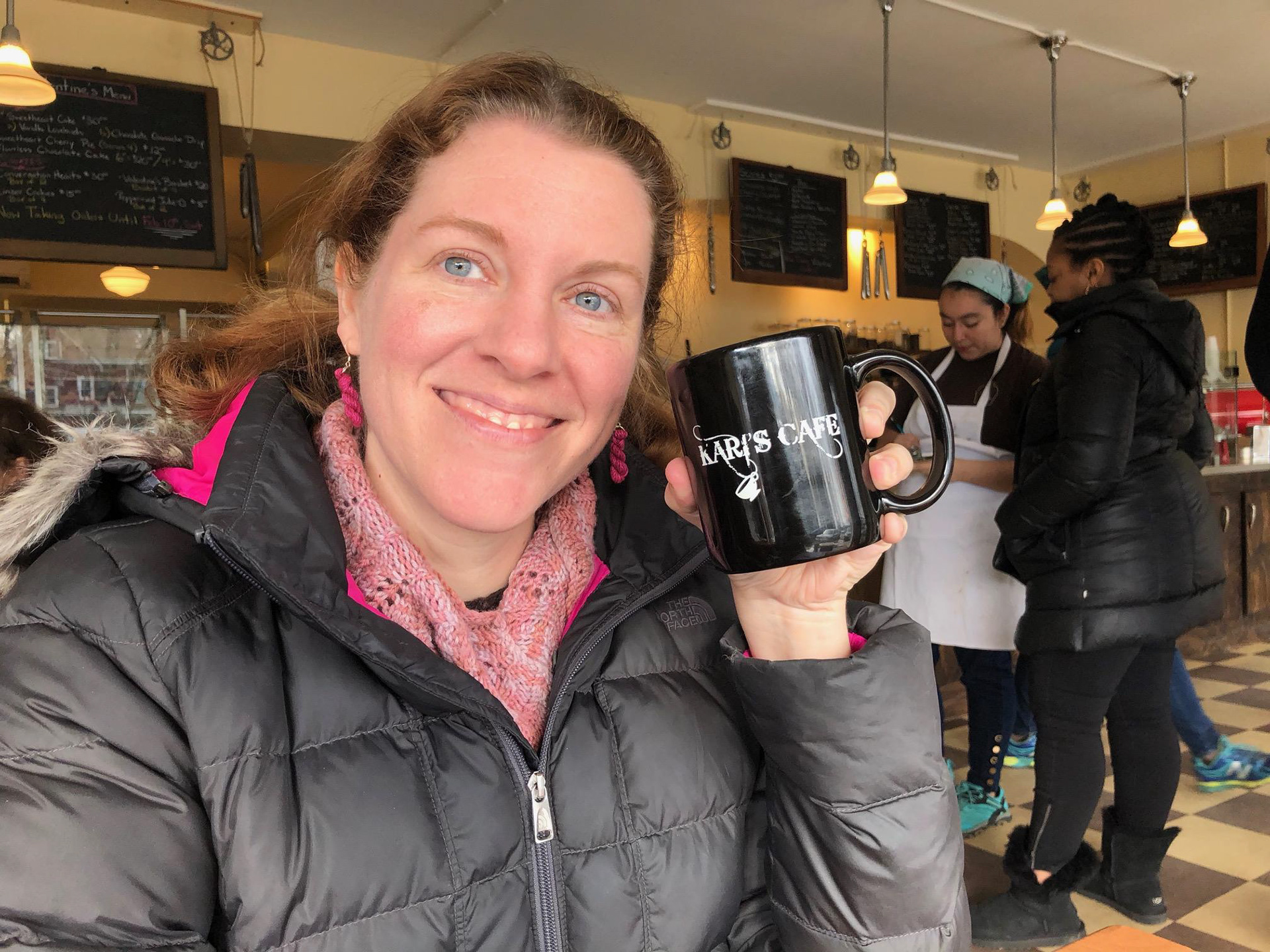
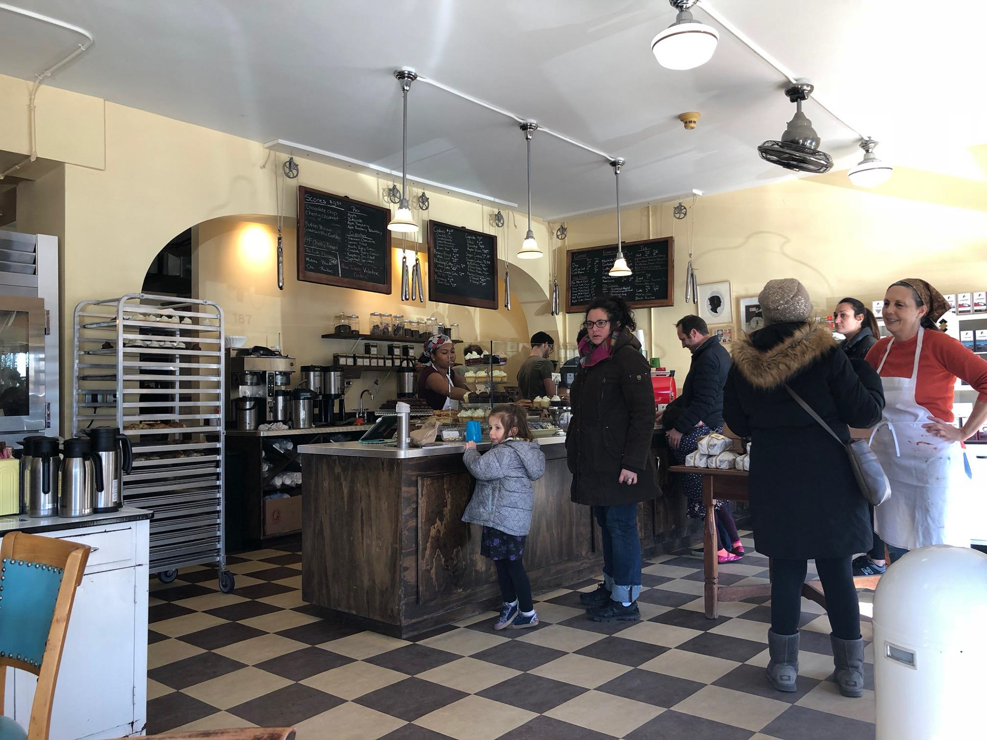
"I come just to get out of the house for awhile... I'll come and work for a few hours." "I'd take a first date here... I wouldn't take one to Starbucks. It's just... special here. This place is very special." “I mean, I've tried other bakeries around here but they're not as good." "I come here so often, they keep my mug here!" “It's so social. I always run into somebody I know here." "I like knowing the owners, knowing their story."

Synthesis + Defining
Tools used: empathy map, primary persona, POV + HMW STATEMENTS, BRAINSTORMING
Uncovering Insights + Identifying Needs
Following the interviews, I created an empathy map to synthesize the information gathered during my contextual inquiry. I looked for patterns, similarities, and contrasts in order to uncover insights from my observations and move towards identifying implicit user needs.

Key Insights
Able Baker’s in-store experience accounts for a large part of their brand and is central to their customers’ feelings of loyalty. The warm atmosphere and nostalgic aesthetic draw people to the bakery. Several participants emphasized the importance of The Able Baker as a social hub— a special place to find community, see friends, talk to and interact with others. This was at the core of why they valued this particular bakery over others.
RECALIBRATING
I’d assumed that at least some of my participants would find the process of placing a custom order in person or by phone inconvenient or frustrating, but the results of my research challenged that assumption. This led me to question whether potential or existing customers who might express frustration with Able Baker’s lack of online custom order intake might not be found in the cafe (perhaps because their schedules don’t leave time for them to be there). With more time, I would want to pursue this question further by reaching out for a second round of research to people in the community.
For now, I'd gained valuable insights into The Able Baker's "superuser" customer base: people very loyal to the bakery who serve as defacto brand ambassadors. Designing a site that aligns with their user needs and priorities provided a strong foundation for the brand as presented in the new site design.
The needs of the primary user persona that emerged from my research were less logistical than I'd anticipated. Linzie cares most about having a local place that feels like her own-- one where she feels welcome, runs into people she knows, and feels at ease about how the identity of the place fits into her own sense of identity. She wants service to be personal, easy, and reliable.
Defining the Design Problem
With my primary persona established, I moved into translating the insights and needs of Linzie into defined Point of View statements, then crafting a set of "How Might We" questions to guide my design.
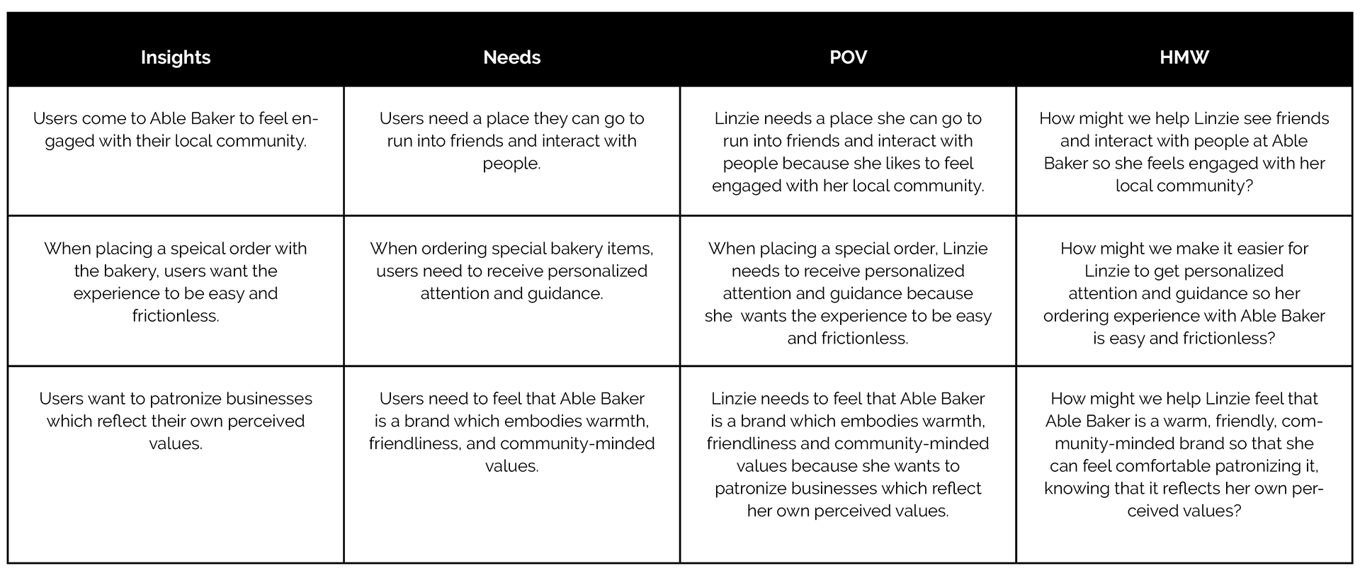
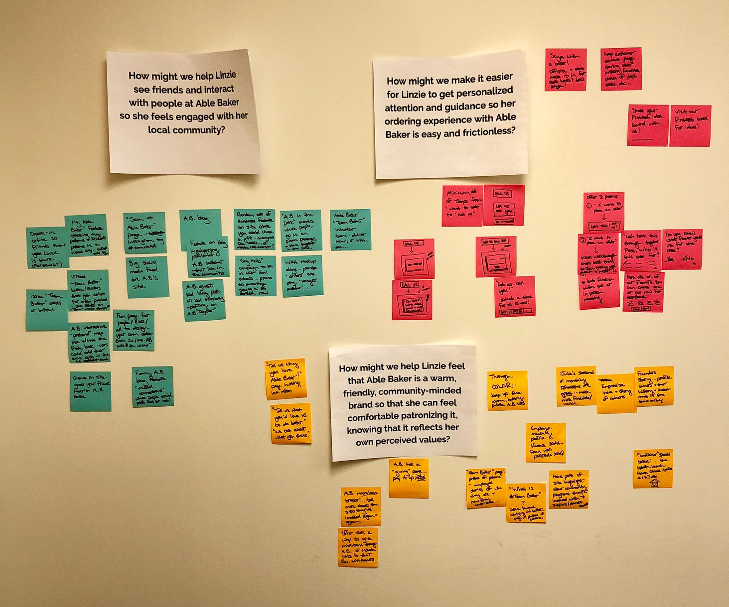
How might we help Linzie feel that The Able Baker is a warm, friendly, community-minded brand so that she can feel comfortable patronizing it, knowing that it reflects her own perceived values?
Brainstorming + Ideation
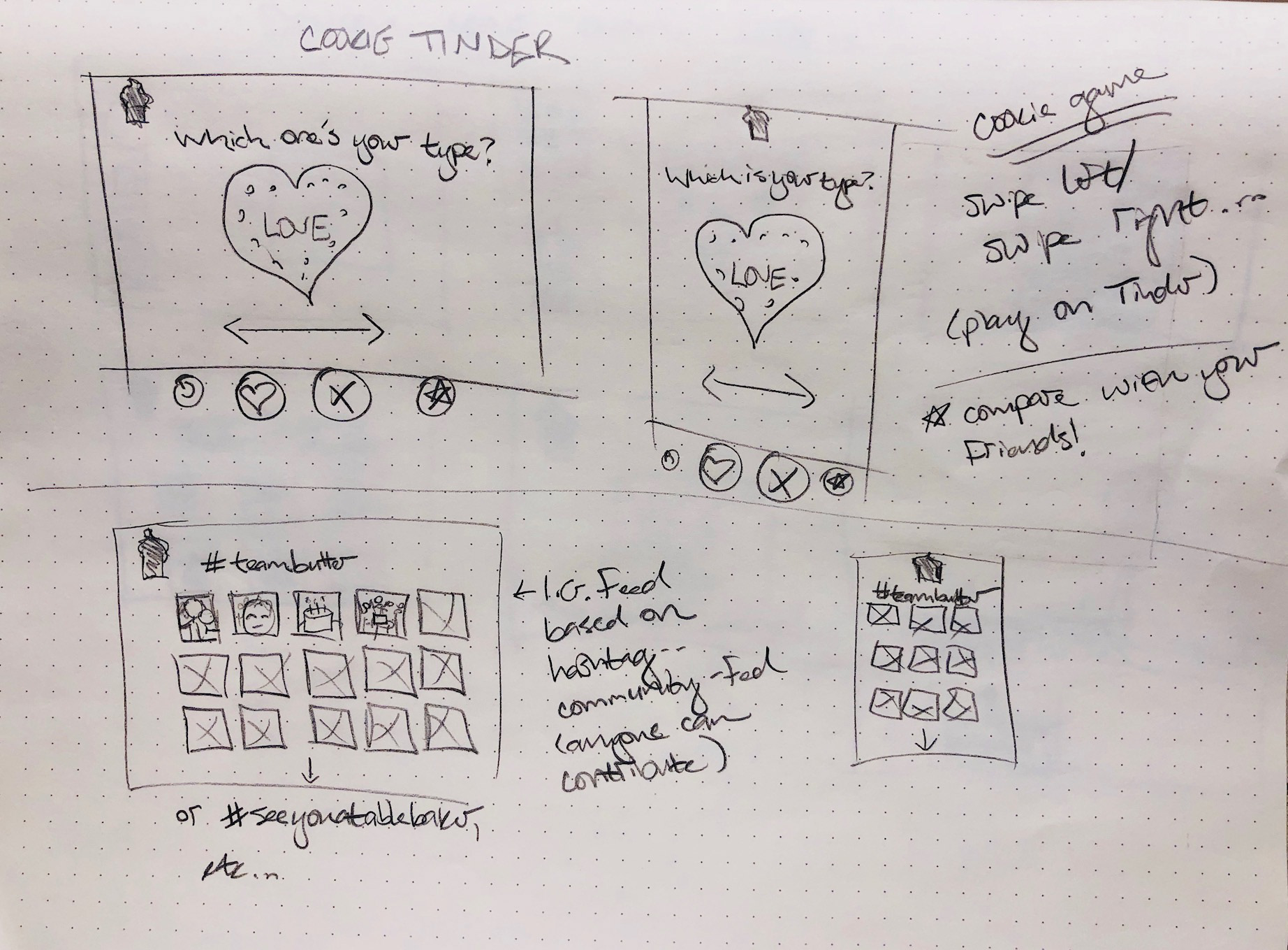
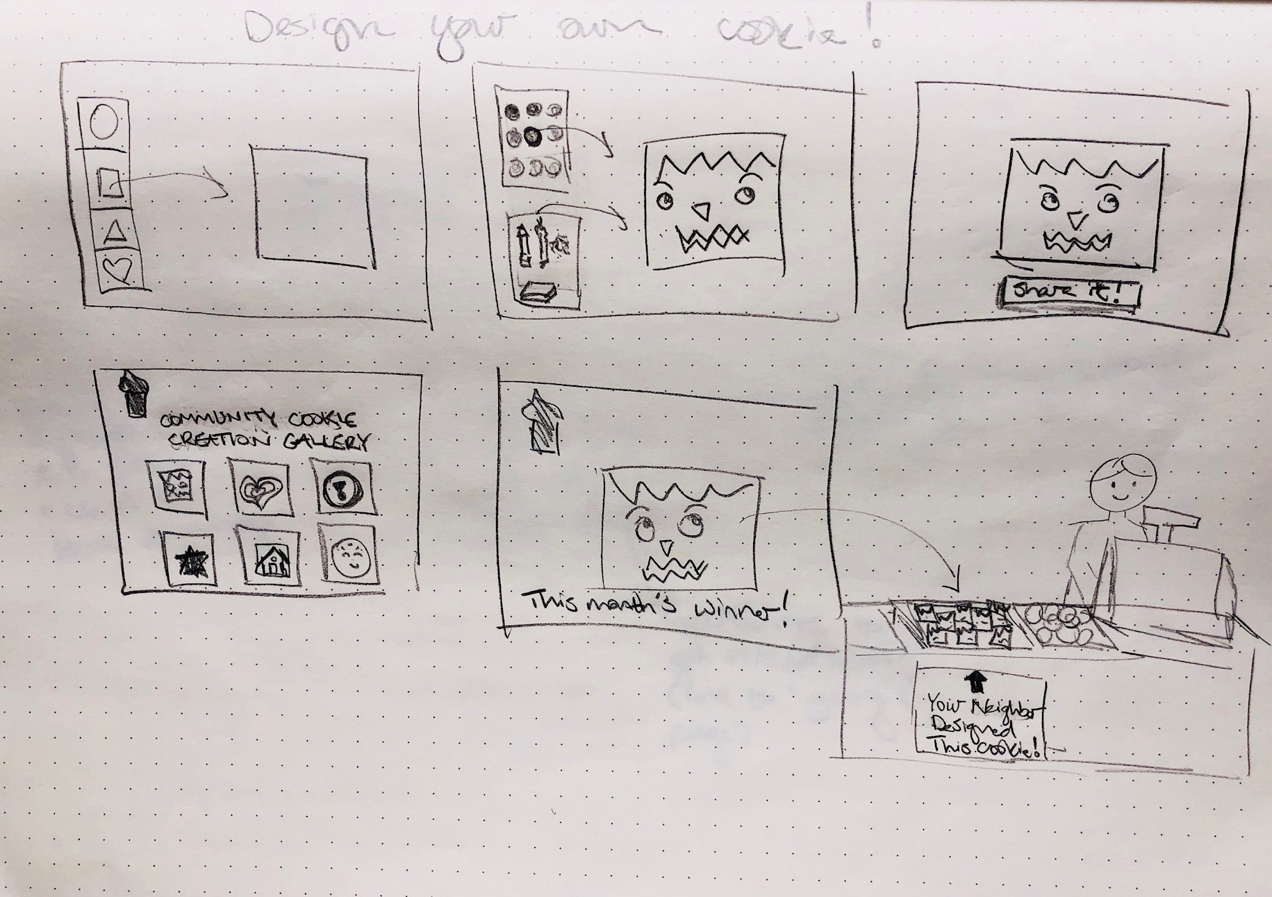
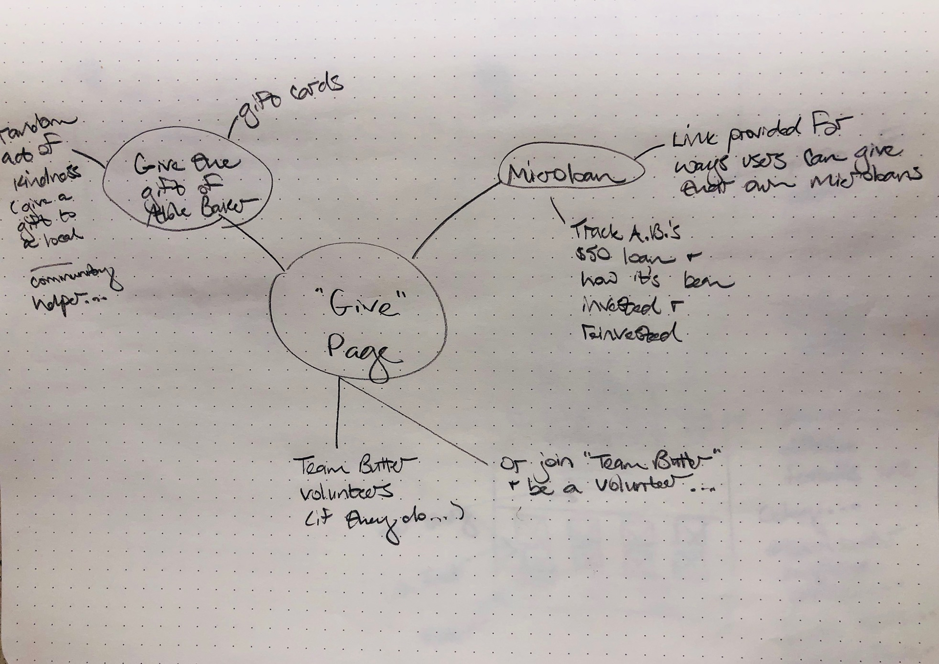
I posted large printouts of my HMW questions on the wall, then generated as many ideas as possible. I grouped them by theme and relationship and then moved into sketching, creating quick, rough sketches to expand on some of the ideas further. I wanted to generate lots of ideas quickly in order to create lots of options which I could then review, sort out, and refine.

Project Strategy
Tools used: PROJECT GOALS MAPPING, PRODUCT ROADMAP, SITE MAPPING
Comparing Business and User Goals
Moving into the next stage of defining the product, I mapped the overlaps of business goals, user goals, and technical considerations. I'd talked with Julie, the owner of The Able Baker, and gathered a good deal of information about her priorities and goals for the bakery. I combined that information with data from my secondary research to articulate the business goals in the diagram.
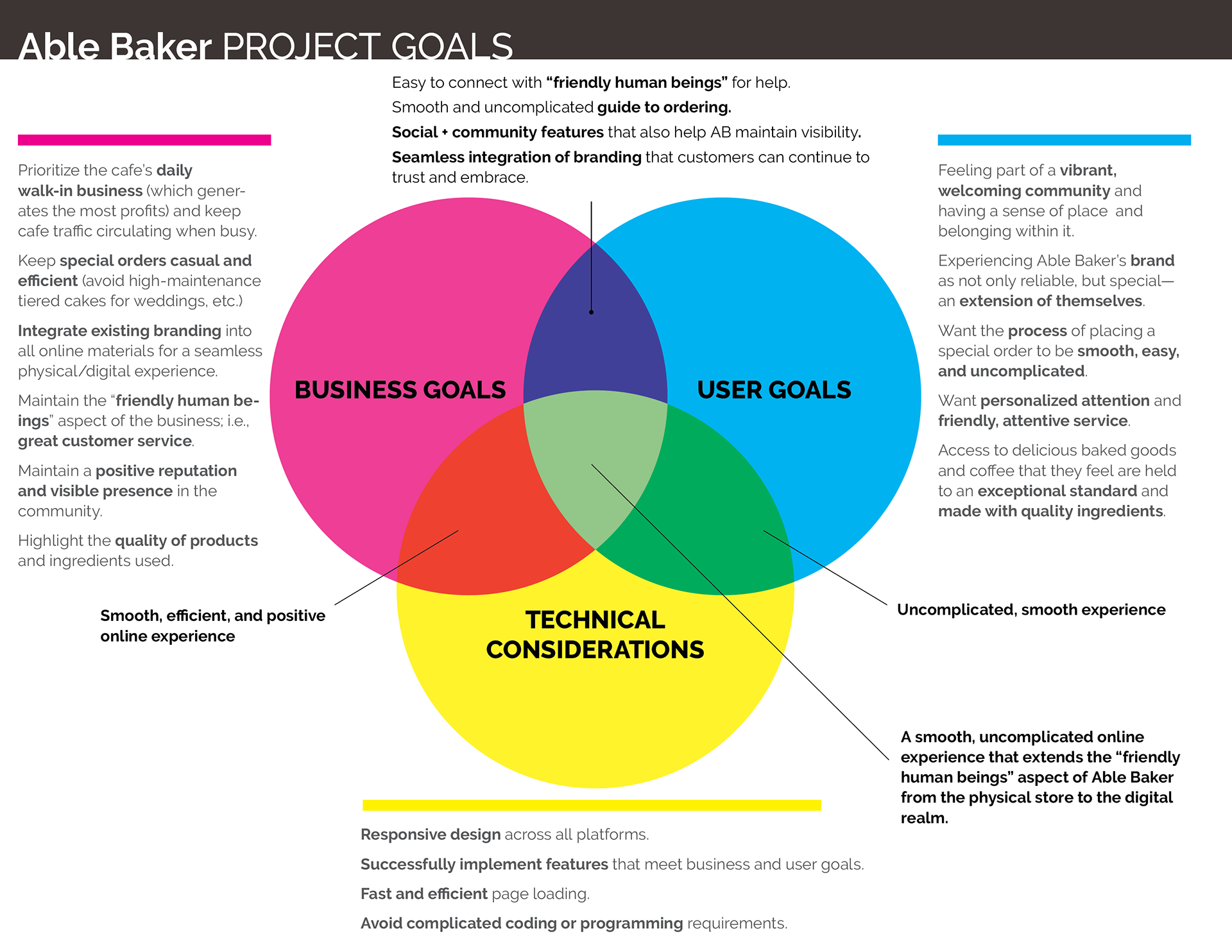
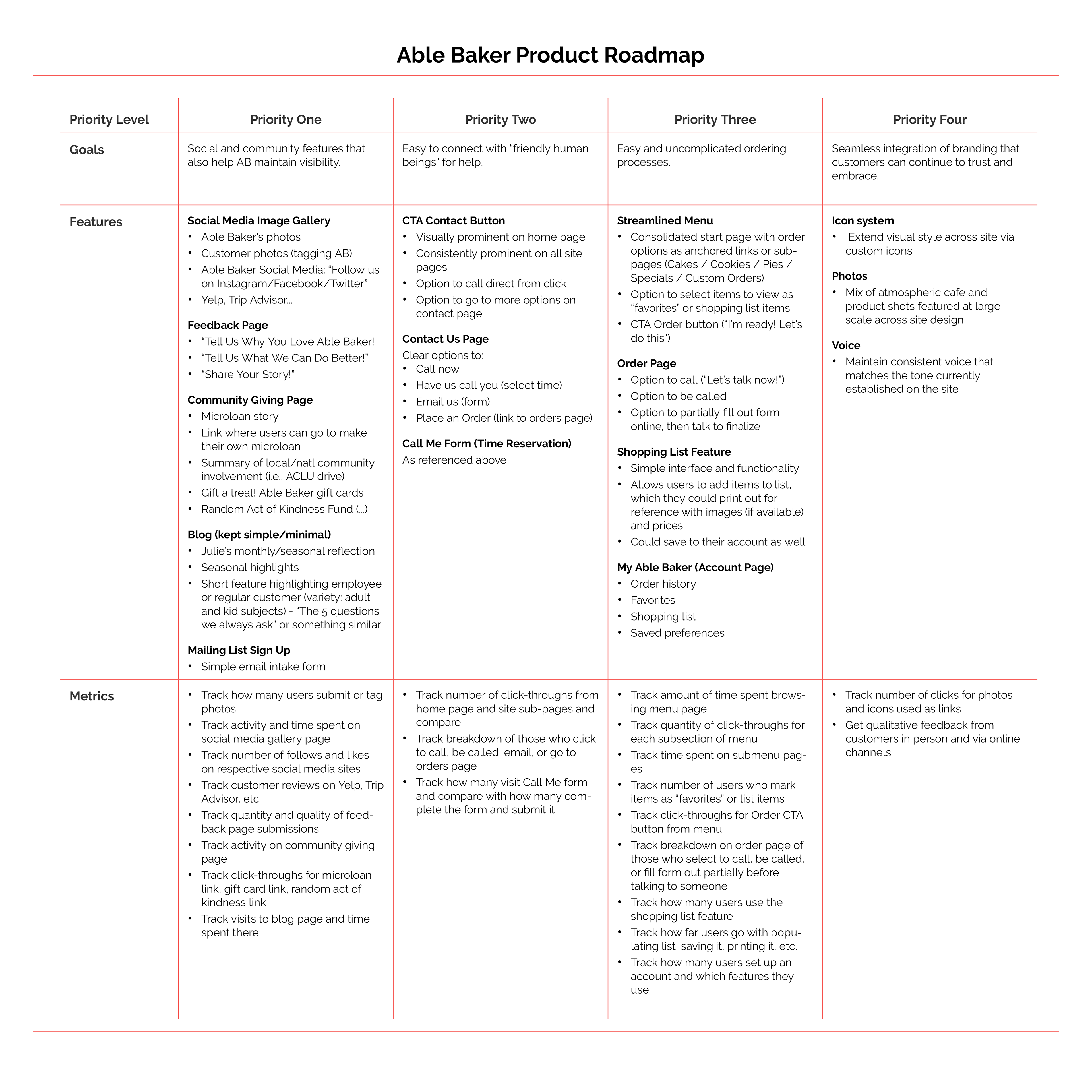
With the project goals in focus, I created a product roadmap, with features presented in order of priority in terms of development, investment, and importance to business and user goals. Linzie's needs and priorities were used to focus the exercise. The roadmap includes proposed metrics for measurement so that the impact and effectiveness of the features can be analyzed.
Mapping It Out
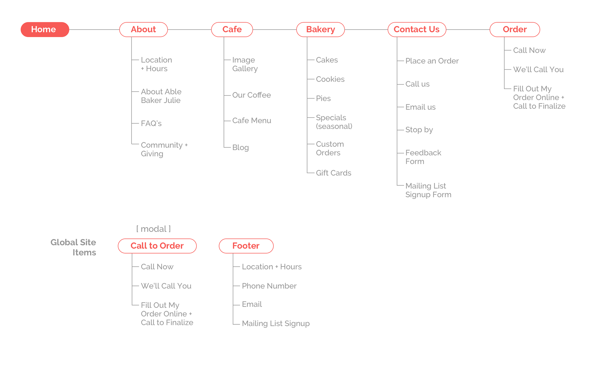
Informed by the features and priorities outlined in my product roadmap, I created a site map showing the content architecture proposed for the new Able Baker site.
INTERACTION DESIGN
Tools used: User flow map, sketching, wireframing in sketch, prototyping in invision
Charting a Path
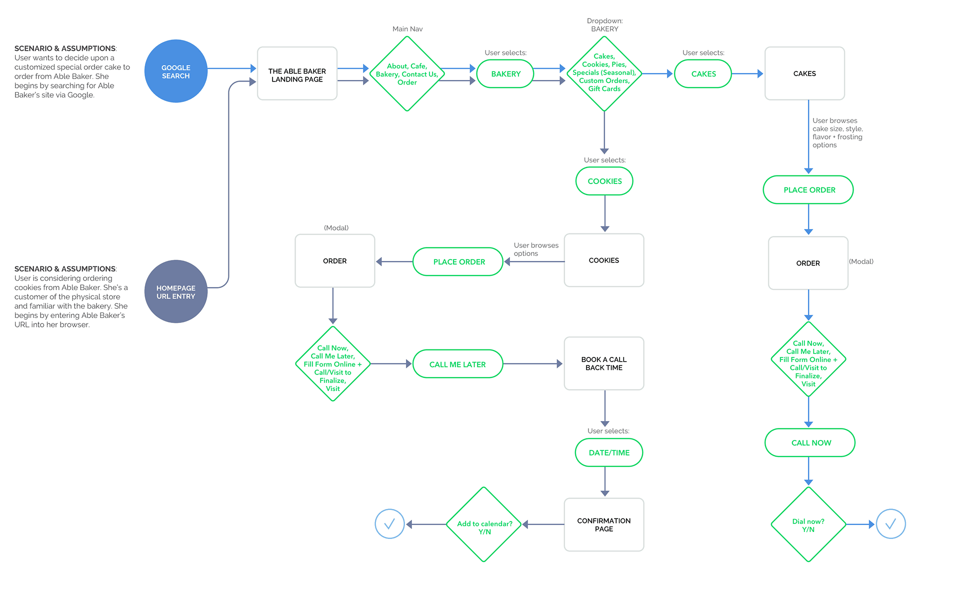
With the site map in place, I moved towards prototyping. I created a user flow based on some simple use cases for Linzie. In this diagram, Linzie moves through two tasks: deciding upon a customized special order cake, and placing an order for customized cookies. Mapping out the user's journey from start to completion helped me think through each step of the process and experience to make sure the organization of the pages flowed in a logical, smooth way.
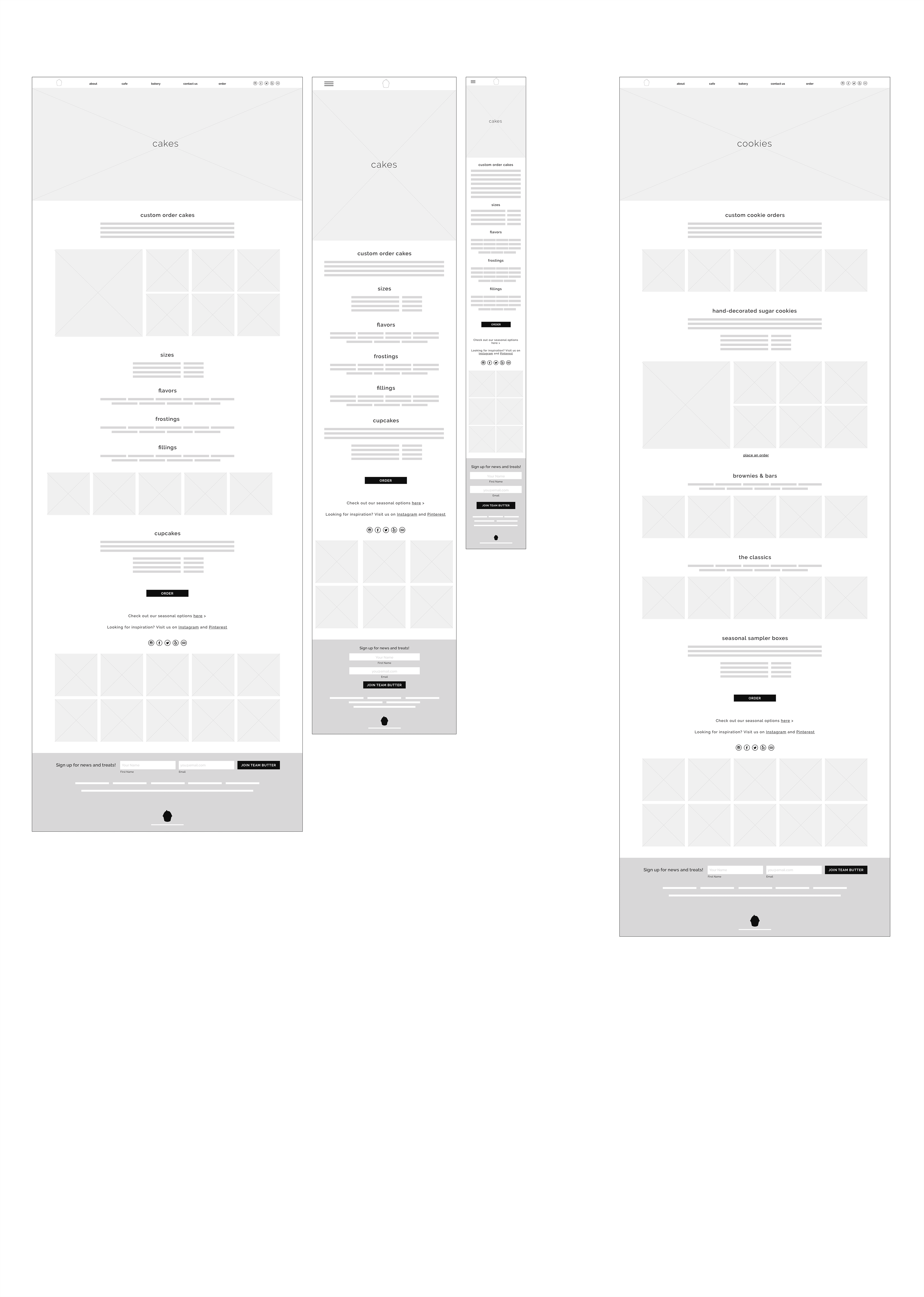
Referencing my site map and product roadmap, I created a detailed list of interface elements for pages within the user flows I'd established. This UI requirements document allows stakeholders to assess and weight in on details of the site before they're implemented, and it served as a checklist for me as I began wireframing. You can view the UI requirements list here >
Wireframing
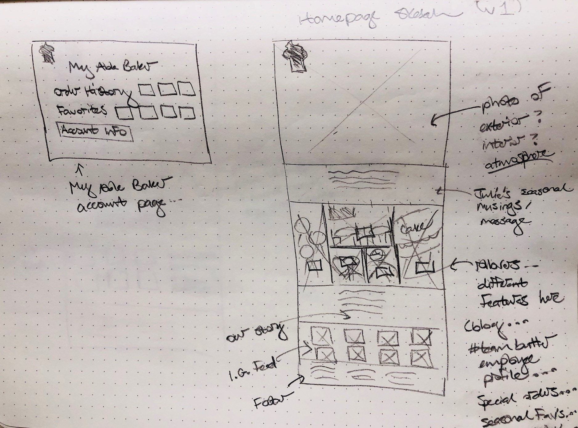
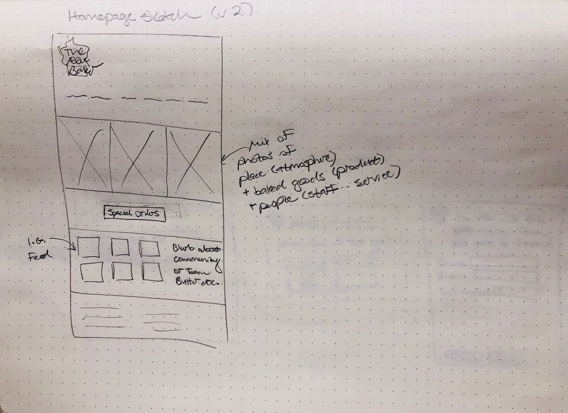
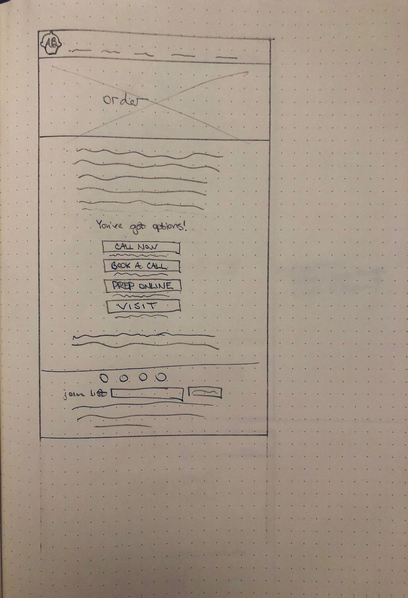
I created some low-fidelity wireframe sketches of key frames corresponding to the user flows I'd mapped out. I referenced the UI requirements and site map to make sure I included priority elements for each page, and conducted a brief search for design patterns to reference as well. At this point, I was already beginning to see how working with the existing logo would be challenging due to scaling and legibility issues.

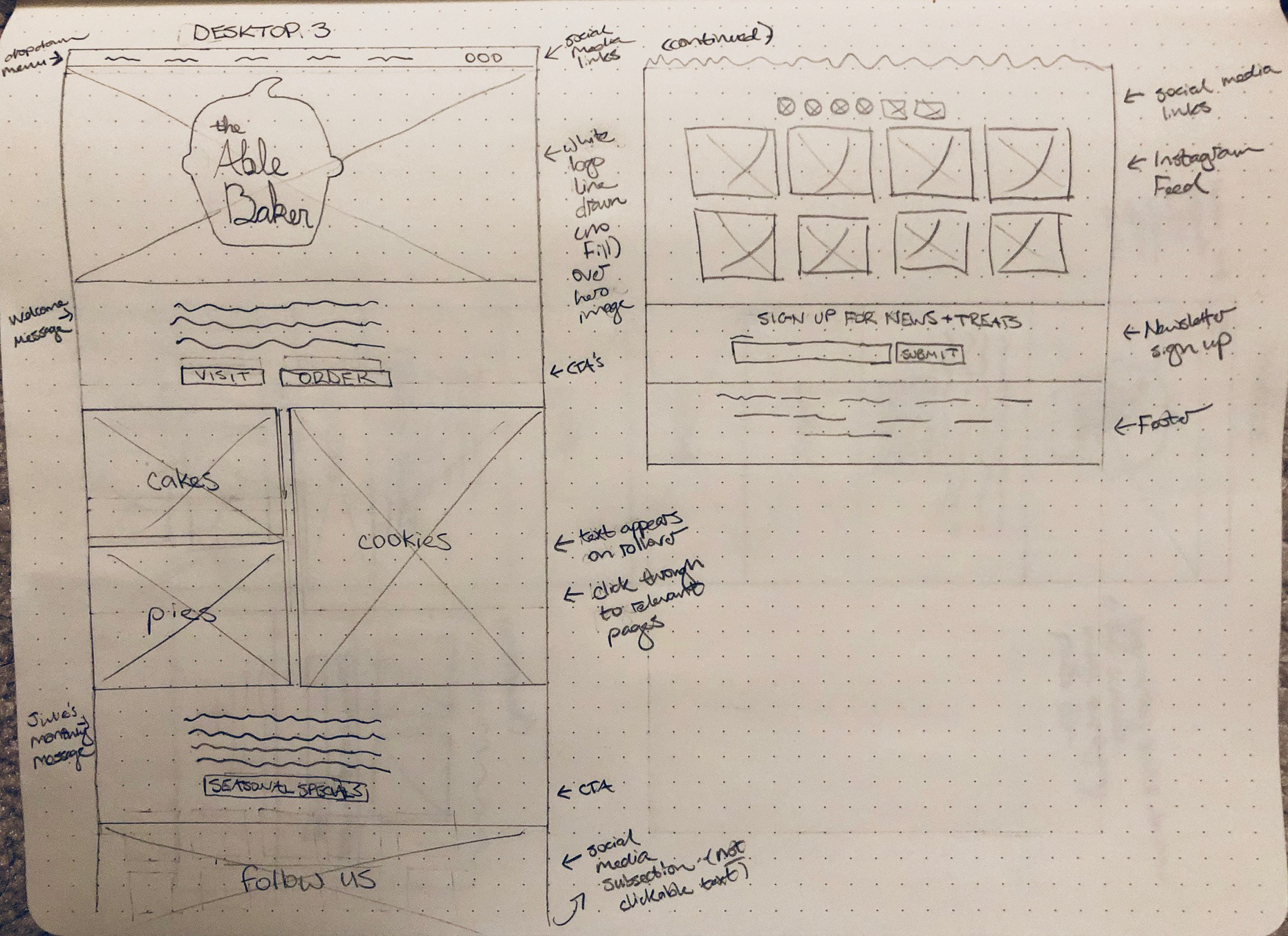
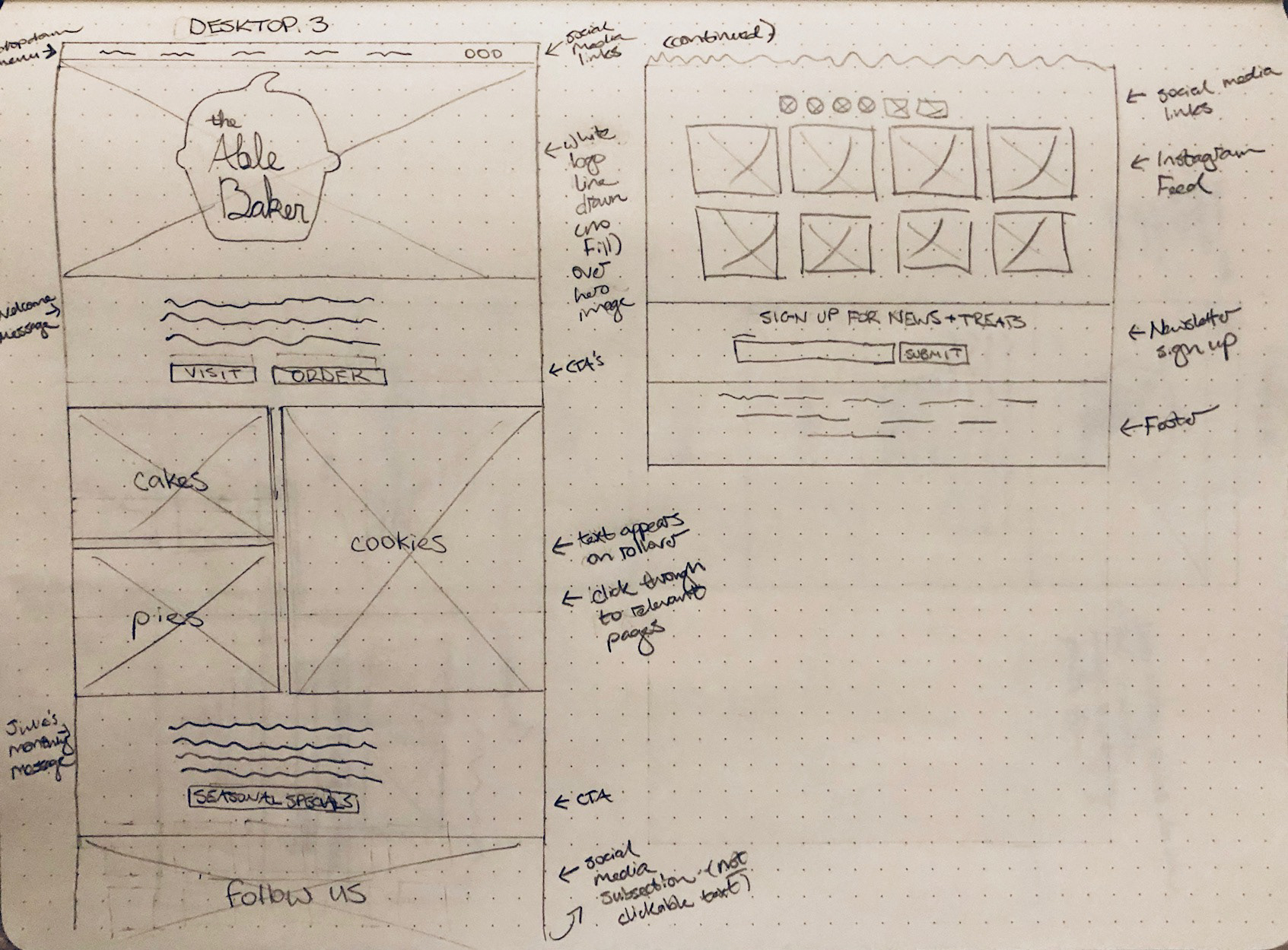
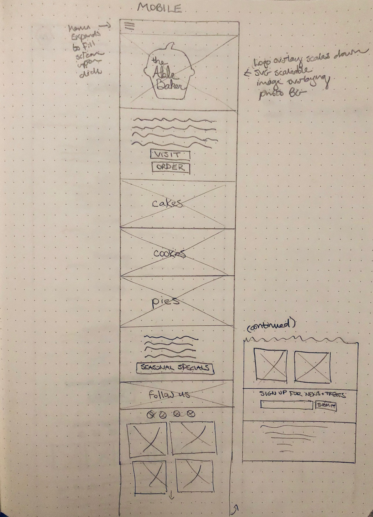

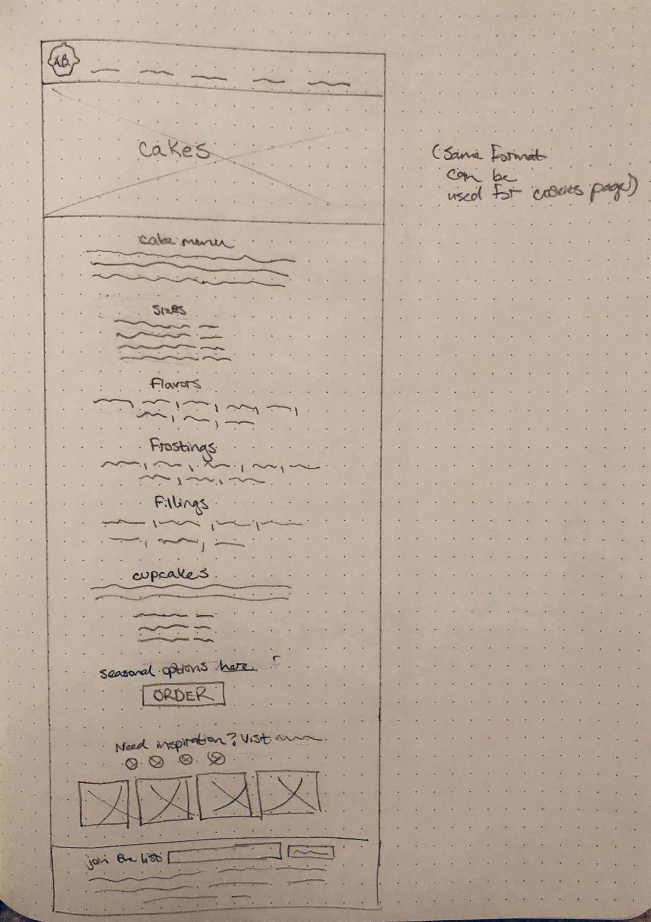

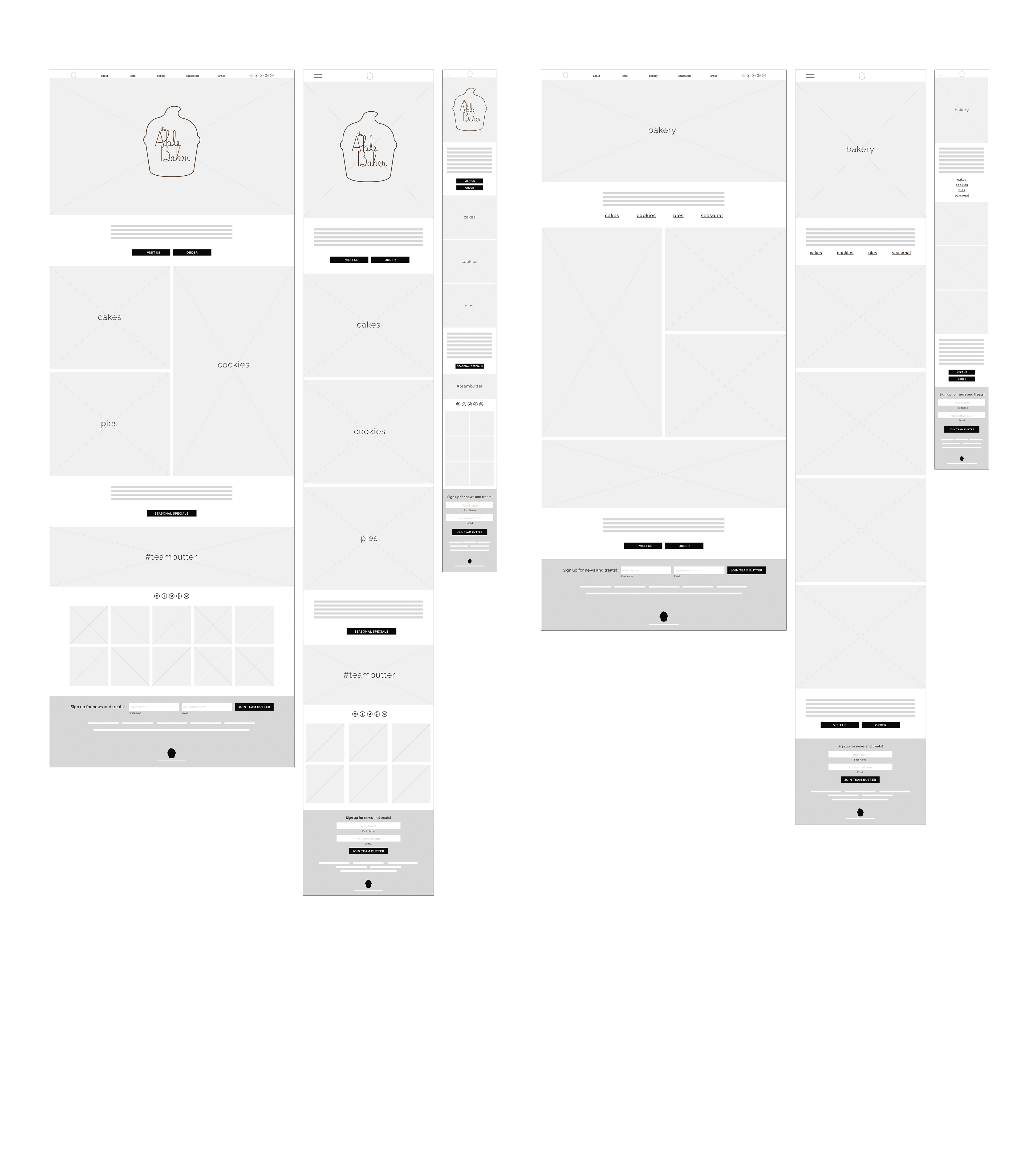
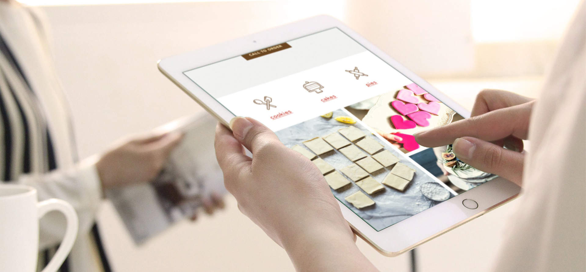
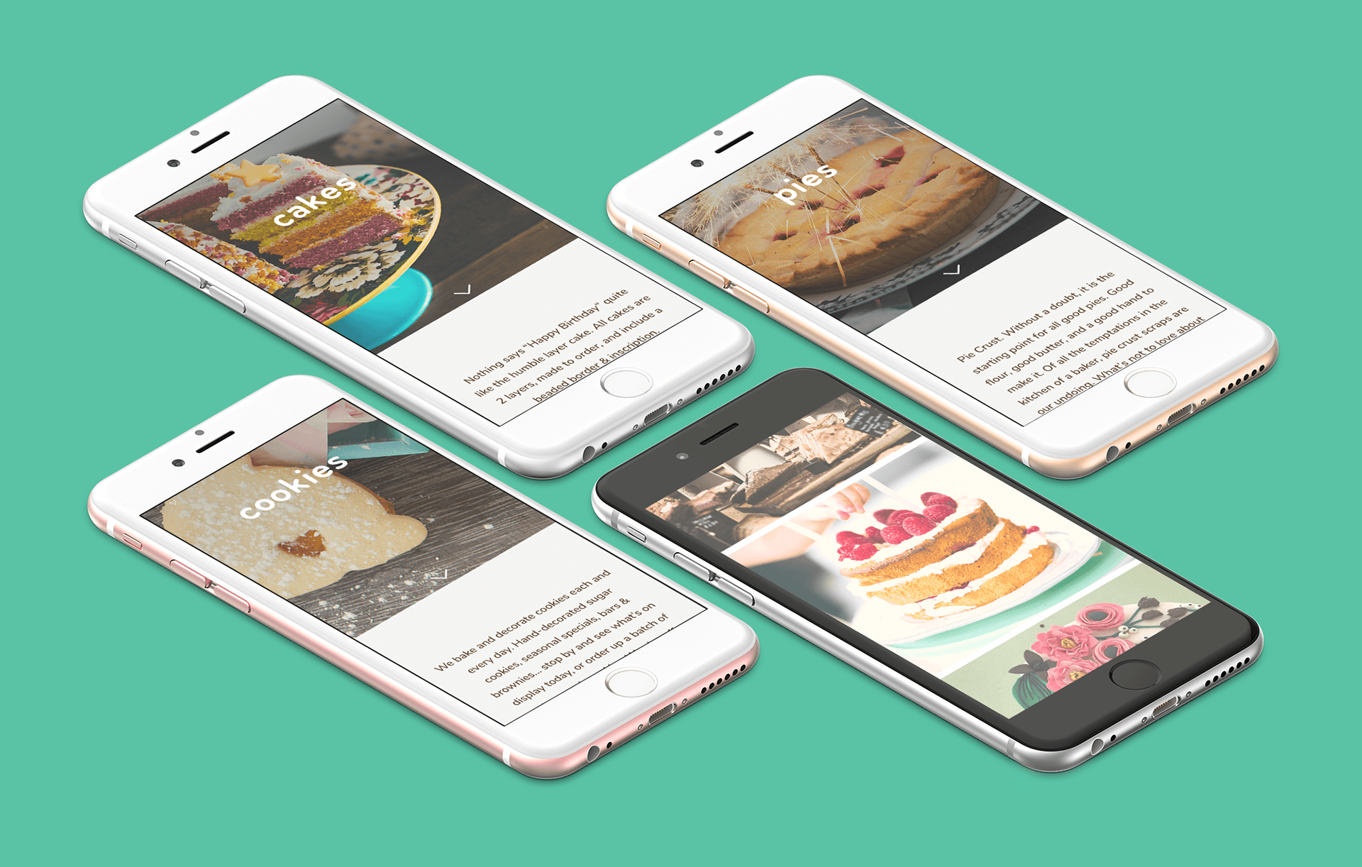
Working from my lo-fi wireframes, I began working in Sketch to create a set of mid-fidelity responsive screens. This set of wireframes shows the site pages that a user would encounter as they progress from the home page towards looking for information on how to order a customized cake or cookies. These frames were developed with the goal of quickly translating them into a prototype, so that I could begin testing my design early in the process. I also annotated each of the wireframes to include details about the intended content and interactivity for the site, including the responsive viewports.
Mid-Fidelity Prototype
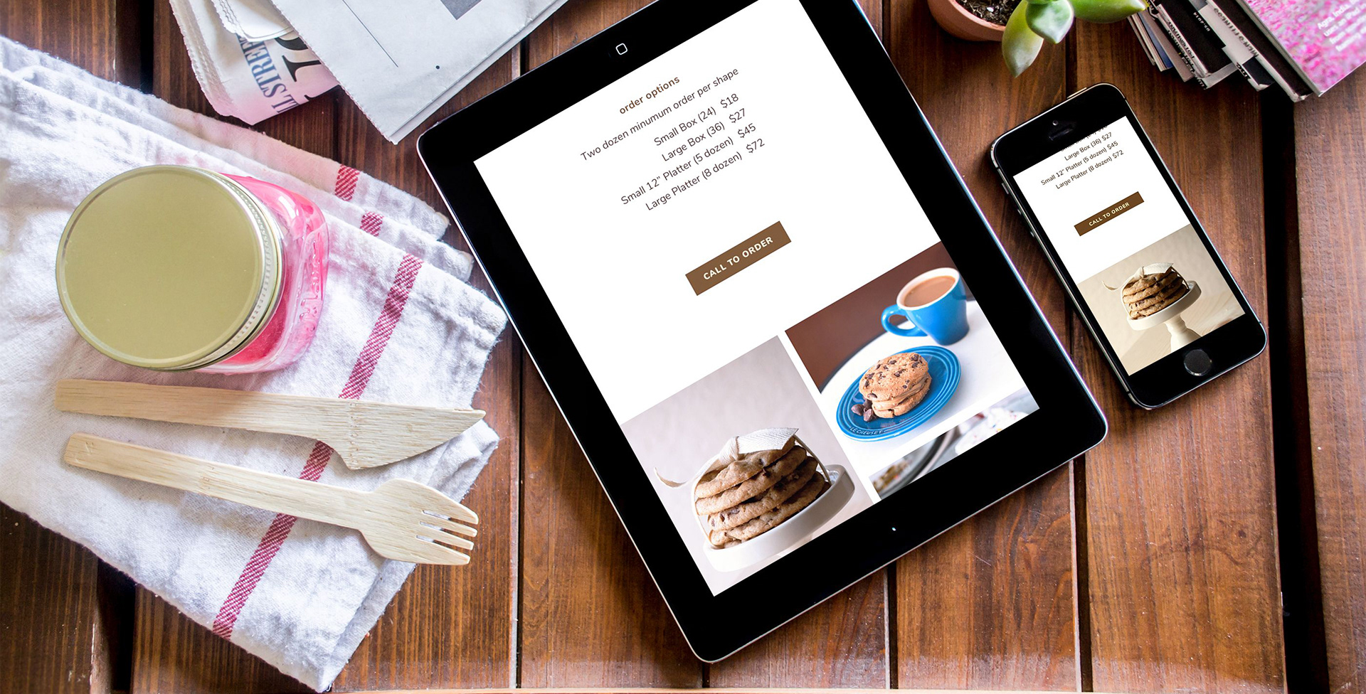
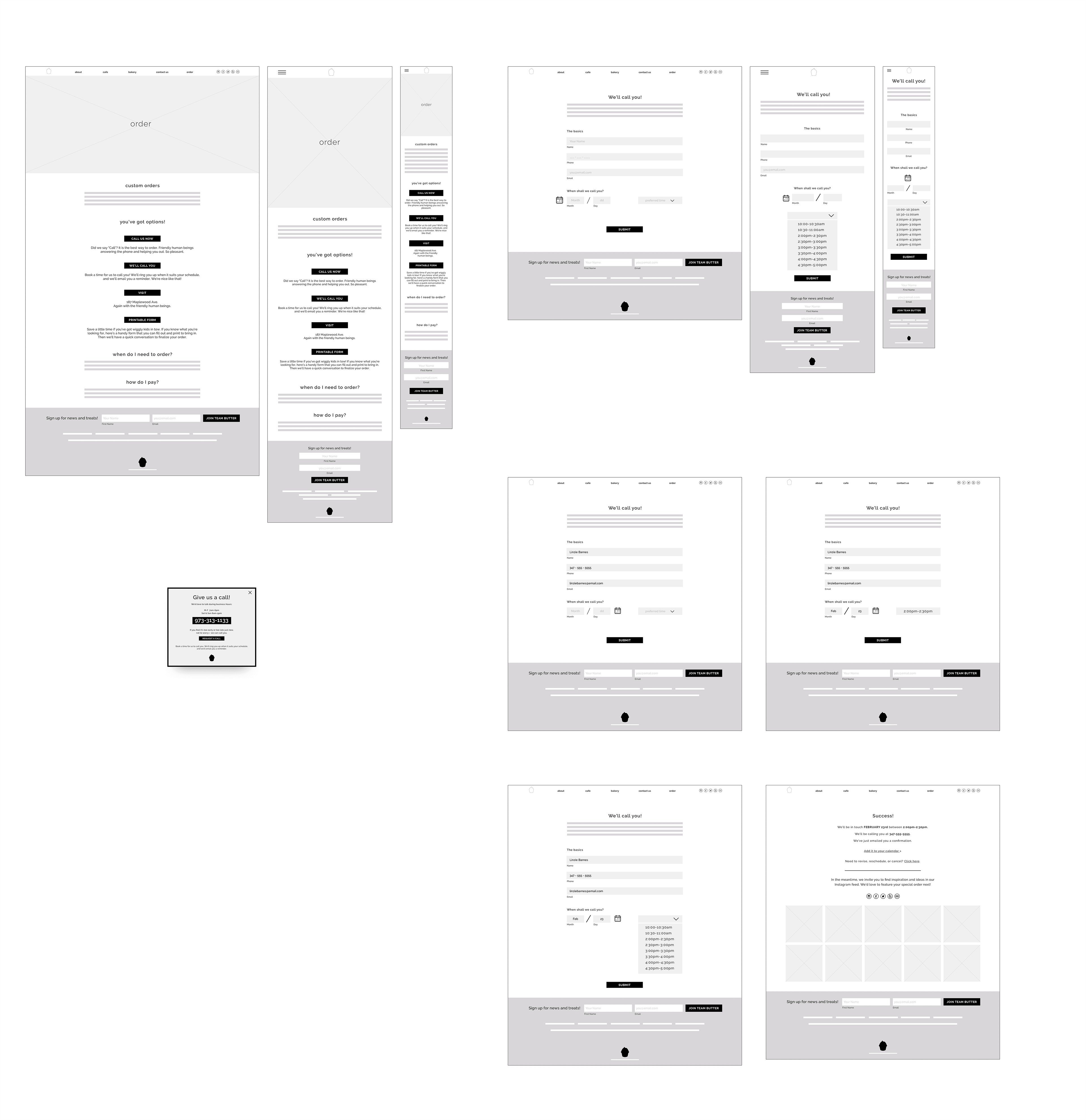
With the key frames of the user flow designed, I brought my wireframe screens into InVision and created a mid-fidelity prototype to share with users. I was eager to see how the options included on the Order Page would fare.
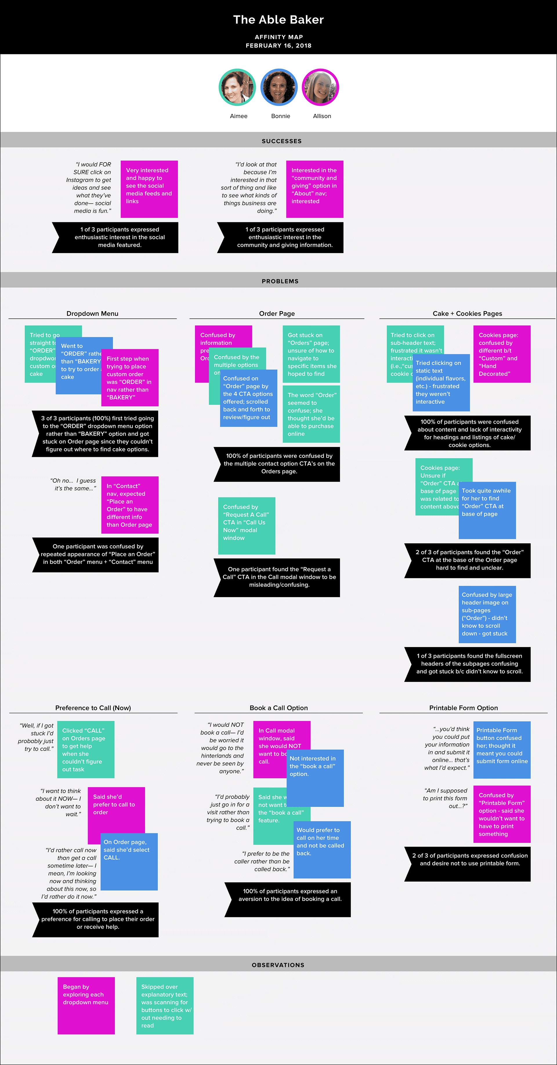
Usability Testing
Tools used: testing plan and script, invision prototype, AFFINITY MAP
I developed a usability testing plan to outline my test objectives, goals and procedures. You can see the full plan here >. Due to time constraints, testing was kept to 3-5 people. I asked participants to click through the prototype with the goal of completing two tasks according to the scenarios I provided, and I observed and took notes as they navigated the site.
Priority Task: Navigate the site as you consider ordering a custom birthday cake for a friend.
Right away, some issues with the site revealed themselves. Testers all struggled with parts of the site's architecture and navigation. It became very clear that too many options were being presented on the Order page. Testers were confused by the number of options, especially since among all of them there actually wasn't a way to place an order entirely online. While this wasn't what I'd hoped would happen, it was great to get this feedback early on in the process.
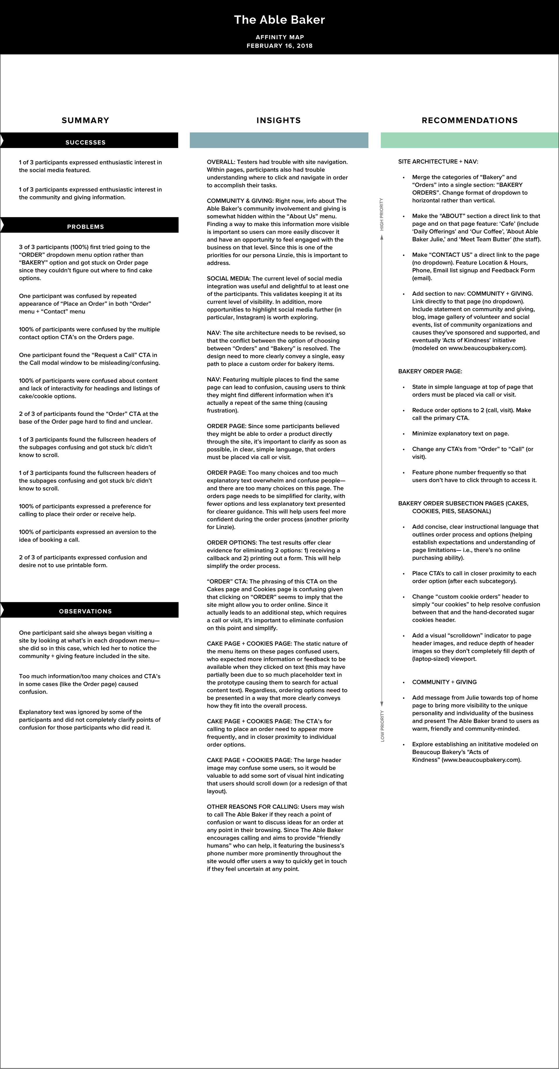
Insights + Recommendations
Drawing from the usability test results, I noted my observations and data on (virtual) sticky notes, then organized them according to patterns and trends. I then created an affinity map as a way of interpreting and prioritizing my findings.
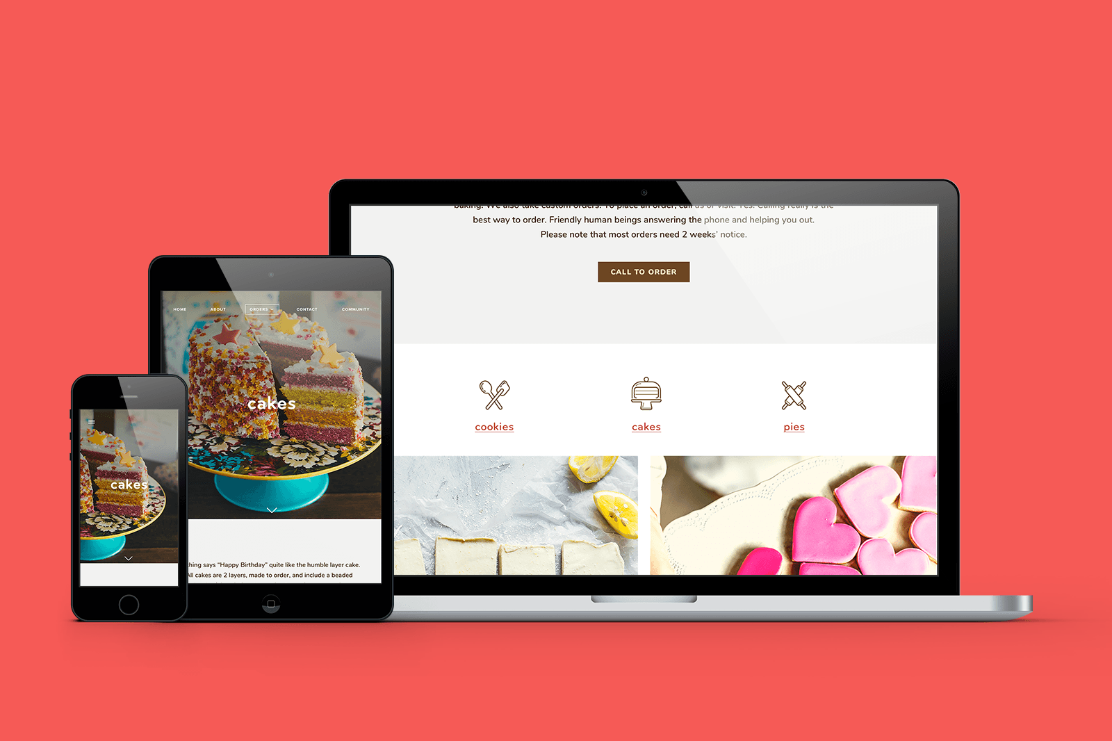
Revising the site's architecture and navigation was at the top of the list of recommendations that emerged from my insights. Close behind came the goal of reworking the bakery order page with fewer options, less explanatory text, and prioritizing a message in simple language explaining that orders must be placed via call or visit. Giving more emphasis to the "community" content of the site came next.
UI DESIGN + ITERATION
Tools used: moodboard, styletile, high-fidelity wireframes + invision prototype, Ui kit
Visual Direction
Working with The Able Baker's existing branding, I looked for ways to expand upon it. I first created a list of attributes to help me articulate the brand, and I developed a moodboard around them:
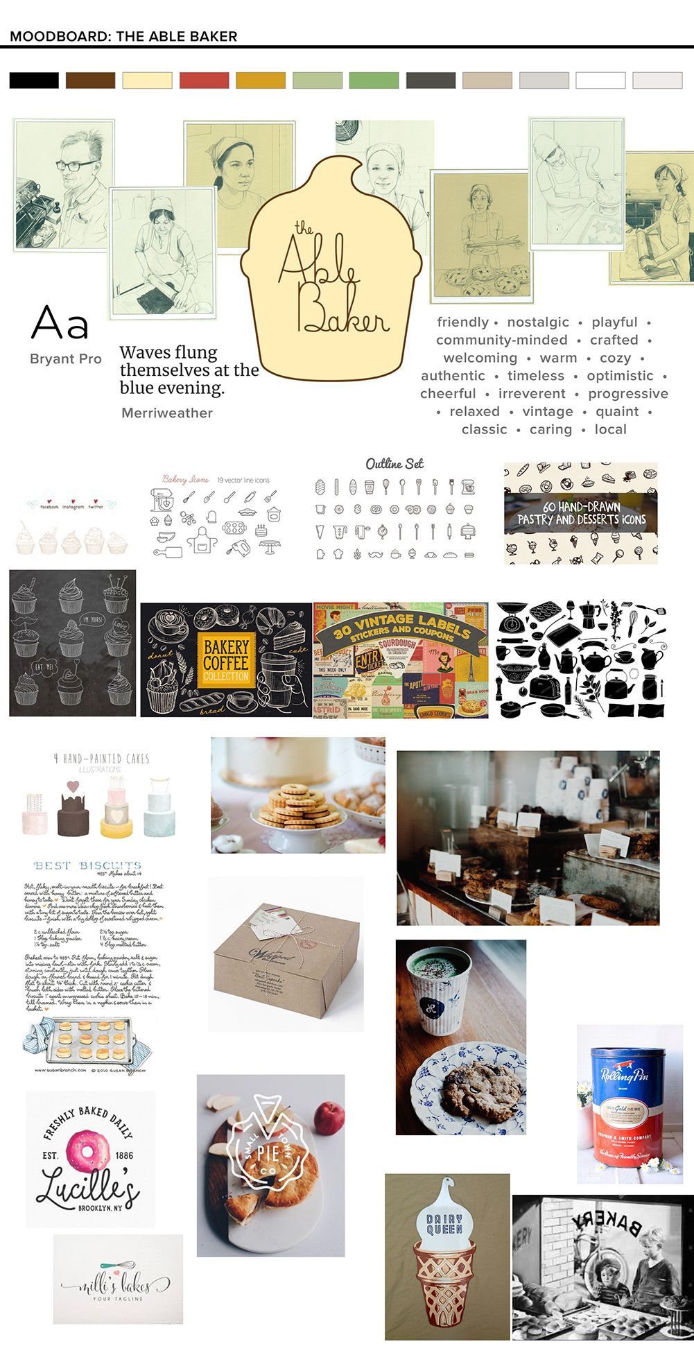
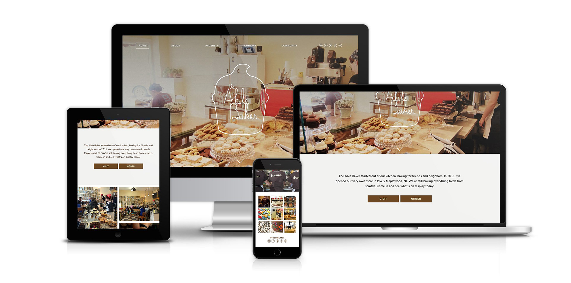
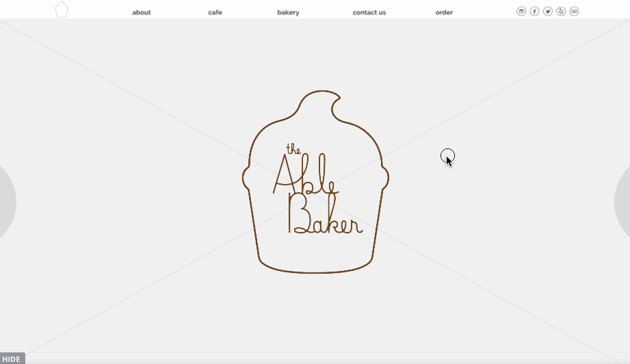
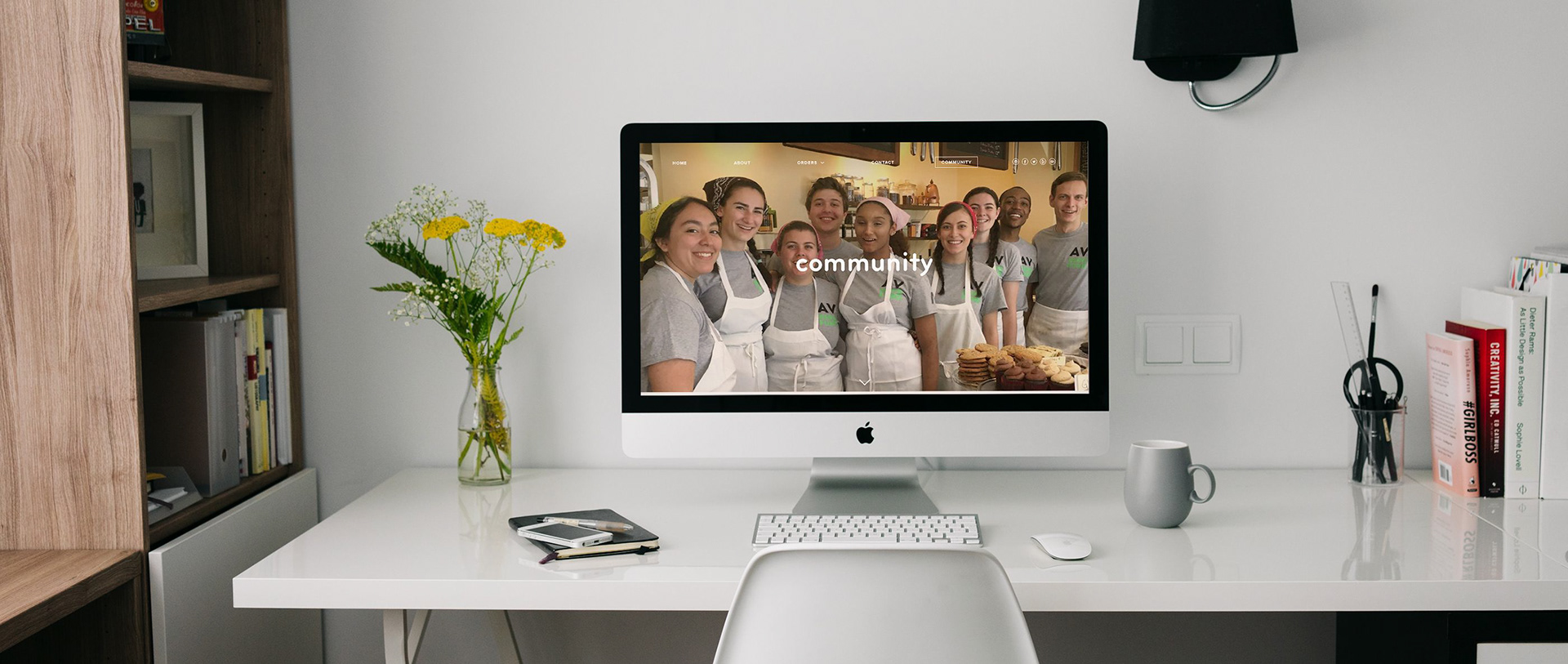
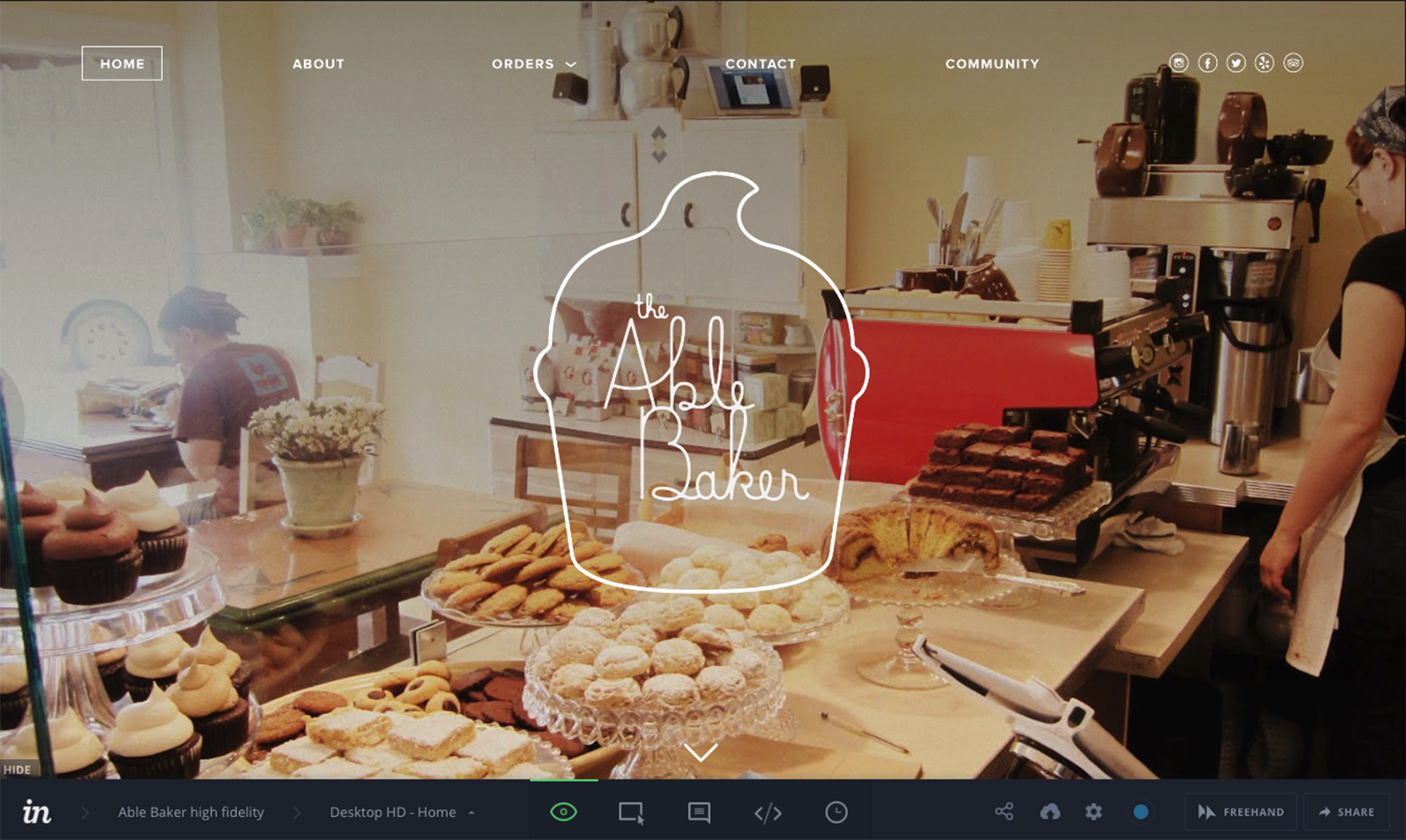
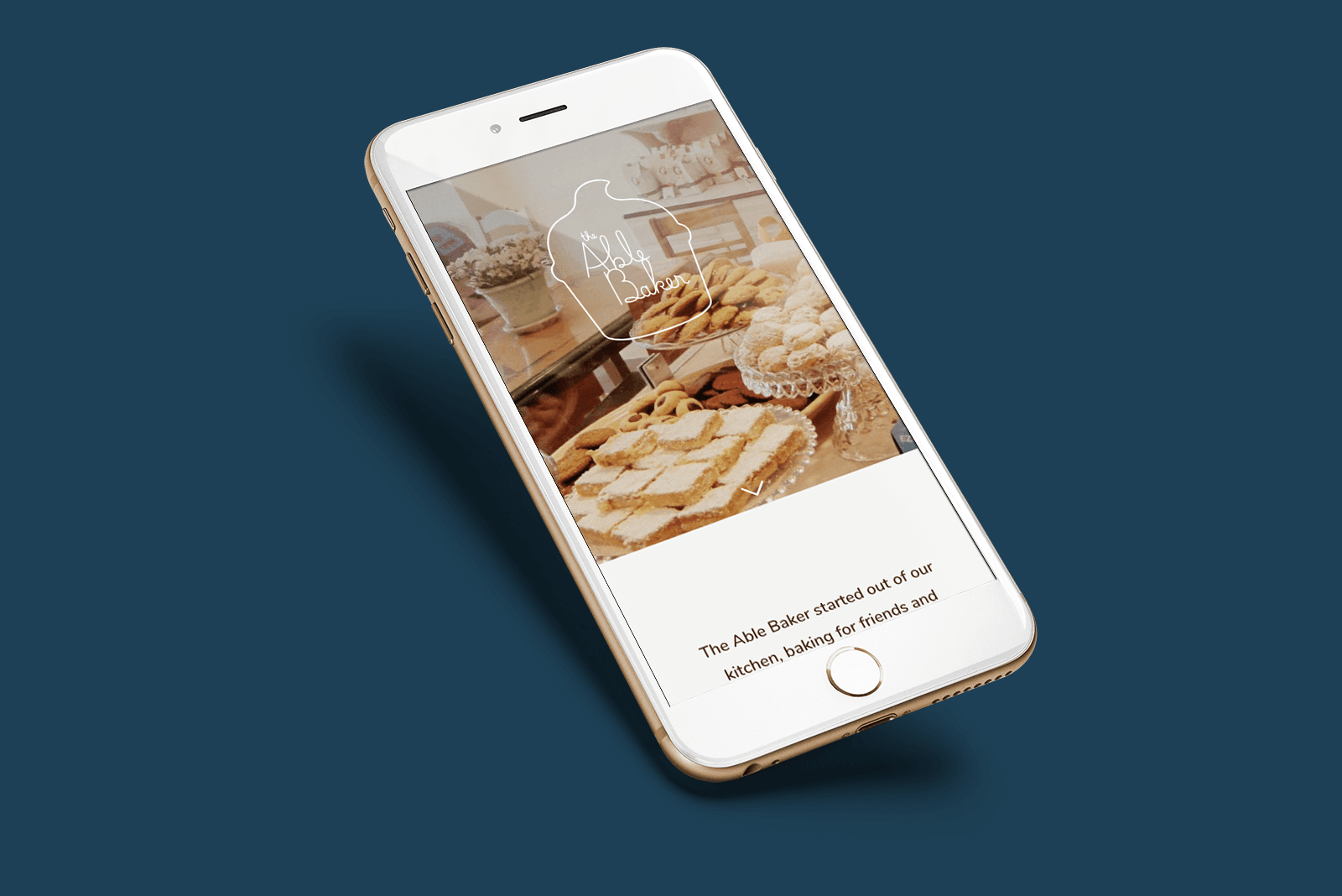
I then refined and developed the direction for the visual design, creating a styletile to show how the color palette, typefaces, branding, icons and imagery would be applied across the design of the new site. The Able Baker's logo works well at large scale, but at small size the lines become to thin and the text illegible. This presented a challenge when trying to incorporate it into the new design. I decided to pursue a direction where the logo would set large, overlaying an image of the cafe's interior. The idea was to mimic the view seen through the actual bakery's storefront window.


With my recommended revisions list from the affinity map in hand, I moved forward with developing a revised set of high-fidelity responsive wireframes. These show how the visual design will be applied to the site and reflect changes made to site architecture and navigation. Gone are the multiple options to choose from that included calling, booking a callback, etc. Now, a streamlined flow presented users with straightforward options.

High-Fidelity Prototype
I brought these wireframes into InVision once again, to create a prototype that offers another opportunity for user testing before going further with the site design and implementation.
UI Kit
Finally, I created a UI Kit to serve as a reference and resource guide for anyone working on the site. Maintaining this guide will help to ensure the consistency of styles and elements used across the site. You can see the UI Kit here >.
PROJECT Takeaways
This project was challenging in ways I didn't expect. Linzie's needs were more intangible and abstract than I'd initially expected. When combined with the constraints of the business, I found that creating a design that focused on offering fewer options within a simple (but intentional and informed) design was the best way to proceed.
In terms of visual design, working with existing branding and a very limited selection of existing hi-res images was also a bit tough. Since so much of the site design depended upon conveying the atmosphere and aesthetic specific to this particular bakery, stock photos couldn't easily be found to accurately portray the right look. Higher quality images specific to The Able Baker would certainly strengthen the visual design as represented in the high fidelity wireframes.
Next Steps
With more time, I'd like to replace the images with professionally shot photos and work a bit more on the visual design for the site (I'm still not entirely satisfied with the layout). I'd also love to explore reworking the logo so that it could work at small scale. Most of all, I'd like to follow up with a second round of research targeted towards the group of users I still suspect might be out there-- people who want to order cakes, cookies, and pies from The Able Baker but are too busy to come in or even call. I could be wrong, but the beauty of this process is that I can research to find out!